Course · Part 1 · Assignment 14
Icebreaker 
Identify Some Design Problems
![]() Time limit: 1 hour
Time limit: 1 hour
Remember to use your visual timer! We recommend the inventor’s iOS and Android apps — just search for “Time Timer” in the app store.
Explanation
In this assignment, you’ll study pictures of six different designs, and imagine what problems they were created to solve.
Instructions
Analyse these designs
![]() Set your timer: 50 minutes
Set your timer: 50 minutes
Study the six designs below, and write a short, one-paragraph design brief for each one. The brief should summarise what you think the problem could have been for the design solution in question.
Then, in a second paragraph, explain how successfully you think the design met its brief. Feel free to suggest possible shortcomings or improvements. Again, in this assignment there are no wrong answers — the purpose of the exercise is just to get you thinking.
As an example of what’s required, here’s a one-paragraph design brief for a stapler:
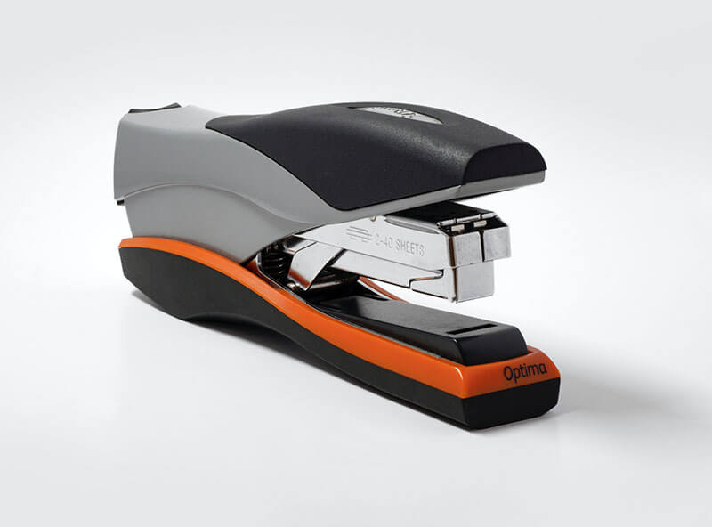
Image credit: Brett Jordan
Brief: Design a device that allows people to quickly, easily, and securely fasten together the pages of a document, either permanently or temporarily.
Success: Broadly, this design is a very successful solution, though there are pain-points around lack of standardisation (staple sizes), and sometimes staples can jam or buckle.
Design 1
Design 2
Design 3
Design 4
Design 5
Design 6
Review the example solution
Once you’ve completed your work on this assignment, take a few minutes to review the example solution below.
Example solution
Here are our answers for each design. We’ve gone into more depth with some of them for your interest. This level of detail isn’t required for the assignment, and isn’t expected in your own answers!
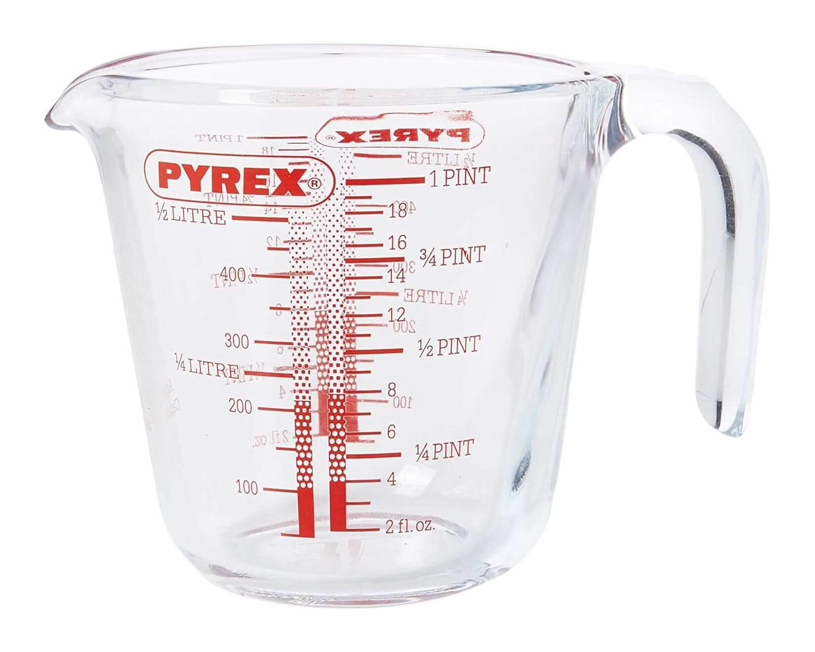
Design 1
Brief: Design an object that allows someone to measure an amount of hot or cold liquid, and pour it into another container.
Success: It meets the brief well. It has clear markings for both metric and imperial measurements, and being made of glass rather than plastic means that it is suitable for hot liquids.
A potential problem is that the markings are printed rather than etched, which means the markings could fade over time in the dishwasher. You also have to crouch down to see what level the liquid is at, which could be difficult for some users.
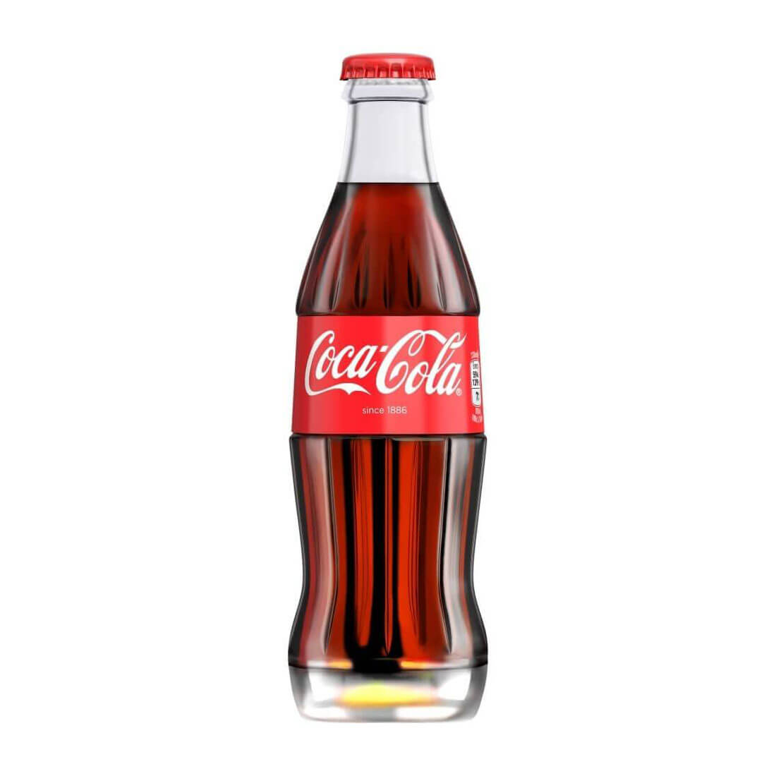
Design 2
Brief: Design a container for the Coca-Cola drink that is highly recognisable and distinct from other brands.
Success: The Coca-Cola bottle is one of the most successful examples of packaging design in history, and it has changed only slightly in over 100 years. It has a very distinctive, attractive shape, and packaging the product in glass allows people to see the product itself.
Although it meets the brief perfectly, this solution does have some ecological drawbacks: glass is heavy, increasing fuel consumption during shipping; and the shape of the bottle means that some space is wasted during shipping, too, reducing efficiency.
Design 3
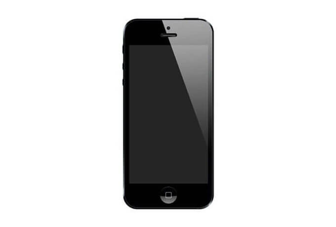
Brief: Design an easy-to-use, pocket-sized portable device that allows people to make phone calls, send messages, access the internet, and find their way around.
Success: The smartphone meets this challenging brief very well. The touch-based interface makes the device much more intuitive and easy-to-use than predecessors like PDAs (personal digital assistants) and Blackberrys, which required people to use a miniaturised physical keyboard. The very small size means it is practical to carry the phone with you all the time.
In terms of problems, these are well known. Their ease of use and ready connectivity makes smartphones very addictive, and these aspects of the design have been exploited by many app developers. Smartphones are an example of a design that met the brief perfectly, but unwittingly enabled many new behaviours. We’ll cover these issues more in Part 2, where we discuss ethical principles in design.
Design 4
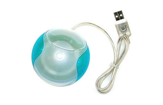
Brief: Design a computer mouse that works efficiently, is comfortable to use, and looks good.
Success: This is the famously unsuccessful “hockey puck” mouse, which Apple created to go with its new iMacs way back in 1998. In essence, it was unsuccessful because Apple put a lot of emphasis on the “looks good” part of the brief, at the expense of the “works efficiently” and “comfortable” requirements.
It is one of the clearest examples of what happens when we think about design more in terms of aesthetics than in terms of usability. The hockey puck’s design flaws were impressively wide-ranging:
- The circular shape is hard to hold, and doesn’t provide any resting place for the palm, potentially resulting in wrist pain
- The circular shape also causes the device to rotate during use
- The USB cord is too short, meaning that the device can only be used within a small area in front of the computer
- The mouse button sits flush with the rest of the device, and doesn’t have any indentation to suggest where to press
- All of these problems require the user to look away from the screen and towards the mouse in order to reposition it or reorient themselves
Design 5
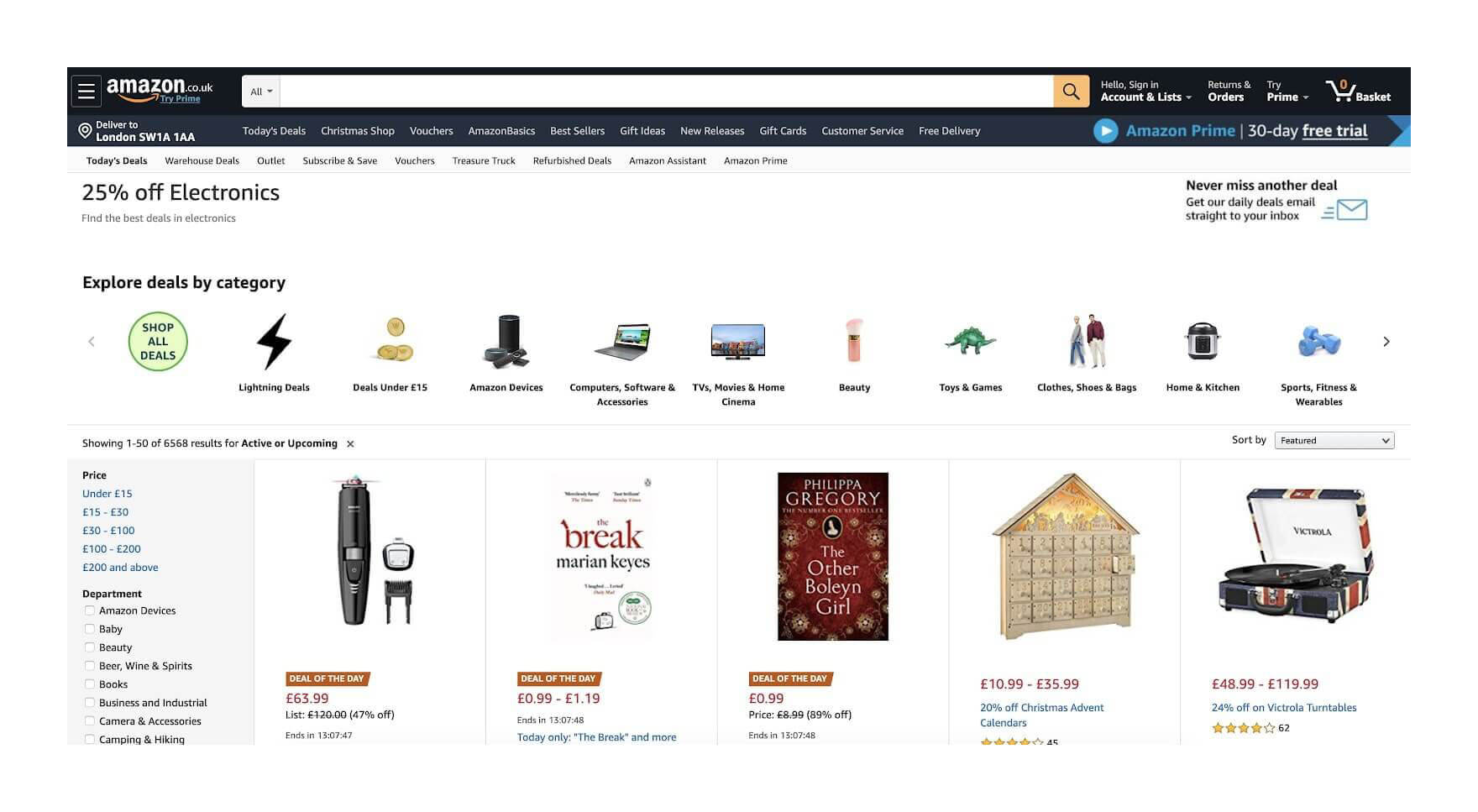
Brief: Design a shopping website that allows people to browse a wide range of products, and find what they’re looking for with ease.
Success: Amazon’s website meets the brief very well. Although it doesn’t look very pretty, and in spite of seeming to be visually cluttered, it is highly usable. There are three main reasons for this:
- The website has very good “information architecture”, which means how logically and intuitively products, categories, and account functions are organised into categories
- It also has quite “flat” navigation, which means that it takes people only a few clicks to get to a particular product, category, or account page
- Finally, it has a prominent search bar and powerful search functionality — essential for a site that hosts millions of products
In contrast to Apple’s hockey puck mouse, this website shows that prioritising usability over aesthetics can result in extremely successful designs.
Design 6
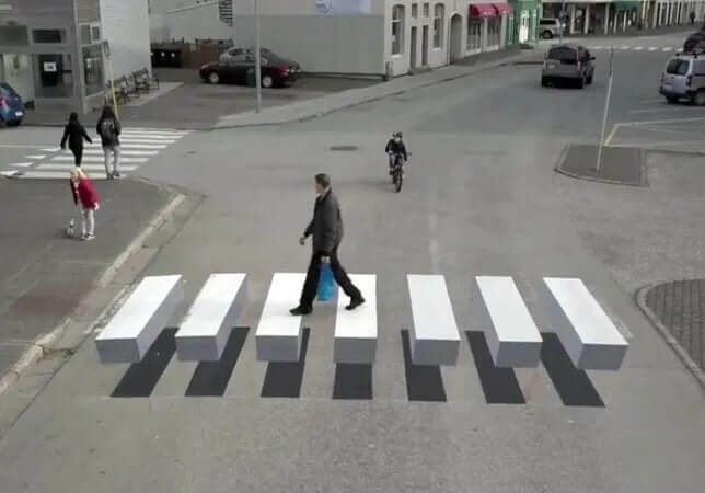
Brief: Design a pedestrian crossing that is more easily seen by approaching motorists.
Success: This is a simple, innovative, and inexpensive solution to the design brief. The crossing has been painted to produce the optical illusion that it is floating — a visual anomaly that is likely to get motorists’ attention, and possibly encourage them to slow down.
There have actually been lots of these trialled in the past few years, as Insider reports here . There isn’t clear information yet on whether they affect motorist behaviour in practice.
As we’ll explore in Part 2, one ingredient of good design is imagining the negative results of a design decision, as well as the positive ones. Here are a few potential side-effects:
- Being unfamiliar, the design could cause motorists to panic and brake suddenly, creating a hazard for following vehicles
- The optical illusion only works from one direction of travel, and on a two-way street, the crossing may be unrecognisable from the other direction
- The fun design may encourage pedestrians to remain on the road for longer to play or take photos, potentially increasing the risk of collision
In conclusion...
Hopefully this exercise has yielded some new insights into what design is, and what it is that makes a design successful. In the next assignment, we’ll cover the different skills required by different design jobs.