Course · Part 4 · Assignment 10
Practise ![]()
Assess These Font Combinations
![]() Time limit: 1 hour
Time limit: 1 hour
Remember to use your visual timer! We recommend the inventor’s iOS and Android apps — just search for “Time Timer” in the app store.
Explanation
In this assignment, you’ll analyse some font combinations and decide whether they’re a good match or a bad match, and why.
Instructions
Assess these font combinations
 Set your timer: 50 minutes
Spend 10 minutes studying each of the font combinations below. Using your learning from the previous assignment, determine whether each pairing is effective, and note down the reasons for your decision.
We’ve provided the name of each typeface, so feel free to do a few minutes of research if you want to find out details about any of the fonts.
Combination 1
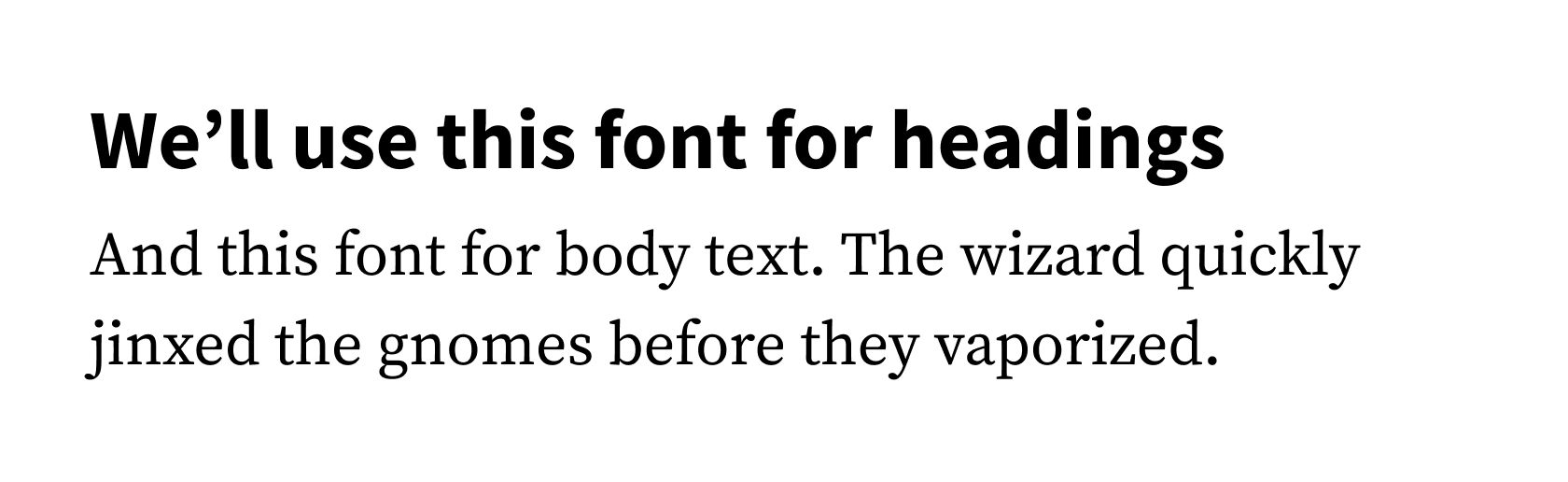
Heading font: Source Sans Pro
Body text font: Source Serif Pro
Combination 2
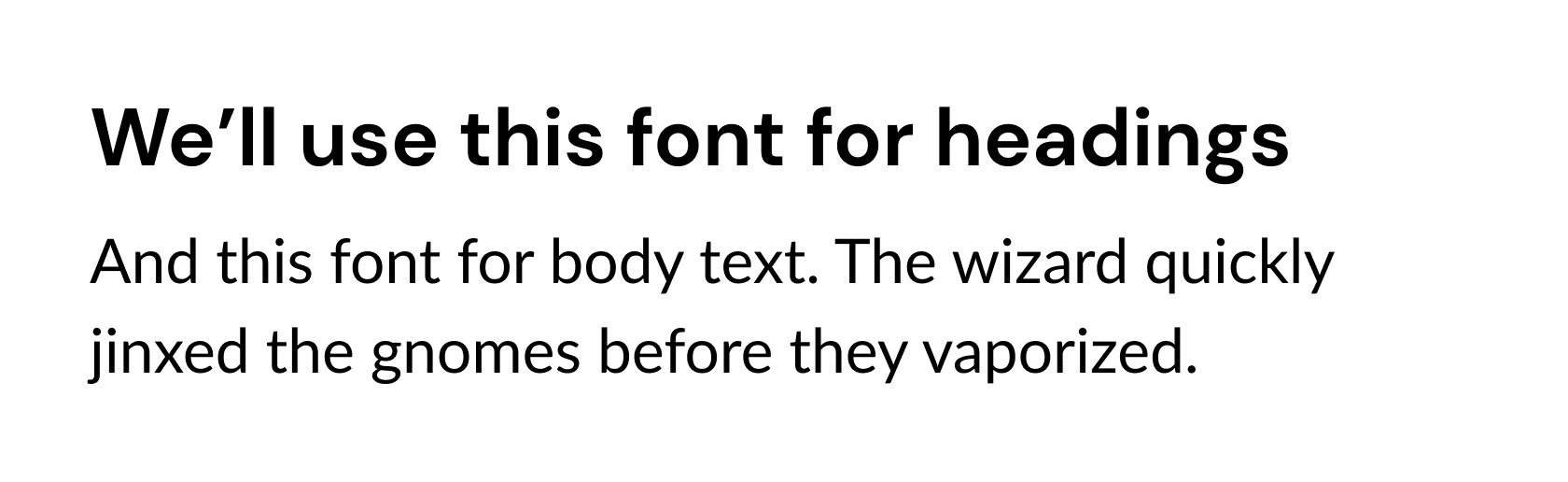
Heading font: DM Sans
Body text font: Lato
Combination 3
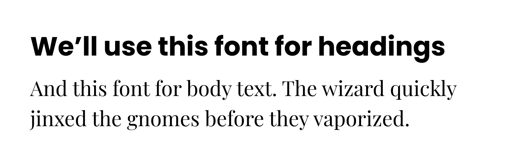
Heading font: Poppins Bold
Body text font: Playfair Display
Combination 4
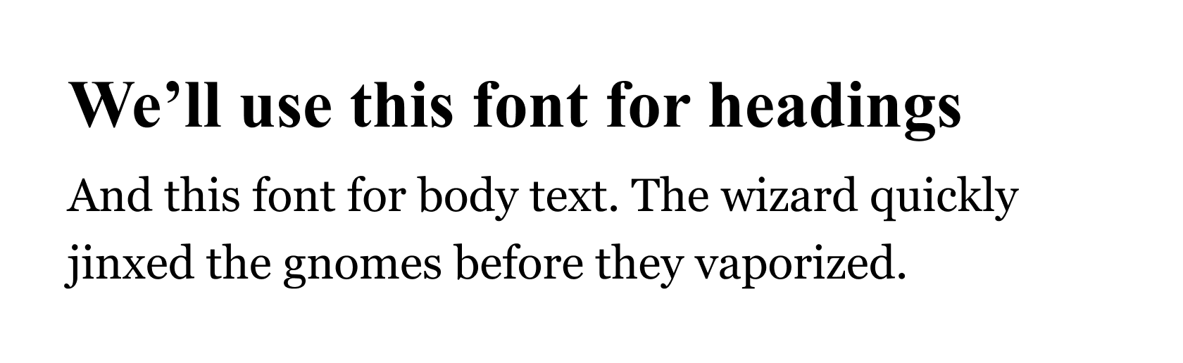
Heading font: Times New Roman
Body text font: Georgia
Combination 5
Heading font: Playfair Display
Body text font: Karla
Review the example solution
Once you’ve completed your work on this assignment, take a few minutes to review the example solution below.
Example solution
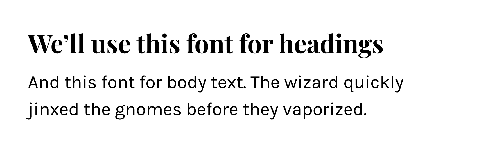
Combination 1
This combination of Source Sans Pro and Source Serif Pro is perfect. The two fonts are from the same “superfamily”, meaning that (in this case) they share the same letter shapes, and are designed to work together. It is also effective to pair a serif and a sans-serif.
Combination 2
This combination of DM Sans and Lato doesn’t work. First, it’s a pairing of two sans-serifs, and second, the two fonts are of different classifications, and clash with one another. (DM Sans is a geometric sans serif, while Lato is a humanist sans-serif.)
Combination 3
This combination of Poppins Bold and Playfair Display doesn’t work. Although it pairs a serif with a sans-serif, the personality of the two fonts is very different, meaning that the combination feels incoherent. Also, Playfair Display is designed for use at large sizes, and would have poor readability as a body text font.
Combination 4
This combination of Times New Roman and Georgia doesn’t work. It’s a pairing of two serifs, which is very rarely effective. They are also too similar — both typefaces are transitional serifs. In this case, it would be more effective to use the same font for headings and body text, or to pair a sans-serif with either Times New Roman or Georgia.
Combination 5
Finally, this combination of Playfair Display and Karla works well. Playfair Display is a didone serif intended for use at larger sizes, so is suitable for use in headings. Karla is a grotesk sans-serif with similar proportions and letter shapes to Playfair Display. The two fonts harmonise well, while having enough points of contrast to be interesting.
In conclusion...
Now that you’ve had some practice analysing good and bad typeface combinations, it’s time to create some font pairings of your own!
In the next assignment, you’ll put together three possible font combinations for the Summit cycling brand you worked on earlier in Part 4.