Course · Part 4 · Assignment 12
Read ![]()
Colour Basics
KeyThree
The key points from this assignment.
- Human perception of colour is physical, psychological, emotional, and cultural
- There two colour mixing models: additive (mixing light sources) and subtractive (mixing pigments)
- Red, green, blue (RGB) colour mixing applies to digital design (additive); cyan, magenta, yellow, black (CMYK) colour mixing applies to print design (subtractive)
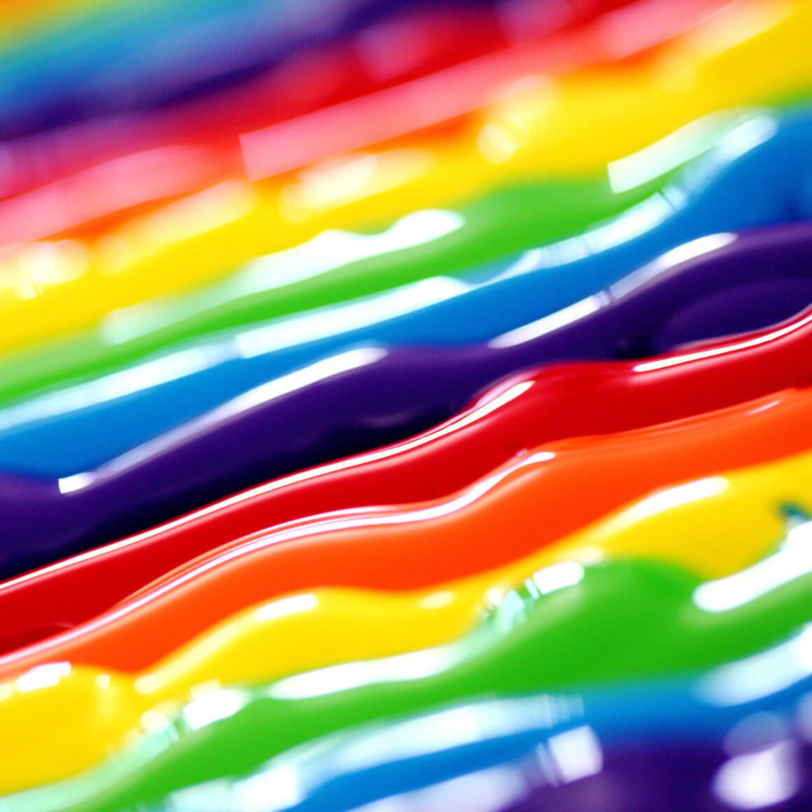
Image credit: Sharon McCutcheon
Introduction
Colour laser printers can create around a million colours. Humans can see around seven million of them. Computer screens can display over 16 million. With so many to choose from, where to begin?
Building colour palettes comes naturally and intuitively to some people, while others find it more of a struggle. Even if you find yourself in that second group, don’t be concerned. There are many tools and techniques that can enable anyone to use colour effectively.
In this lesson, you’ll learn what colour is, the difference between additive and subtractive colour mixing models, and the psychological, cultural, and ethical issues surrounding colour.
What is colour?
This might seem like an obvious question — almost too trivial to ask. But it’s a more complex one than you might imagine.
We could answer it in terms of:
- colour physics (waves of light)
- aesthetics (which colours and combinations look nice)
- emotion (how colours make us feel)
- meaning (what different colours signify in nature and culture)
- function (for example, which colours aid clear communication)
- accessibility (certain colour combinations can’t be seen by some people)
- ethics (for example, too many bright colours can cause sensory overload for some people)
These different perspectives indicate that, as a whole, colour is best defined as an experience.
The colour “blue” as we experience it isn’t actually “out there” in the world. Blue is a representation of something about the world, created by our brains, in response to a given frequency of light meeting our retinas. We then invest that perceptual experience with aesthetic, emotional, and cultural meaning.*
And because an experience of colour is formed through the physical, neural, and psychological processes of each individual person, colour can also be highly subjective.
When we make colour choices as designers, we therefore need to navigate not only the physical and technical aspects of colour, but also what colours mean aesthetically, emotionally, naturally, culturally, functionally, and ethically.
In the rest of this assignment, we’ll work through some of these considerations in a little more detail, beginning with colour physics and colour mixing.
* The phenomenology of colour is interesting, but very complicated. You can read more in the Stanford Encyclopedia of Philosophy .
Colour physics and colour mixing
The light waves out of which we form an experience of colour can be perceived either directly from a light-emitting source like a computer screen, or indirectly via reflection off of another surface.
Almost all of our visual experiences of the world (beyond computer screens) are of reflected light.

The perception of emitted light

The perception of reflected light
These two ways of perceiving light waves lead directly to two different models of colour mixing: additive and subtractive.
On the one hand, when we look at a computer screen, we are experiencing additive colour mixing. Red, green, and blue light is mixed in different proportions to create any of 16.7 million possible colours. 0% 0% 0% is black; 100% 100% 100% is white.
On the other hand, when we look at a surface from which light is being reflected, we are experiencing subtractive colour mixing. The properties of the surface absorb certain wavelengths of light, “subtracting” that colour from the light that is reflected back and perceived by the retina.
In turn, additive and subtractive colour mixing leads us to the two main colour models we need to know about as designers:
- RGB (red, green, blue), which is used for digital design
- CMYK (cyan, magenta, yellow, black), which is used for printed design.
(There are other colour models too, but we’ll cover those a bit later.)
Aesthetics, emotion, and meaning
Now that we’ve got the science out of the way, let’s consider how different colours come to assume aesthetic, emotional, cultural, and natural meanings.
What is it that makes us describe one colour as “beautiful”, and another as “horrible”? How and why do we form value judgements about waves of light?
Our attitudes towards colour come from many places — here are just a few.
1. How we’ve evolved biologically to interpret particular colours
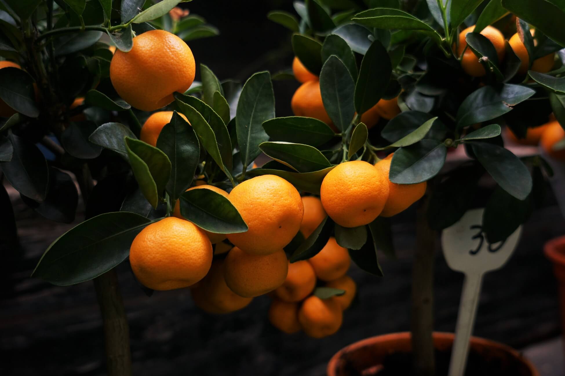
Image credit: Erwan Hesry
Since we can’t see in the dark, we might associate black with danger. Conversely, we might find bright, vibrant colours attractive, because they often indicate sources of food, and indirectly, sources of water.
2. What others taught us when we were young
For example, we might have been taught that red berries can be dangerous. And sadly, some boys are chastised for liking pink, while some girls are told off for liking blue.
3. Memories of colours

Image credit: Baseline Team
These will be especially powerful if they evoke important experiences in someone’s past. For example, the house where we grew up might have been painted purple, which could make purple a nostalgic experience.
4. Associations with the colour of objects
For example, a particular kind of yellow might make us think of bananas, and a specific shade of green might make us think of grass. (These associations are often used to help describe paint colours.)
Those objects will also have secondary associations. For example, banana-yellow and grass-green might make us think of summer, fresh air, health, and exercise.
5. The cultural meaning of particular colours or colour combinations
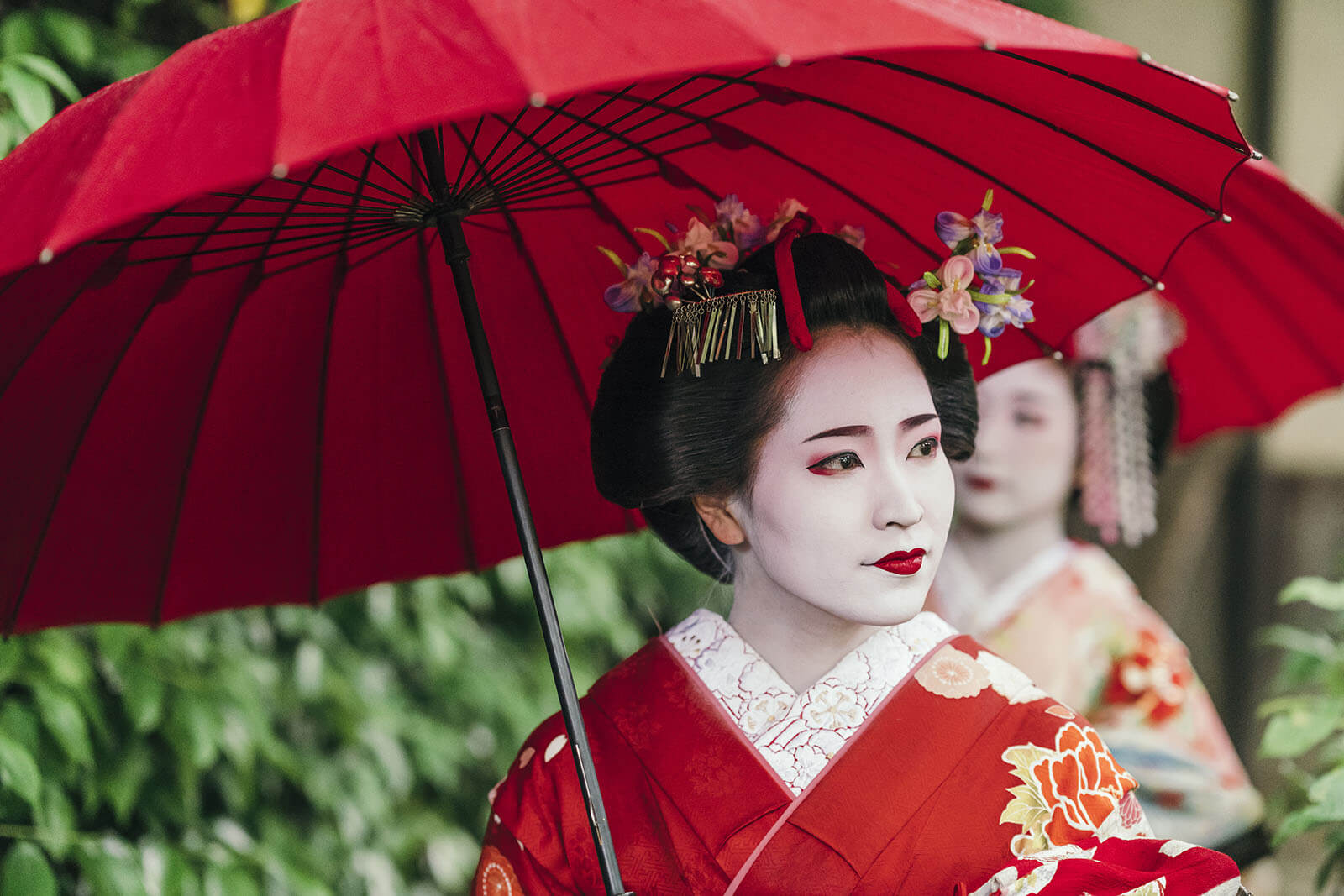
Image credit: Juri Pozzi/Shutterstock
For example, many westerners associate red and green with Christmastime, and in Japan, red and white are traditionally associated with happiness and joy.
6. Historical associations
For example, the combination of black, white, and red might remind people of the flag of Nazi Germany — especially because it persists in the present visual experiences of history books and documentaries.
7. Brand associations

For example, the combination of particular shades of red and yellow might remind us of McDonald’s, or greeny-blue could remind us of Tiffany & Co.
What this list should tell us as designers is that colours always have associated meanings. Those associations can be helpful and creative, but there is also always a risk that we trigger unintended associations.
Functionality, accessibility, and ethics
As designers, it’s important for us to be aware of how our colour choices affect others — particularly those with non-typical colour vision.
For example, as many as 1 in 10 boys and men have some form of colourblindness, the most common being red–green and green–blue. This may make it hard to distinguish those colours from one another when they’re combined, or make it unclear whether a colour is red or green in isolation.
In turn, this should make us reconsider how we use these colours and combinations in our designs — particular if those colours are used on something important or functional.
More broadly, those with impaired vision may struggle to read text if it is set using colours with a low “contrast ratio”. The highest contrast ratio is black on white. The further each colour moves from black and white, the lower the contrast ratio gets.
The use of colour can also lead to wider ethical questions. For example, large areas of bright colour can be overloading to some people, including some people with autistic spectrum disorders. There is some evidence that large areas of bright yellow can be particularly problematic.

Image credit: Ink Drop/Shutterstock
Other ethical questions relate to the colour associations we discussed earlier. For example, some colour combinations have strong associations with particular countries, cultures, movements, and communities.
The trans pride flag, for instance, uses a very specific combination of white, pink, and blue. Before using that colour palette, as designers it is our responsibility to consider whether our application of it could lead to unintended interpretations, or cause unintended offence.
In conclusion...
Now that we’ve covered the basics of colour, in the next assignment let’s talk about the different kinds of colour palette you can use in your projects.