Course · Part 4 · Assignment 14
Read ![]()
How to Create a Colour Palette
KeyThree
The key points from this assignment.
- Always start with the requirements of the project — not with a desired aesthetic.
- Combine those requirements with your knowledge of colour psychology and standard colour palette structures from previous lessons.
- Use our simple five-step method for building simple, versatile, and effective colour schemes!

Image credit: Baseline Team
Introduction
In this assignment, we’ll build on your knowledge of standard colour palettes, and outline a simple, five-step process for developing a colour palette from scratch.
Just like the process for choosing fonts, it’s essential that you begin with the goals and requirements of the project — not with a particular trend or aesthetic.
Step 1: Choose a base hue
Select a base hue in light of the requirements of the project, and your knowledge from the earlier assignment on colour basics.
For example, if you’re designing a brand colour palette for a bank, it’s likely that it will need to evoke calm, competence, and professionalism. This might lead you towards the blue area of the colour wheel.
Or if you’re choosing colours for a fruit and vegetable distributor, it might lead you towards a colour associated with healthy eating, like green or orange. For this example, let’s stick with orange as our base hue.

Step 2: Adjust the saturation and value of your base hue
Remember, in most design tools, if you move the colour picker to the left, you are reducing saturation (“adding” white), and if you move the colour picker down, you are reducing value (“adding” black).
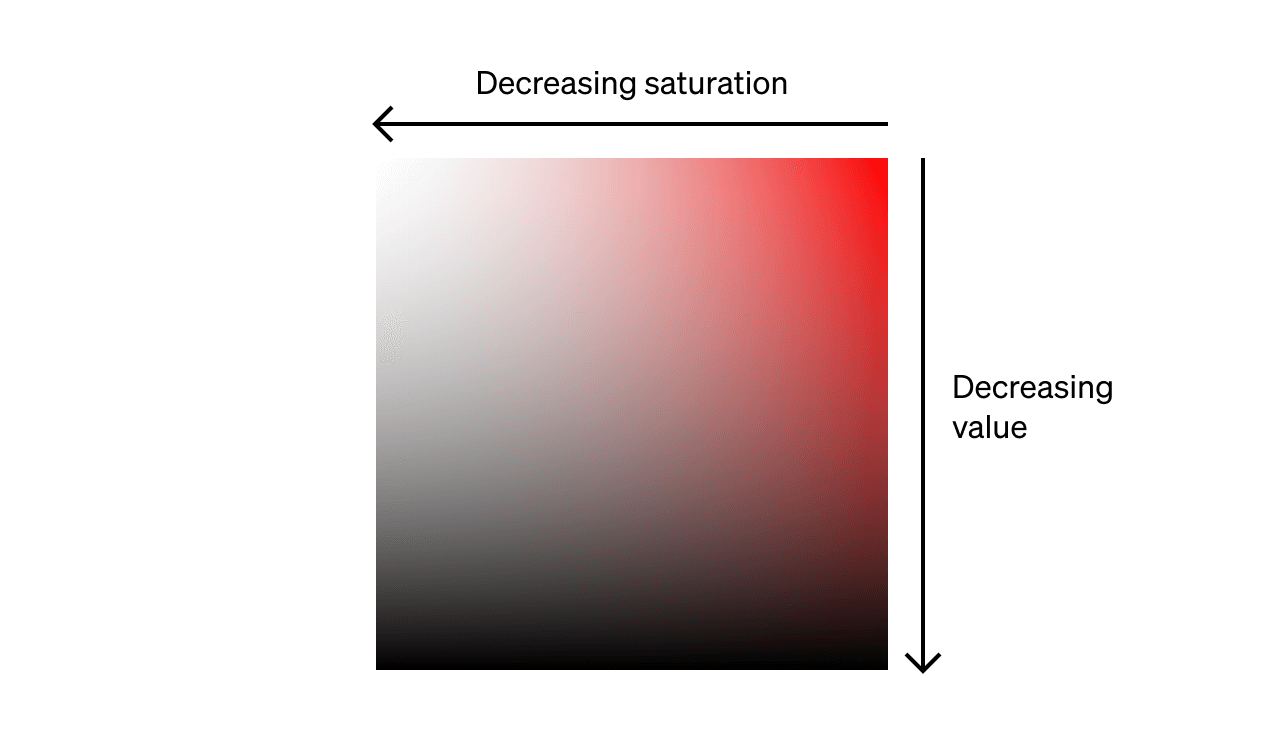
Unless you want an extremely bright palette, you’ll probably want to reduce the saturation and/or value to some extent. If you want a very subtle, muted base hue, reduce them significantly.
We want a slightly muted palette, so we’re going to reduce the value by 10% and reduce the saturation by 10%.

Step 3: Explore standard colour palettes
Discover what different colour options would be offered by palettes that are analogous, complementary, split complementary, triadic, tetradic, and square. Explore these initially by shifting only the hue; leave the saturation and value the same as they are for your base colour.
Here are some standard palettes based on the colour we created in step 2 (orange at 90% saturation and 90% value).

Step 4: Pick a palette, and fine-tune each colour
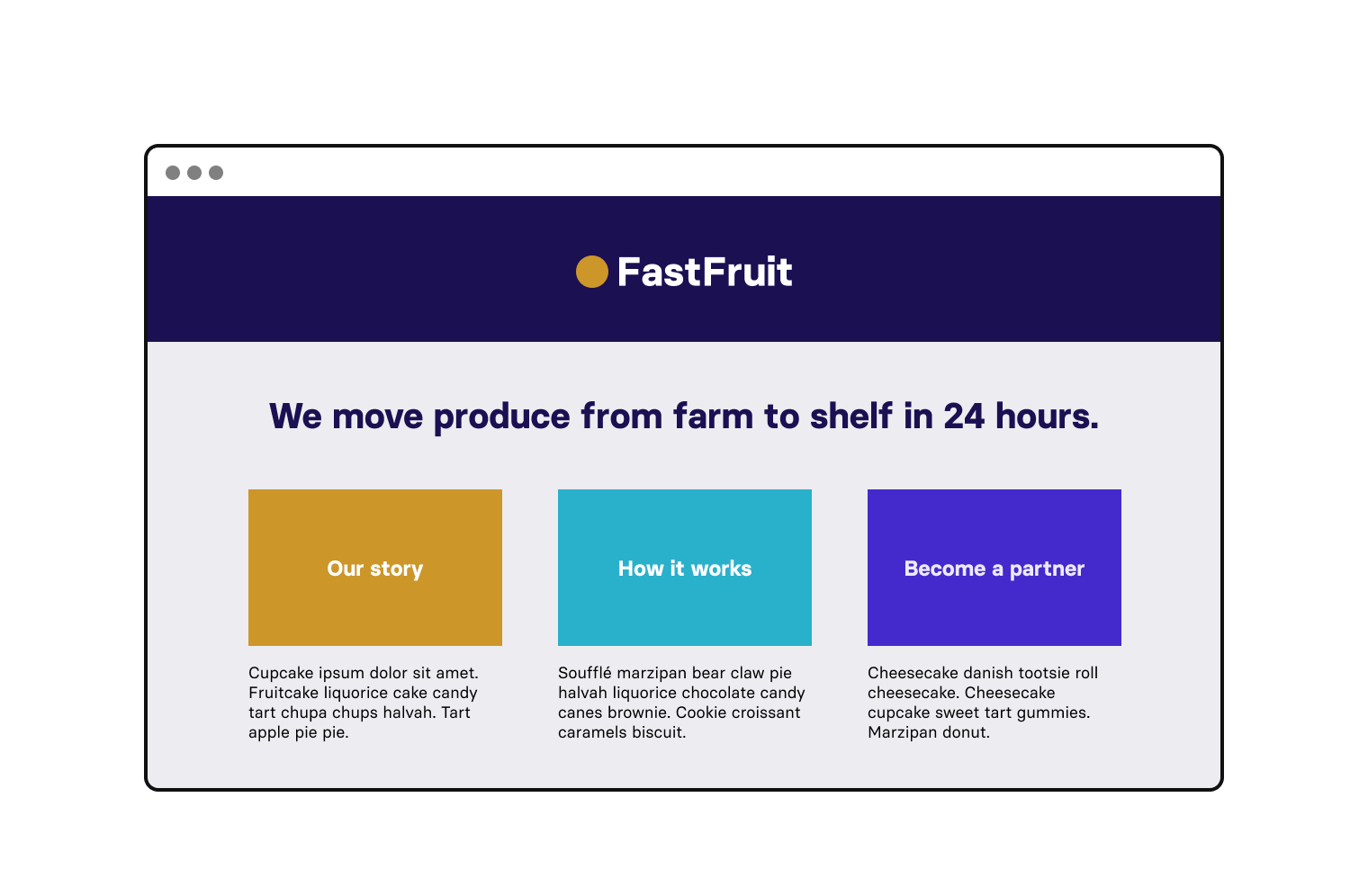
Next, pick which kind of palette you want to use. We’ve chosen a split-complementary palette, because it provides a nice cool green and blue to go with the warm orange — and orange, green, and bluey-purple will provide a nice range of options for our fruit and vegetable distributor.

At this stage, you can also fine-tune each colour, making small adjustments to it hue, saturation, or value, until you feel they are harmonised.
Here’s our colour palette applied to FastFruit’s website:
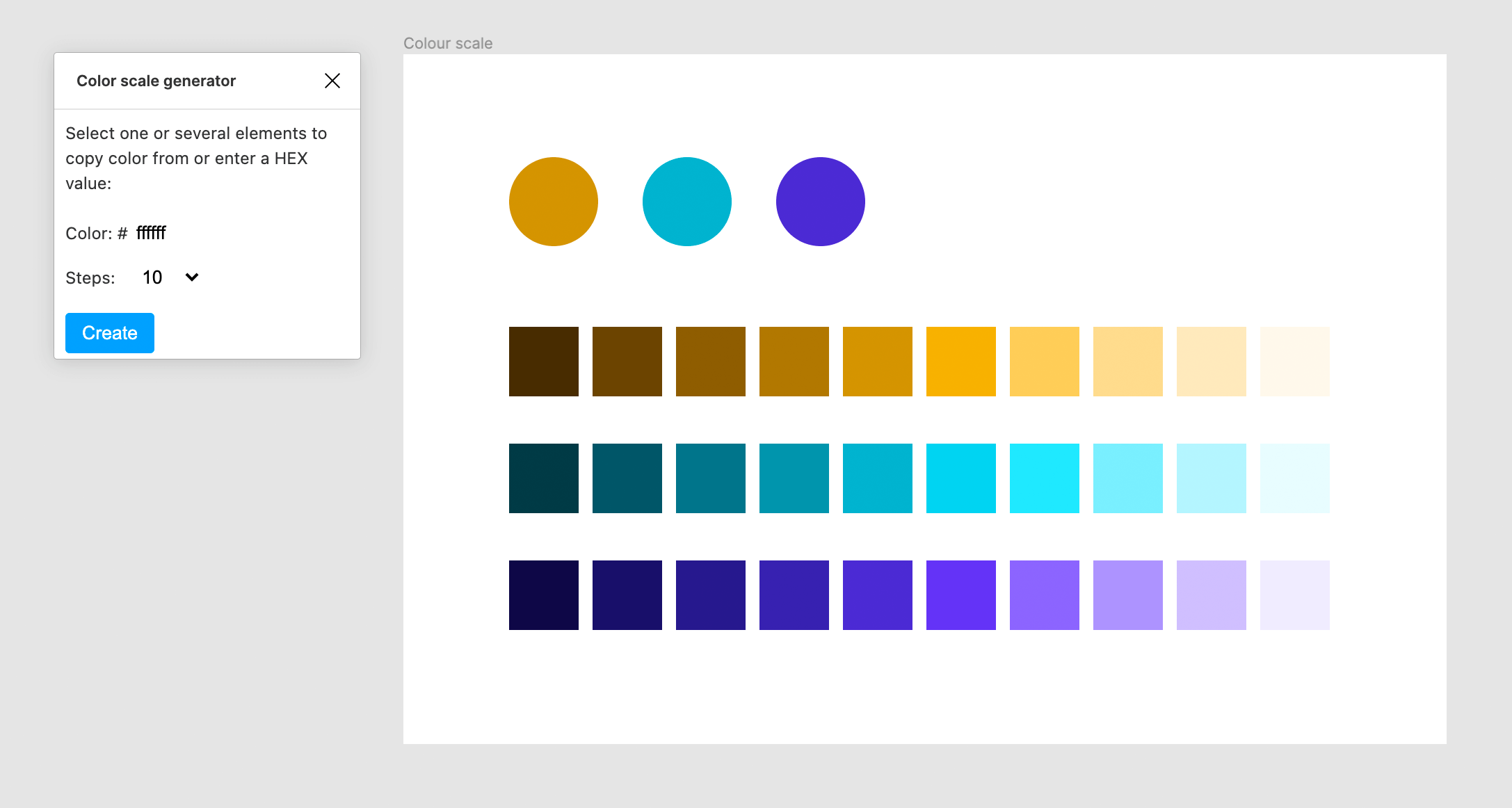
Step 5: Create a colour scale
A colour scale is essentially a range of tints (lighter colours) and shades (darker colours) derived from each of the colours in your palette.
Colour scales are particularly useful for creating background colours, text colours, and illustration palettes.
Here’s an example of a colour scale for our chosen palette:

You can create a colour scale manually in Figma, but it’s quite fiddly. So we recommend installing this Figma plugin created by Elena Borisova.
To use it, all you need to do is install it, then select the “Plugins” menu in Figma, and click “Color scale generator”. Then just create some shapes filled with your colours, select them, and click “Create”. Hey presto!
Here’s an example of how a colour scale could be used to connect our fruit and vegetable retailer with its sister business (a coffee roastery and cafe):

In conclusion...
This five-step process will provide you with a starting point for creating harmonious, practical colour palettes.
In the next few assignments, you’ll delve into some more detail about working with colour, and then practise creating a colour palette of your own.