Course · Part 2 · Assignment 6
Practise ![]()
Identify Usability Principles
![]() Time limit: 1 hour 30 minutes
Time limit: 1 hour 30 minutes
Remember to use your visual timer! We recommend the inventor’s iOS and Android apps — just search for “Time Timer” in the app store.
Explanation
It’s time go hunting for examples of the five usability principles you read about in the previous lesson! You can search inside your house or venture outside, and you can focus on a single object or look at several.
Instructions
Go on a design treasure hunt
 Set your timer: 40 minutes
Find one or more designed objects or experiences (dishwasher, table, car, fence, news app, shopping website, etc.) and try to identify at least one “good” and one “bad” example of each usability principle.
Make a brief note of each observation, ready to record in more detail in the next step. There are tips below, in case you get stuck.
Explain and reflect on each example you found
Set your timer: 40 minutes
Using your notepad, a text document on your computer, or a voice note, briefly explain and reflect on each example.
Aim to cover:
- What is it about the object or experience that demonstrates good or bad application of the usability principle in question?
- Did you notice anything unexpected or surprising during your analysis of the object or experience?
- For examples of bad usability, do you have ideas about how the experience could improved? Why do you imagine those things weren’t done to start with?
Tips
Here’s a reminder of those usability principles:
- Learnability
- Efficiency
- Memorability
- Error reduction and error forgiveness
- Satisfaction
Finding examples of good usability
To find examples of good usability, think about some everyday experiences you find efficient or satisfying.
For example, perhaps you enjoy tapping your travel card to enter the metro system in your city. Which usability principles might help explain why that is a positive experience?
Finding examples of bad usability
To find examples of bad usability, try to remember some recent frustrations you might have experienced — it may not even have occurred to you at the time that the frustration had anything to do with design.
For example, one of our team recently left a package at the post office for too long, and it got returned to sender. The usability of the collection system failed on two points:
- Poor learnability: the information about how long different kinds of package are kept for collection was complicated and confusing, and the type of package was unclear
- Poor error reduction and error forgiveness: no reminders were sent, and there was no grace period once the stated number of days had passed
Review the example solution
Once you’ve completed your work on this assignment, take a few minutes to review the example solution below.
Example solution
Here are some of the examples we found around our office. (Well, if we’re honest, mainly around our kitchen.)
Learnability
Good learnability: Philips Cafe Gourmet drip coffee machine
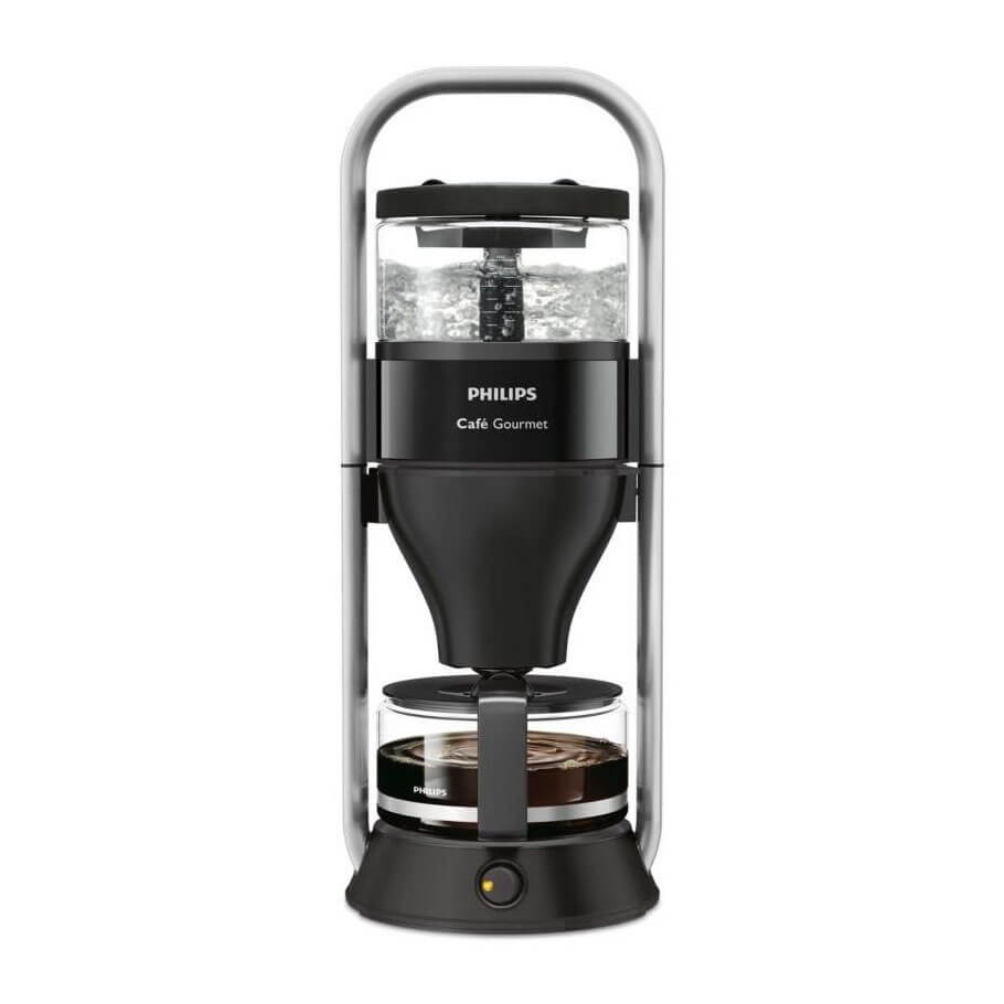
The physical, top-to-bottom arrangement of the water tank (top), filter (middle), and coffee pot (bottom), makes it very clear how the machine works.
Positioning the power button at the bottom also means the four required steps to brew coffee are in vertical sequence: 1) fill water tank; 2) add coffee; 3) make sure pot is in place; 4) turn on.
Bad learnability: De’longhi Eletta espresso machine
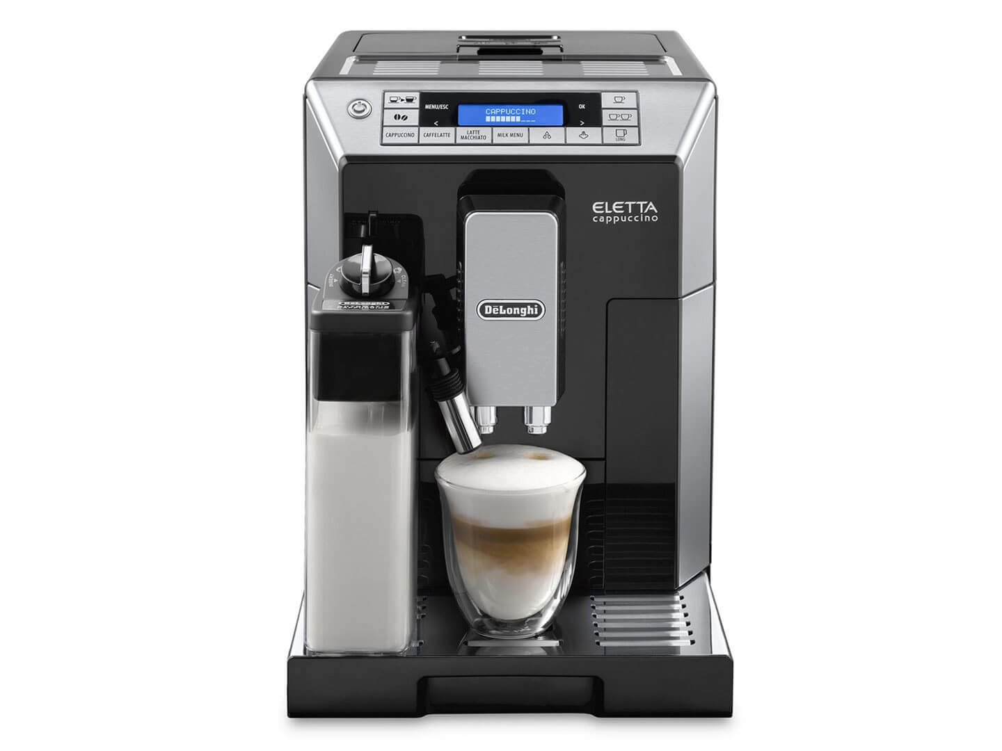
In spite of using this machine at the office most days for over a year, we never properly learned how to use it, and regularly made mistakes.
The learnability problem is caused by a combination of too many buttons, ambiguous icons, some buttons looking like labels, and a screen that is too small to convey the right information at the right time.
Efficiency
Good efficiency: Coeur de Lion brie wrapper


Many packets of brie (we’re sure you’ll agree) are fiddly to open, and messy to close again. This one, though, folds the paper differently, so that the label on the top can be used to open and re-seal the cheese. Once it’s opened, the sides fold out, making it easy to cut the cheese.
Bad efficiency: St Dalfour jam jar

Although it looks quite pretty, this jam jar is too narrow for a standard dessert spoon to fit in, and too tall for a standard teaspoon to reach the bottom. Also, the decorative shoulder near the top traps jam and makes it hard to get the last bit out. At scale, that could result in a lot of food wastage.
Memorability
Good memorability: Calory food tracking app
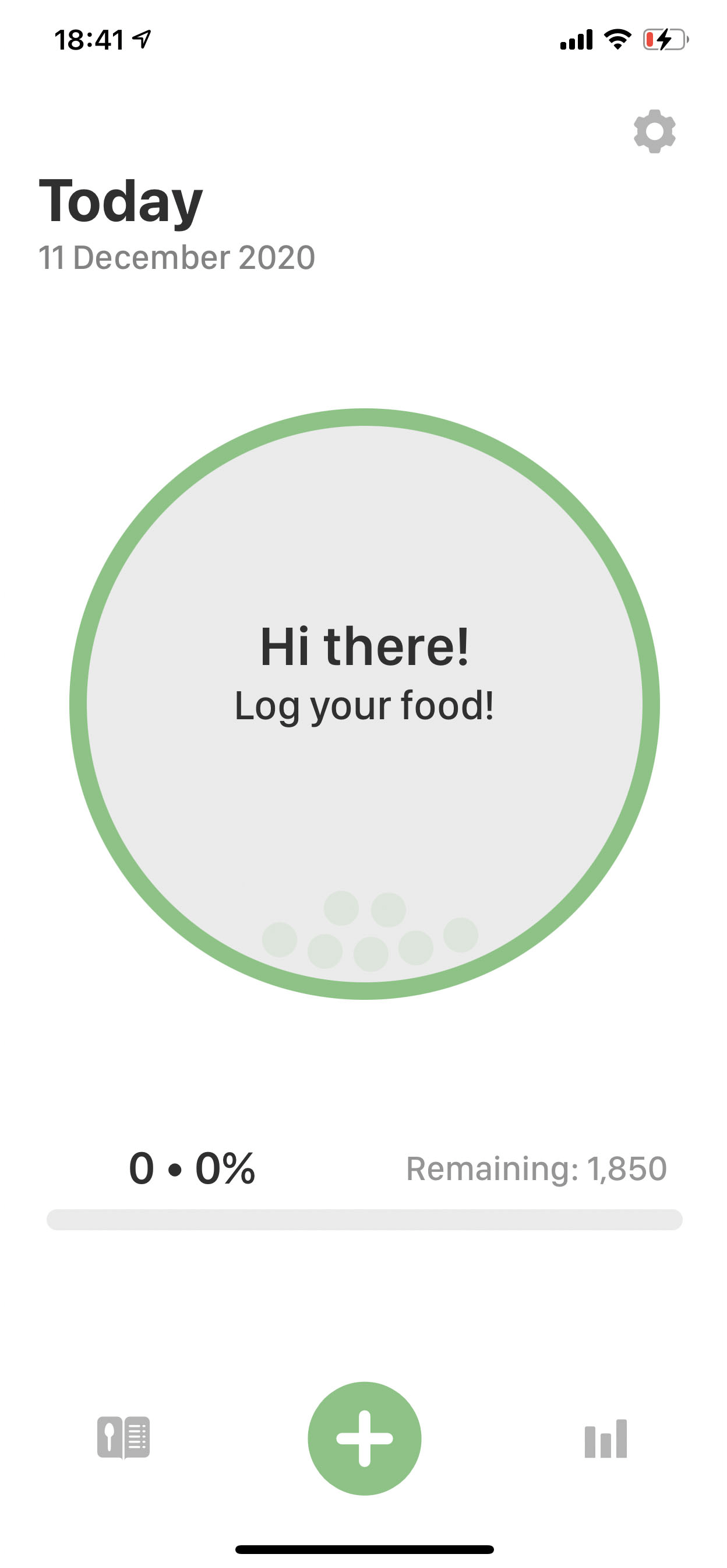
It’s easy to take a long break from using this app (!), return to it, and still remember how to use it. The screen pictured above is the first one you see, and it’s obvious how to log a meal.
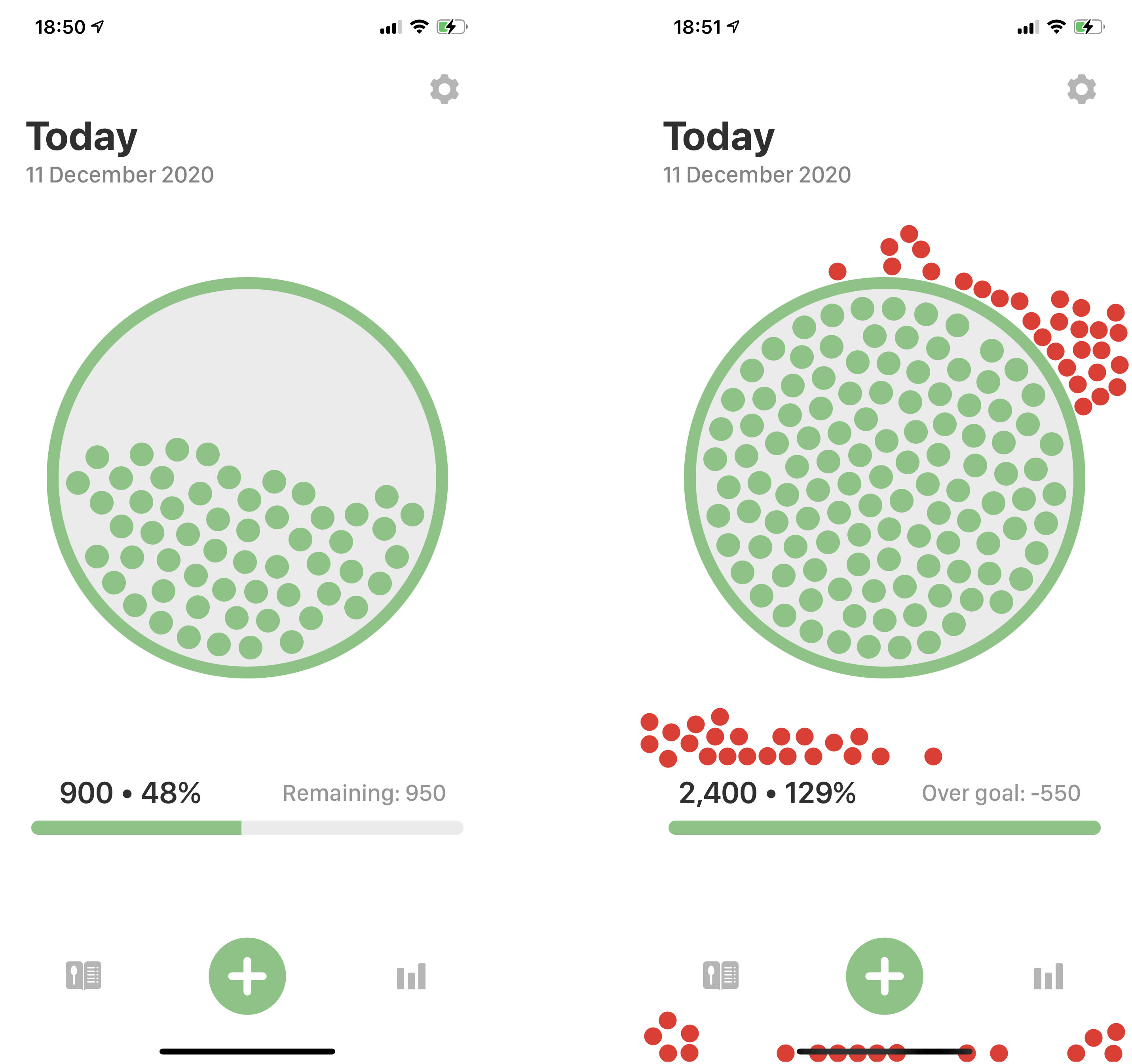
By the way, that circle in the middle fills with balls as you log food. If you go over your calorie allowance, the balls fall out and go all over the screen. This fun feature also leads to greater satisfaction! See the screenshots below.
Bad memorability: every website that requires a password
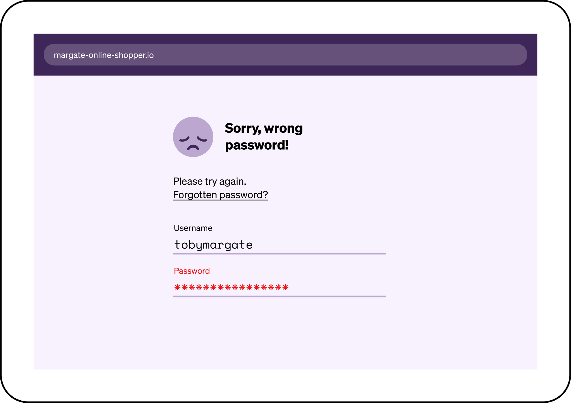
There’s not much more to be said about this one. How many passwords did you forget so far this week?
Error reduction and error forgiveness
Good error forgiveness: Ariston fridge-freezer
The Ariston fridge-freezer in our office has a “door open” alarm, which alerts us if the door has been open for more than a minute. This is a great example of good error forgiveness.
Bad error reduction: Ariston oven
Whereas our Ariston oven requires two actions in order to be turned on: first, turn the dial to the “oven” setting, and second, press the (unlabelled) “start” button.
However, all of the normal oven noises begin after completing the first action. If you then forget to press the start button as well, the oven will silently turn itself off again after about a minute (by which time you’ve probably left the room). Come back half an hour later for your raw dinner!
Satisfaction
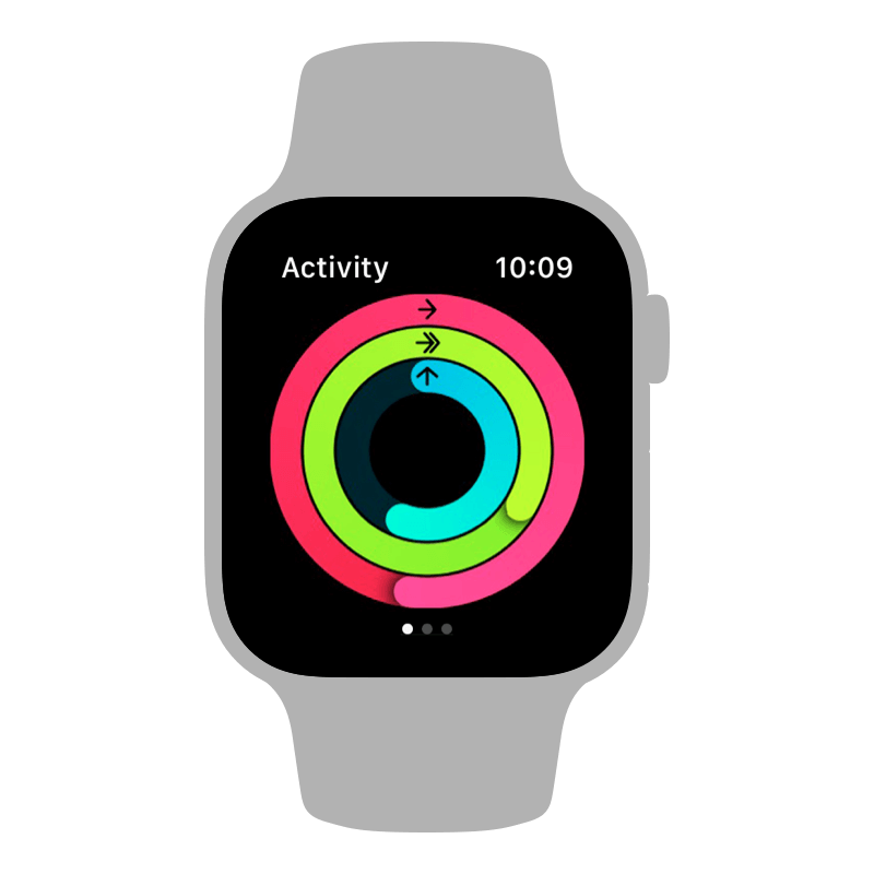
Good satisfaction: Apple’s activity rings
The concept, execution, and animation of the activity rings in Apple’s Exercise apps give an excellent sense of completion and satisfaction to the user, especially when they beat their goal multiple times over.
Bad satisfaction: Bank transfers
Most traditional banks aren’t transparent about when money transfers will arrive in the destination account. Interactions with banking apps are often high-efficiency (the transfer is requested in just a couple of steps) but low-satisfaction (little sense of completion, or sense of when completion will happen).
In conclusion...
Usability is everywhere! In the next assignment, you have the chance to apply usability principles to a mobile app design of your own.