Course · Part 2 · Assignment 2
Read ![]()
Visual Principles
KeyThree
The key points from this assignment.
- The initial visual appeal of a design is usually a reflection of how well that design uses fundamental visual principles
- Amongst these principles are: proximity and grouping; visual hierarchy; spacing; alignment; contrast; balance; repetition and consistency; and pacing
- We can find all of these at work in a famous scene from the 1979 film “Manhattan”
Image credit: Jp Valery
Introduction
Whether a poster, webpage, app, book cover, or any other visual composition “looks good” to the untrained eye is usually a reflection of how well that design uses visual principles.
These principles have remained largely unchanged for hundreds, if not thousands, of years. That’s because visual principles aren’t about aesthetics — they’re about how people see, and how we interpret visual information.
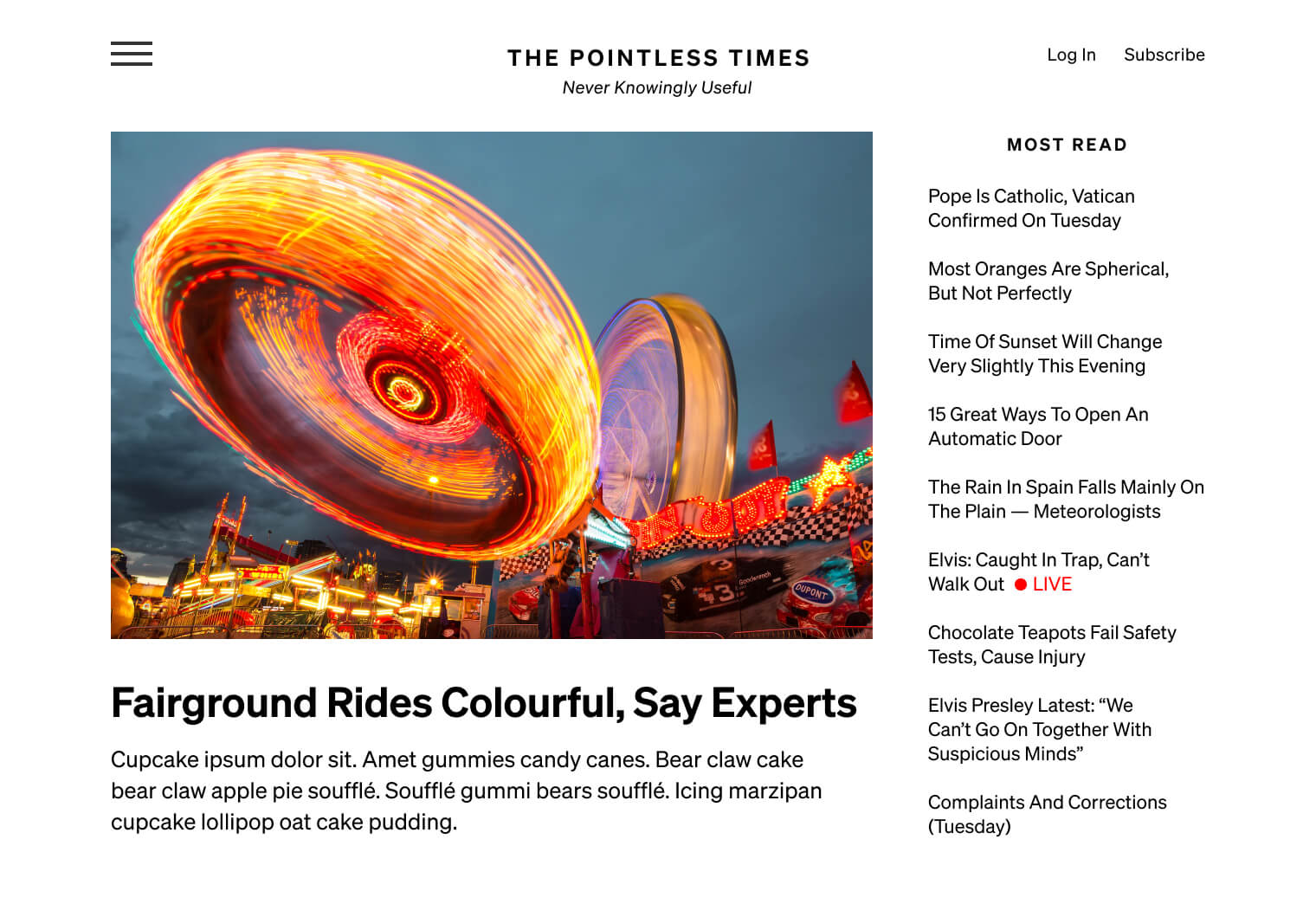
In this assignment, we’ll examine visual principles in detail, and see how they apply to this famous scene from the film “Manhattan” (1979):
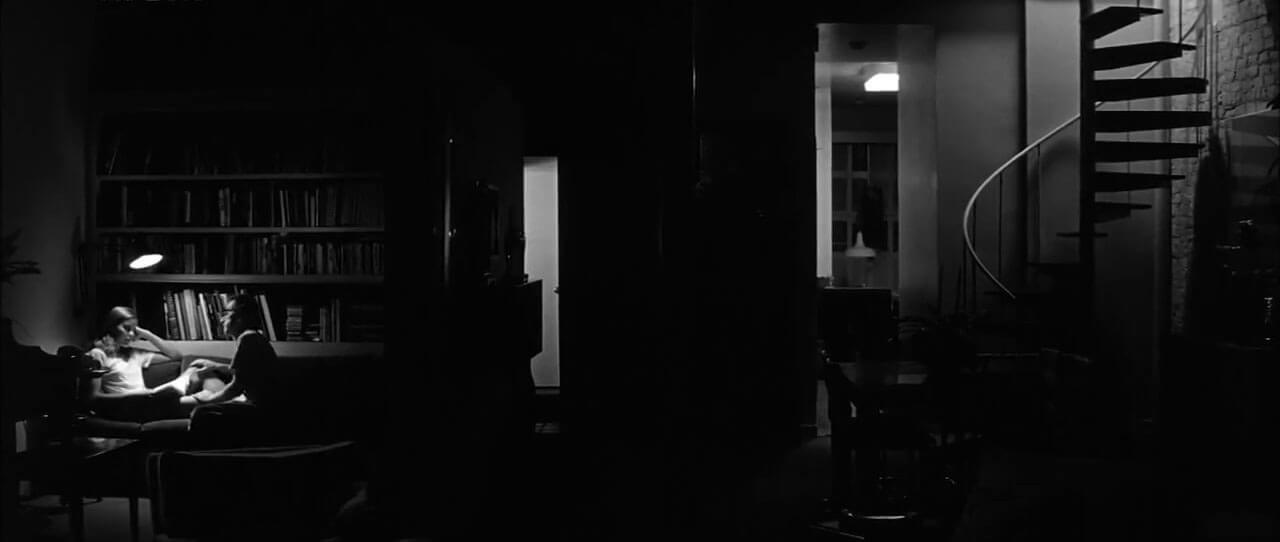
The scene we’ll be analysing
This is the longest reading assignment in the whole course — so we recommend making a note of each principle as you go along (and maybe making a cup of tea).
Principle 1: Proximity and grouping
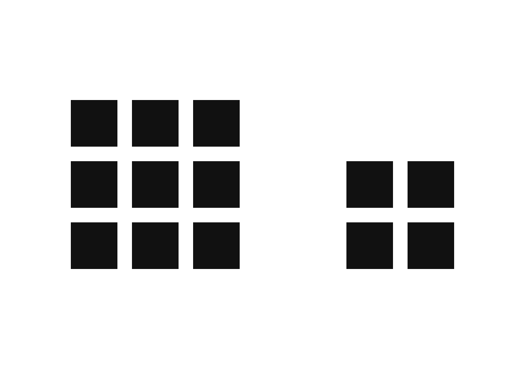
People tend to see things that are in proximity to one another, or that share similar characteristics, as groups. In the image below, we naturally see two groups of squares before we see nine squares, four squares, or thirteen squares.
Grouping by proximity
Similarly, the eye will group together elements that share characteristics like shape, size, and colour.

Grouping by shape

Grouping by size

Grouping by colour
In the film scene, there is proximity between the two people (and the reading lamp), forming a group.
There are also a few other groups in this scene. How many can you find?
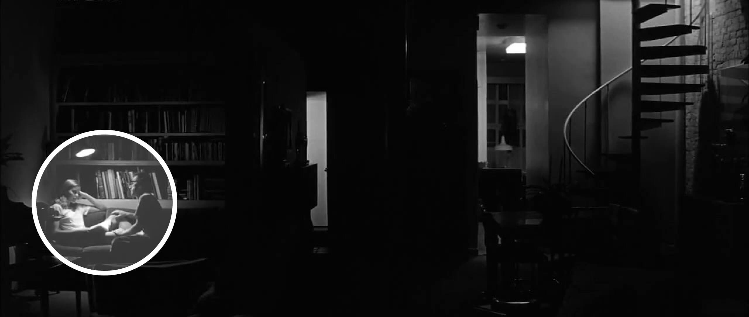
These three foreground elements form a visual group
Principle 2: Visual hierarchy
Visual hierarchy is about the relative visual prominence of different elements in a layout.
If the eye is immediately drawn to something in a design — a headline, for example — that element is said to be “high” in the visual hierarchy. If an element is one of the last things the eye travels to — perhaps a page number — it is said to be “low” in the visual hierarchy.
Here’s an example:
Visual hierarchy between elements in a webpage
Visual hierarchy is created by the interplay of a number of factors, including:
- Size. Larger elements tend to attract more attention.
- Position. Western readers are used to “starting” in the top-left of a page, and then following a line down the left edge.
- Light and dark. A dark area on a light background attracts attention, as does a light area on a dark background.
- Surrounding space. The more space there is around an element, the more prominent it tends to be.
Visual hierarchy isn’t an exact science, particularly in more complex layouts. Someone’s attention can usually be directed to the first and second areas of focus, but after that, their visual journey can get less predictable.
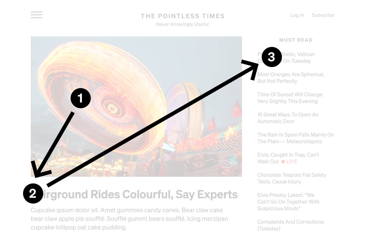
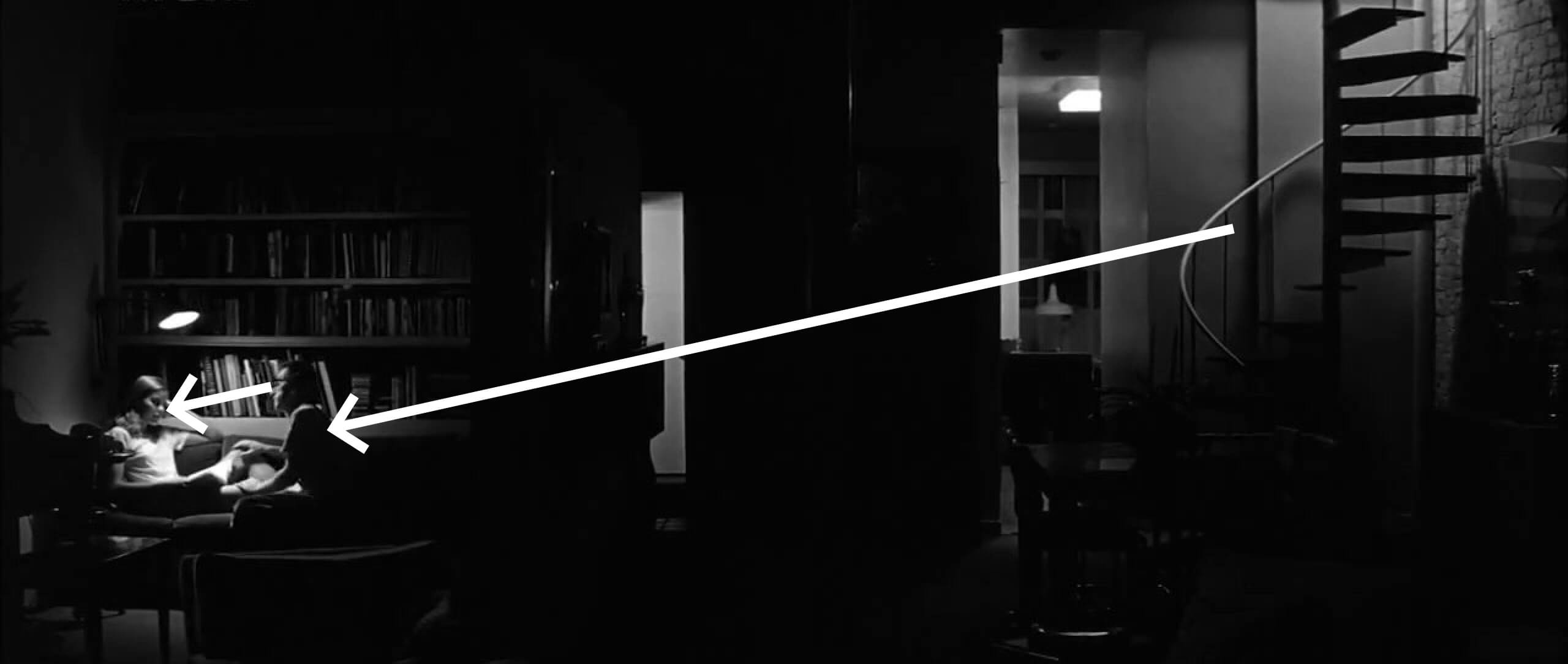
In the film scene, the large area of light in the top-right probably attracts our attention first, and the smaller area of light in the bottom-left second. However, this hierarchy is quite subtle, creating a level of visual tension (and reflecting, perhaps, the tension in the conversation).
Visual hierarchy between two areas of lighting
Principle 3: Spacing
“Design is as much an act of spacing as it is of making.”
— Ellen Lupton, designer, writer, curator, and educator
Spacing in design is similar to the spaces between notes, phrases, and movements in classical music. Just as music is made up of gaps and pauses as well as sounds, design is composed of visual spaces as well as visual elements.
Spacing serves a number of purposes. Where there is a lot of content, space is an important tool for breaking it up, organising it, and making it easier to absorb. And going back to the first principle in this list, spacing is what allows us to create visual groups.
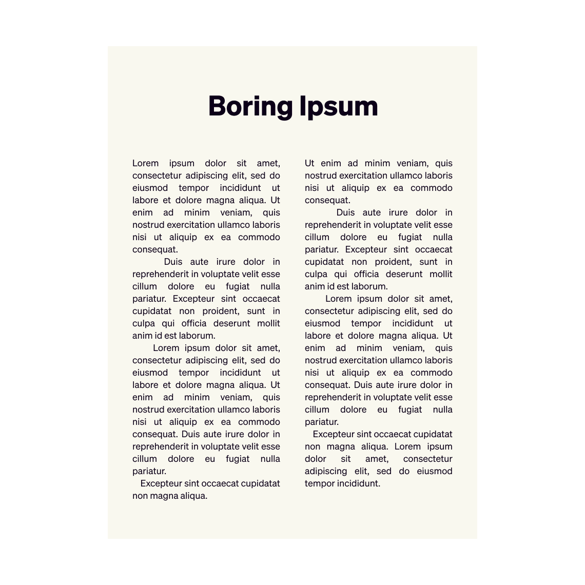
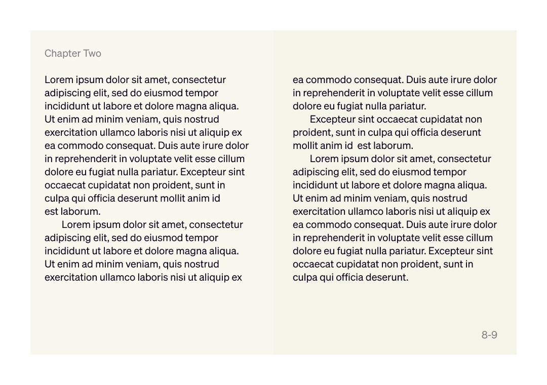
For example, the image below shows a mockup of a book spread without any spacing. To organise the text, we can create visual groups simply by adding space before and after each heading, and by adding space to the first line of each paragraph.
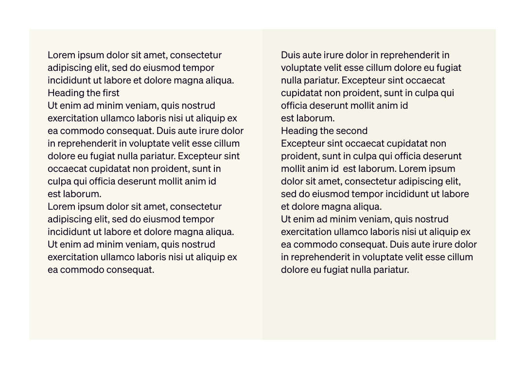
Some text without any spacing
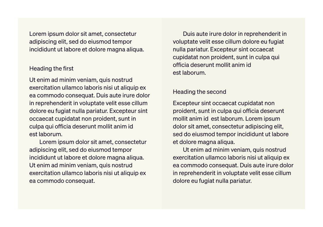
The text with spacing added
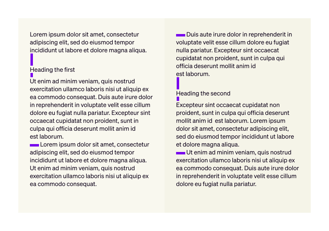
Where the spacing was applied
In the film scene, there is a large area of space in the centre, which helps guide our attention to the two areas of focus identified in the previous point. Can you find other ways that spacing is used in this scene?
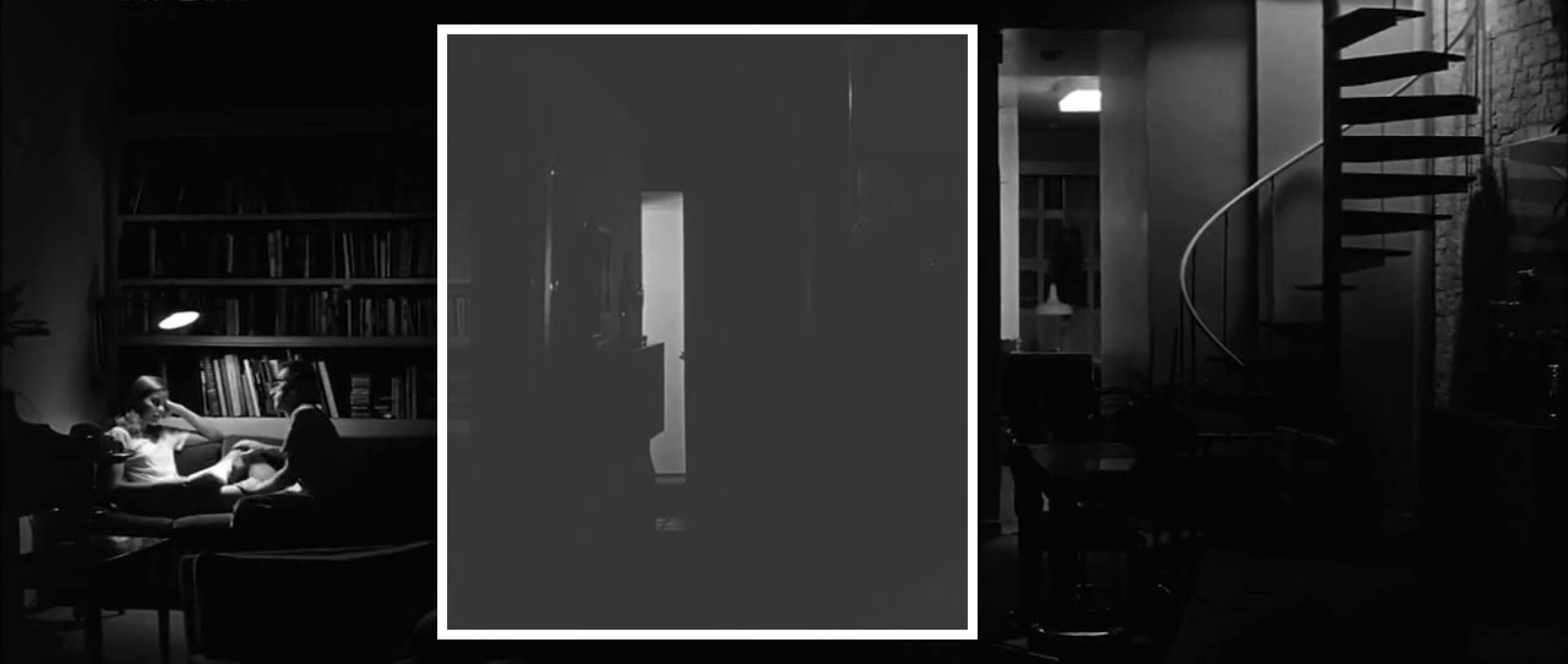
Spacing in the film scene
Principle 4: Alignment
Alignment is about how different visual elements line up with one another (and about how they don’t).
Josef Müller–Brockmann was perhaps the greatest advocate of alignment using a grid. The secret to his work was to limit himself to just a few key points of alignment in each layout.
For example, in the poster design below, there are six main points of alignment: the top margin, and the five column edges.
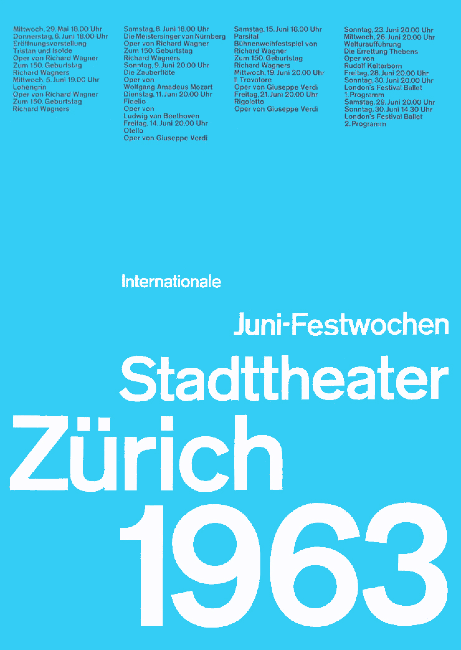
A poster design by Josef Müller-Brockmann
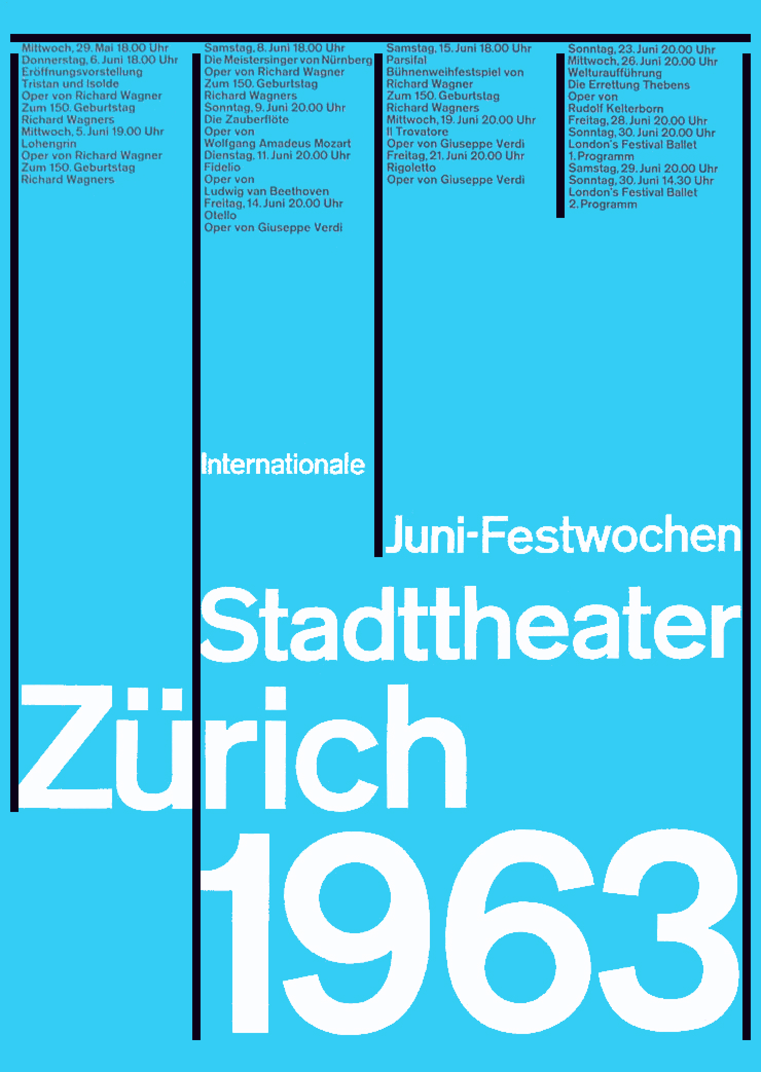
The main points of alignment
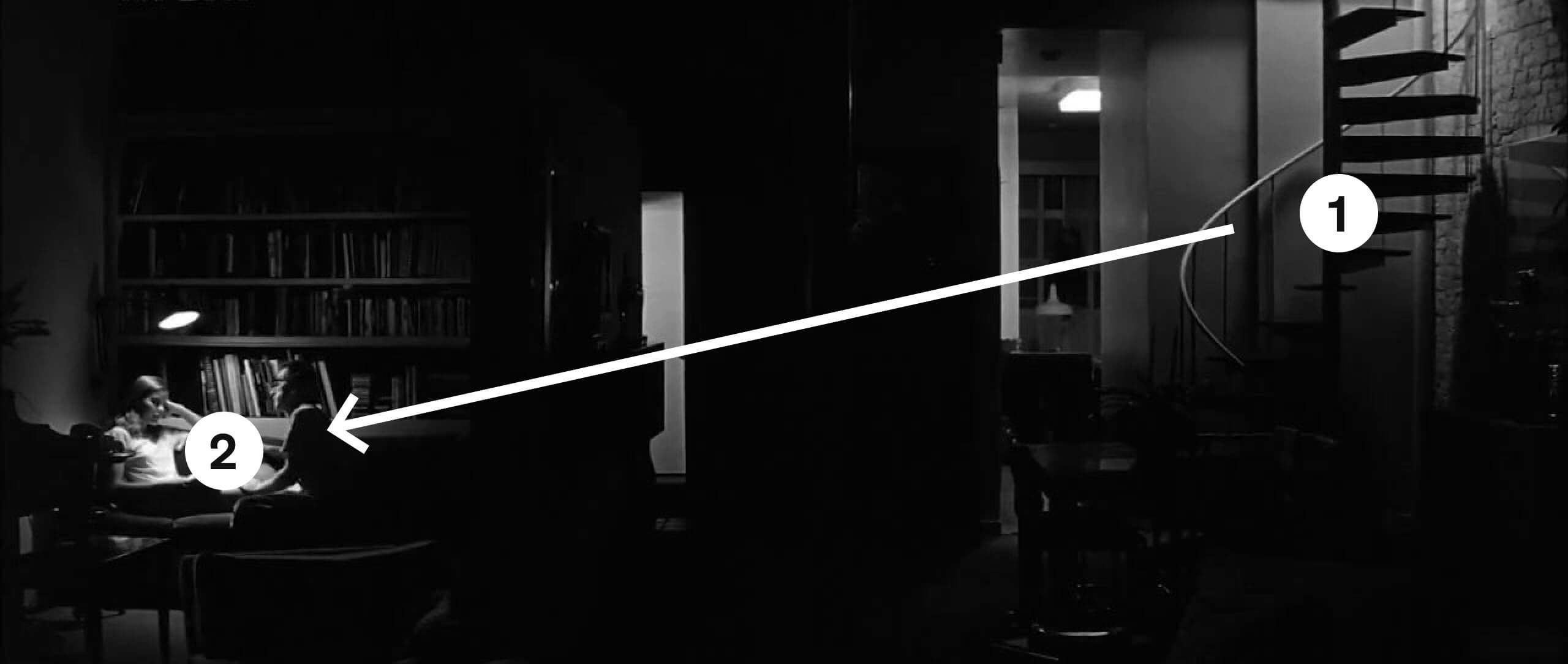
In the film scene, there is diagonal alignment between the two people, which reflects both the diagonal, right-to-left visual hierarchy, and the uneasy hierarchy in the relationship between the two characters.
Also note how the diagonal alignment here contrasts with the many horizontal and vertical lines within the scene.
Diagonal alignment between elements
Principle 5: Contrast
Contrast is about combining different sizes, colours, and styles to support visual structure, and often to create visual drama. A few examples are illustrated below.

Size contrast: big and small

Colour contrast: bright and muted
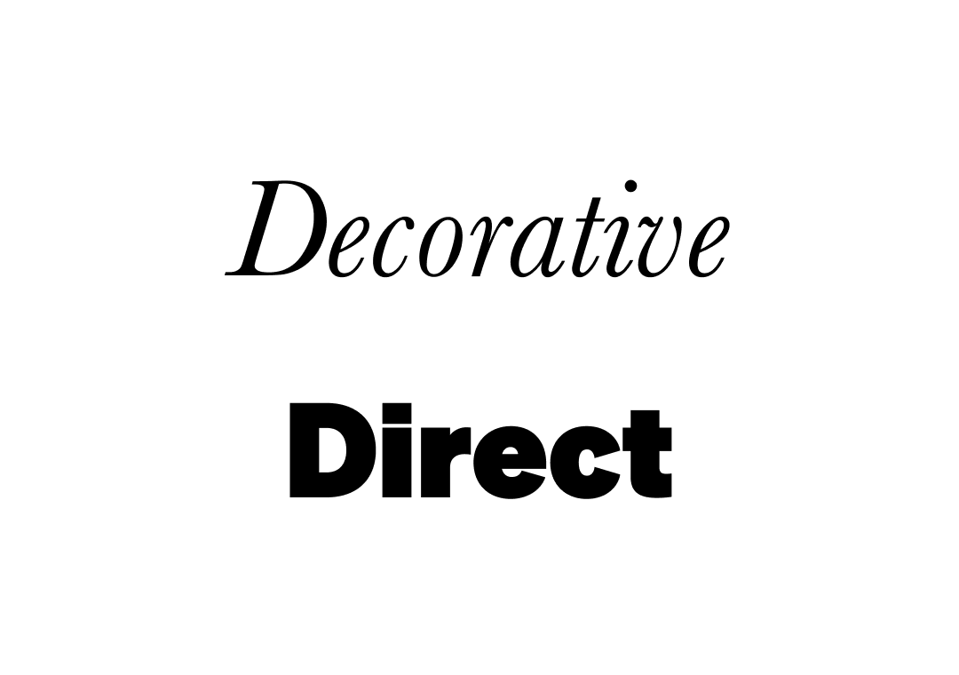
Type contrast: decorative and direct

Texture contrast: rough and flat
In the film scene, there is contrast between the many horizontal and vertical lines. This is also an example of the seventh principle in this list, repetition.
Contrast between repeated vertical and repeated horizontal lines
Principle 6: Balance
Balance can be created either symmetrically or asymmetrically. Symmetrical balance is straightforward, but it can also be visually boring:
Symmetrical balance
Asymmetrical balance tends to be more visually exciting, and it can be achieved in quite understated ways. For example, in the book mockup pictured below, the chapter number and page number provide subtle asymmetrical balance.
Asymmetrical balance
In the film scene, there is asymmetrical balance between the two main areas in the visual hierarchy.
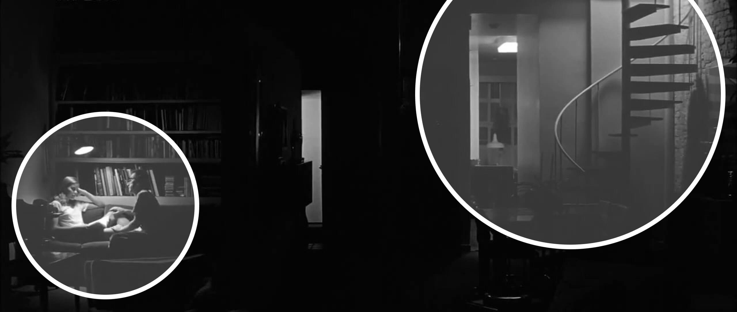
Asymmetrical balance between two areas of lighting
Principle 7: Repetition and consistency
Repetition allows the eye to identify patterns and understand information. Standard book designs use some simple forms of repetition: the same layout for each page, the same layout for the first page of each chapter, and so on.
Other common forms of repetition include:
- repetition of colours, resulting in colour palettes
- repetition of style through elements like text, illustrations, and icons
- repetition of shapes and patterns
The right-hand page in the example below shows how repetition can be used in editorial design:
Repetition of elements on the right-hand page
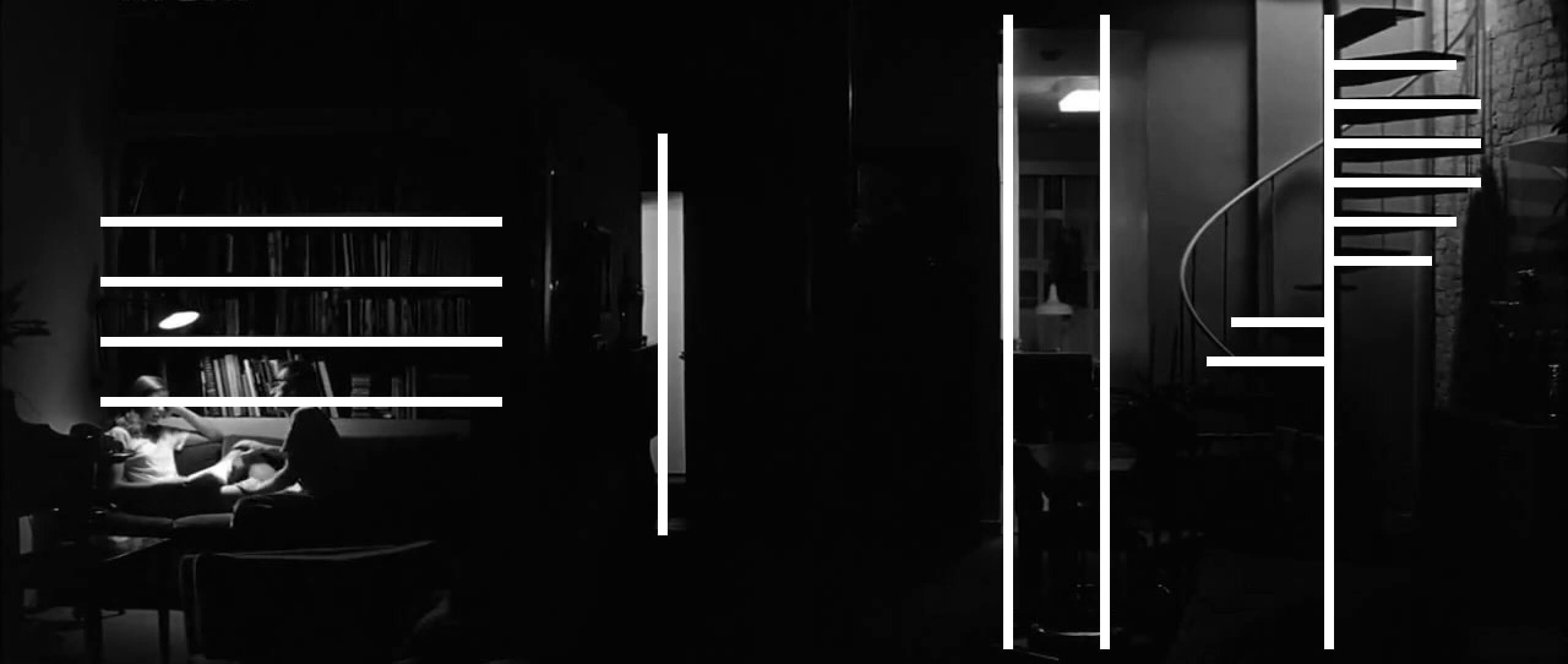
In the film scene, both the staircase and the bookshelves create repeated horizontal lines. In turn, these also form groups.
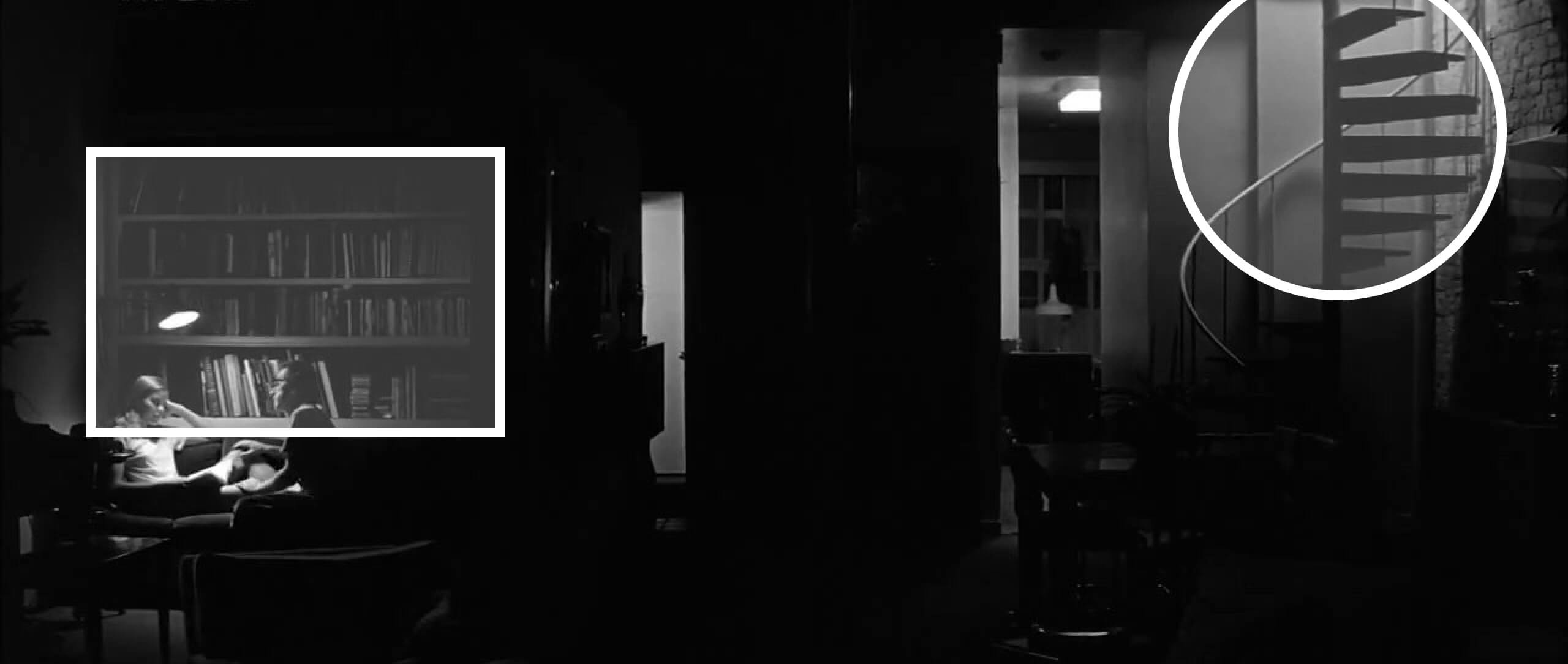
Repetition of horizontal lines
Principle 8: Pacing
Pacing is a more subtle visual principle, which usually applies across multiple pages or screens.
It’s about breaking up content, but in a way that keeps it connected. It’s also about making the design visually varied, and drawing the reader’s attention to the right points.
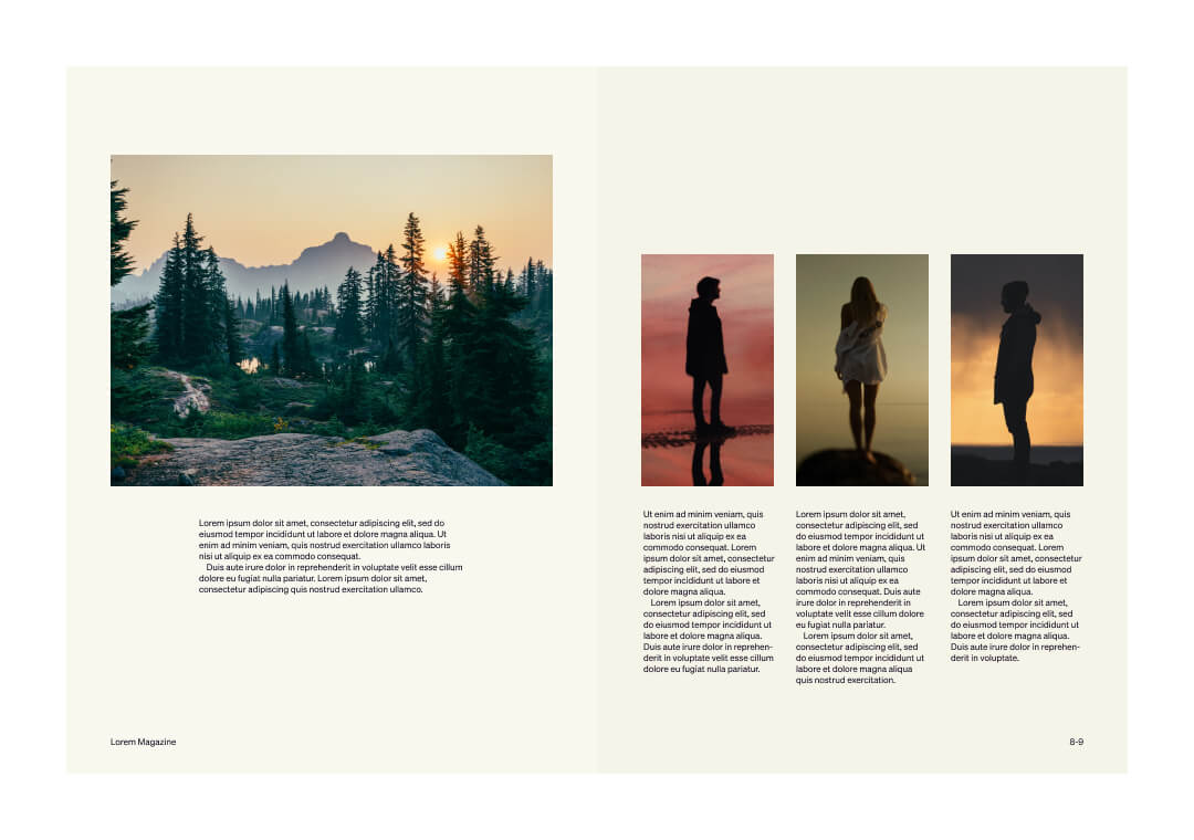
In text-heavy designs (like this assignment), graphics and headings are often used to pace the reader’s progress through the text, reducing fatigue and (hopefully) boredom. Here’s an example of how a magazine feature might be paced by alternating text and images:
Pacing
The need for pacing depends on the type of project. For example, most novels contain no pacing other than chapter headings — they are simply a stream of text.
However, publications like magazines and textbooks are often designed so that every one or two pages there is an image-heavy page to pace and illustrate the surrounding text. Ads are sometimes used in magazines to pace different features.
In the film scene, the blocks of vertical light in the centre help to pace the composition. Without these elements, the two areas of focus — the staircase and the conversation — would feel separate and disconnected. We’ve removed these pacing elements in the second image, so that you can see for yourself.
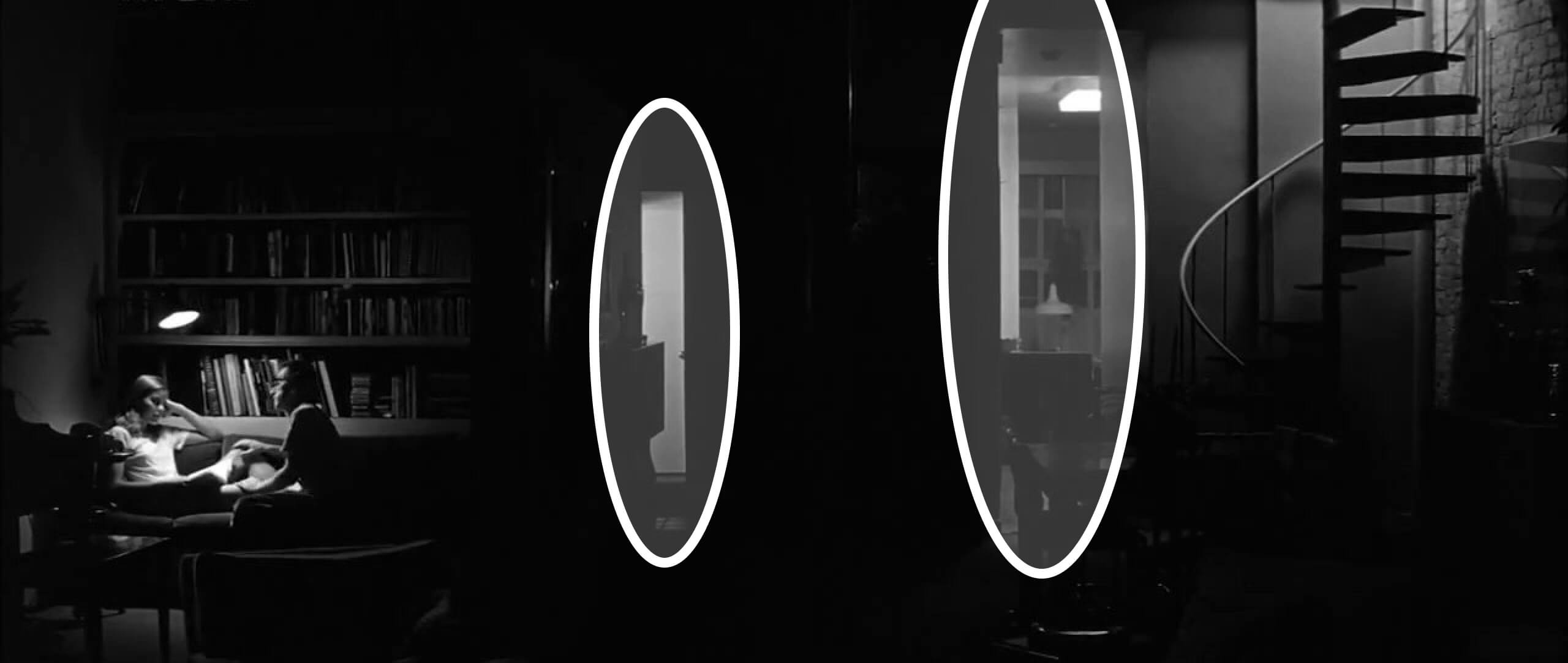
Pacing with visual elements
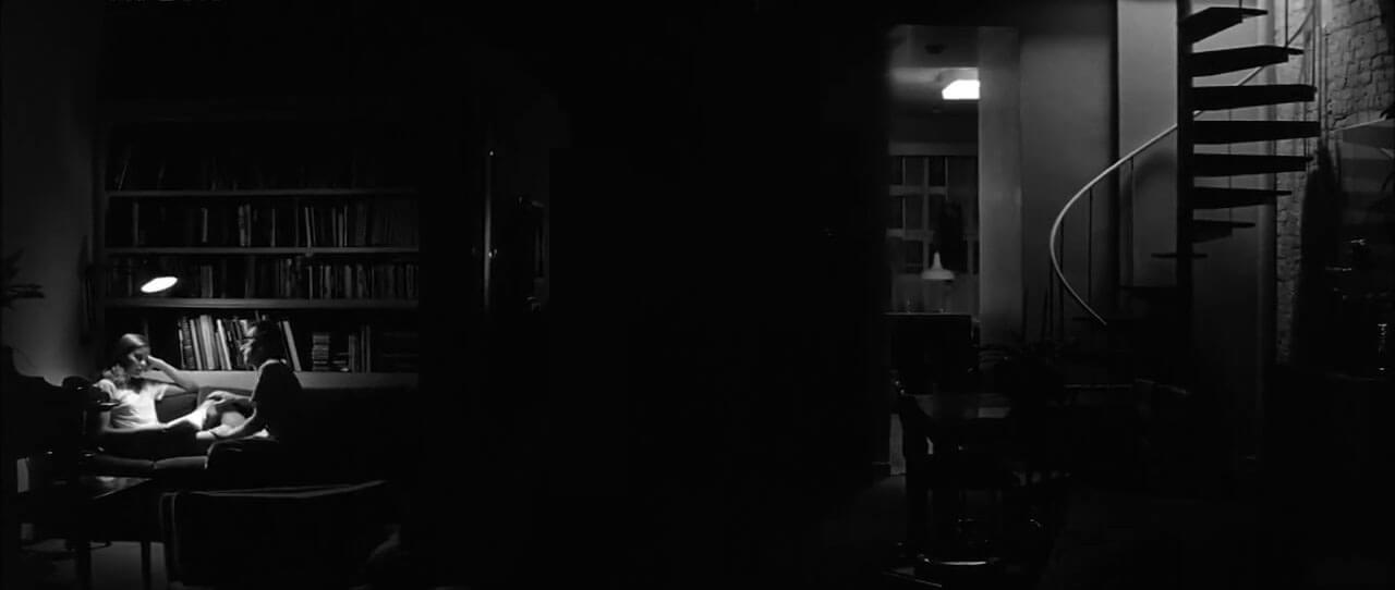
Lack of pacing when visual elements are removed
In conclusion...
Visual principles are powerful tools for us as designers, because they work with how people naturally see the world and interpret visual information. In each design brief you work on, think actively about how to use them, and how each principle could support the goals of the project.
In the next assignment, you’ll examine a poster design by Josef Müller-Brockmann, and try to identify how it uses visual principles.