Course · Part 4 · Assignment 6
Read 
Ten Typography Tips
KeyThree
The key points from this assignment.
- Use a maximum of two typefaces, and consider typeface options beyond the “standard” ones
- Choose an appropriate, readable font for body text, but customise text when using it graphically
- Be careful with text colour contrast, and avoid negative tracking and line spacing
Image credit: Baseline Team
Introduction
This assignment presents ten practical typography tips. They are general rules that will stand you in good stead when working with type.
As with all design rules, though, there are times when it will make sense to break them. As you gain in practice and experience, you’ll find it easier to understand where it might be appropriate to deviate from convention.
1. Use a maximum of two typefaces
Both in print and on screen, you usually only need to use one or two typefaces to create a successful design.
Although it’s also possible to create excellent designs use three, four, or more typefaces, it takes a lot of skill and experience to execute more complex combinations without the design feeling confused or amateurish.
Typewolf is a great resource for exploring examples of designs that demonstrate a high standard of typeface matching. Here are two recent designs featured by that site — the first uses just one typeface, and the second uses just two.
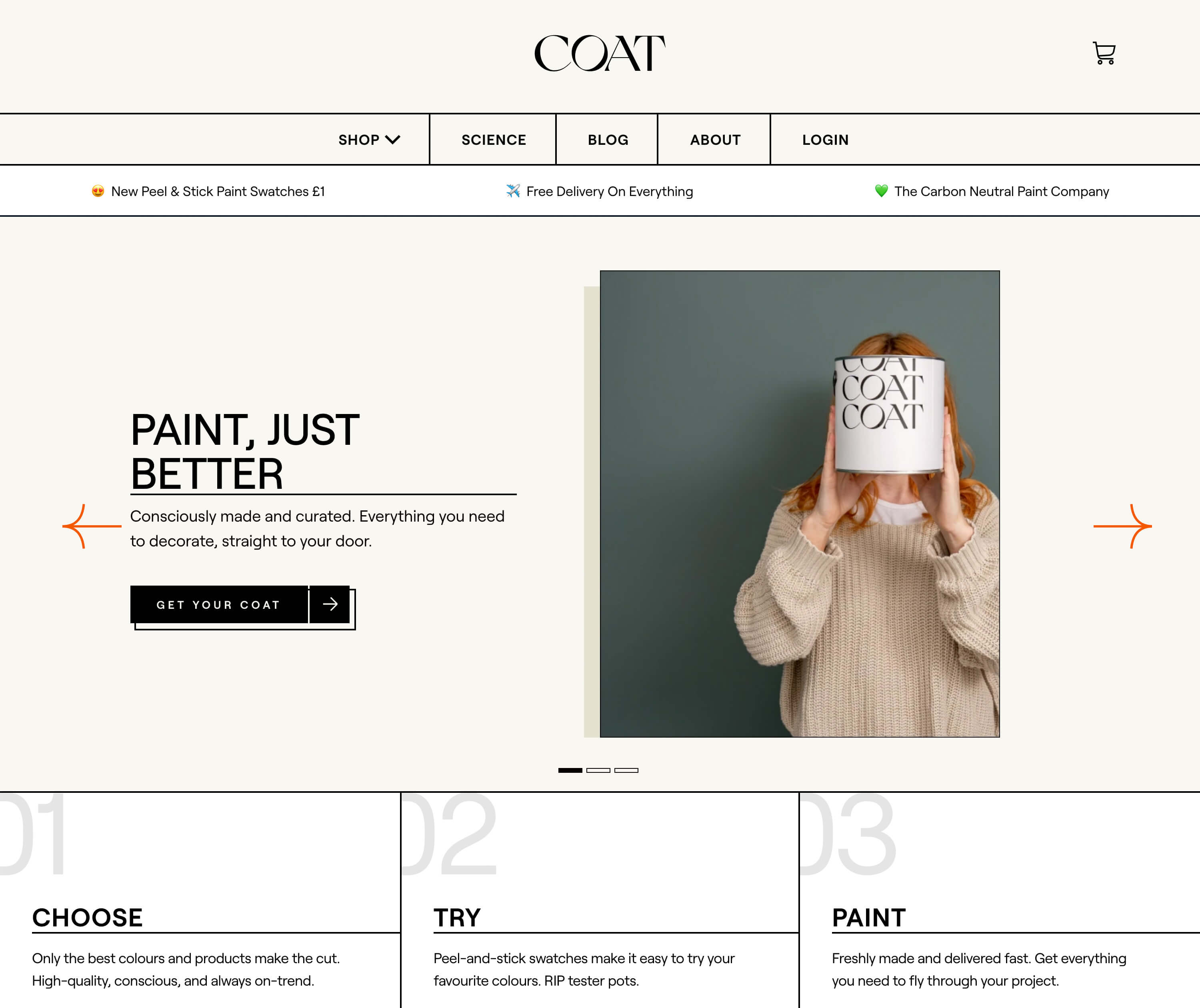
Coat use just one typeface — Roobert. Image credit: Typewolf
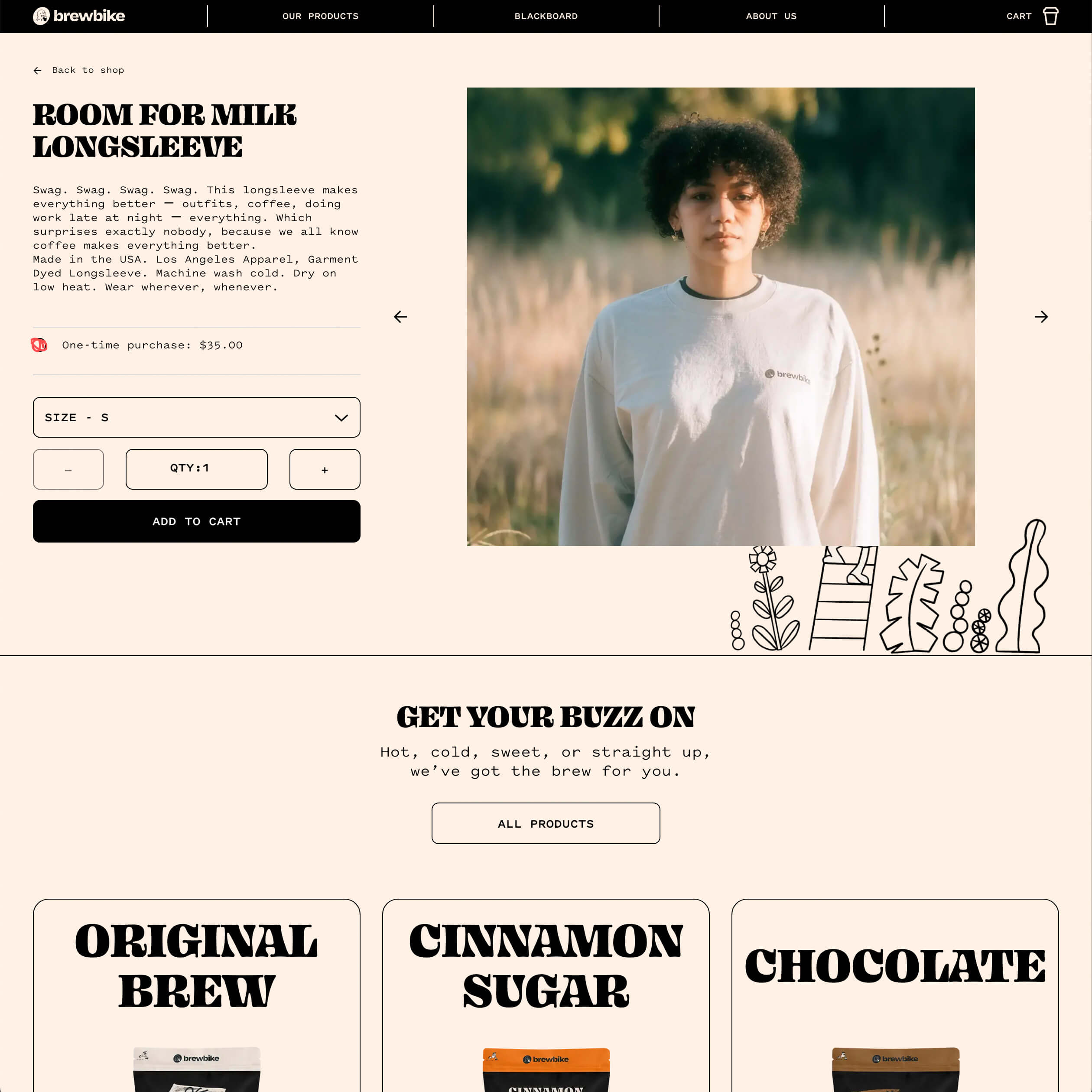
Brewbike use two contrasting fonts — Ohno Blazeface for the headings, and Pitch Sans for the other text. Image credit: Typewolf
2. Use font families and superfamilies
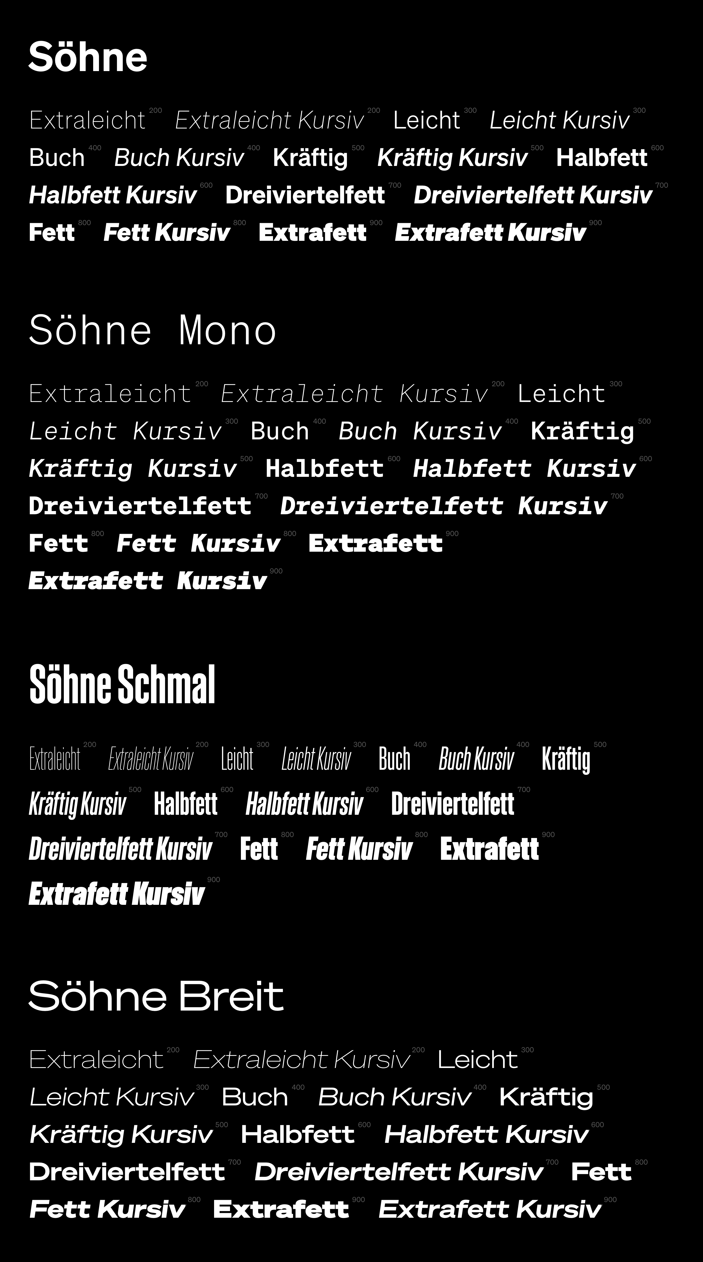
A font family is a set of fonts, almost always created by the same type designer, that are stylistically connected to one another, and designed to be used together. For example, we use two typefaces from the Söhne family on this site — Söhne (two weights: Buch and Halbfett) and Söhne Schmal (one weight: Fett).
When you’re choosing two fonts to pair, font families can be extremely helpful because the fonts they contain are ready-made to work together. Large font families also give you many different options. In Söhne’s case, there are a total of 64 combinations of style and weight. Other examples of large font families include Univers and ITC Franklin Gothic.
Font superfamilies contain fonts of different classifications — often serifs and sans-serifs, but sometimes more. Examples include FF Meta (FF Meta and FF Meta Serif), and Source (Source Sans Pro, Source Serif Pro, Source Code Pro).
3. Choose an appropriate font for body text
Whether for print or for screen, it’s essential that body text is set in a legible font. Avoid fonts with low x-height or high stroke contrast, and generally stick to a serif or sans-serif option.
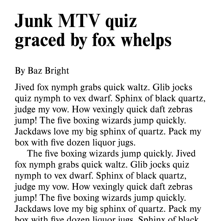
Use a legible serif or sans-serif for body text
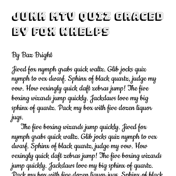
Don’t use display, script, or other extreme typefaces for general reading
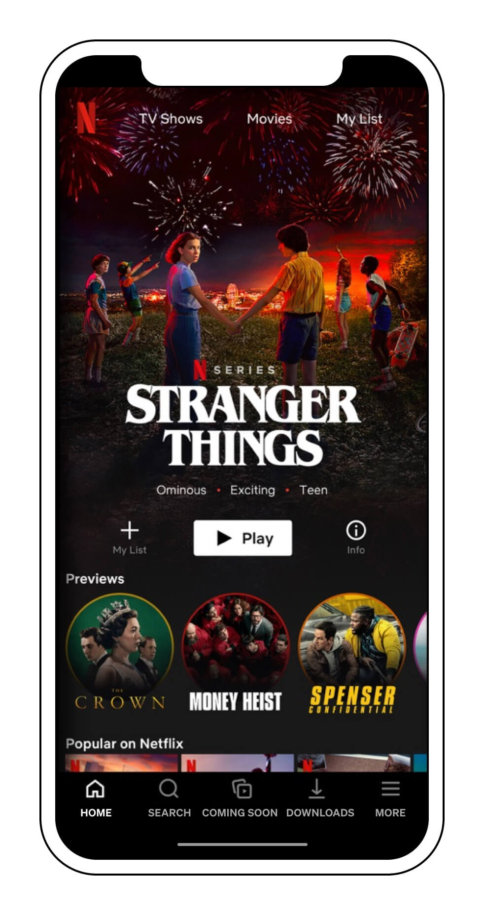
4. Optimise small text
Generally very short snippets of text — like labels and navigation items — can be a bit smaller than body text. This is because people don’t have to engage in extended reading as they do with body text.
Many high-profile apps still use extremely small interface text on mobile. For example, the navigation bar in the Netflix app has label text set at around 10px, even on a large screen like the iPhone 11 Pro Max.

Text that small is very inaccessible for anyone with a visual impairment. So, on both desktop and mobile, aim not to go below 14px for any navigation or label elements.
If you do have to use text smaller than that, a trick for making digital text more legible at very small sizes is to follow three steps:
- Make it all uppercase
- Use a medium or semibold weight
- Slightly expand the tracking (letter spacing)
We’ve applied those changes to the Netflix screen below. Note how, without changing the text size, the result is significantly more legible.
Another option is to allow multi-word labels to occupy two lines, freeing up some horizontal space. (However, this may not be possible within design guidelines for some platforms.)

In the final example, we’ve removed one item from the navigation bar, and used 14px text with semibold weight and extra letter spacing. As you can see, the best way to avoid font size issues in nav bars is not to cram in too much content to start with.

5. Rag paragraphs in print
In graphic design, “rag” refers to the shape of the right edge of the paragraph forms (when text is left-aligned). Design software like Adobe InDesign (which we’ll cover in Part 4) does not automatically optimise the rag of a paragraph, so to get the most aesthetically pleasing results, we have to do it manually.
The highest priority when ragging is to ensure that the last three lines of each paragraph look good. That means:
- make sure there isn’t just one word stranded on the last line of a paragraph, unless it happens to be a very long word
- make sure that the penultimate line in the paragraph isn’t longer than the one before it
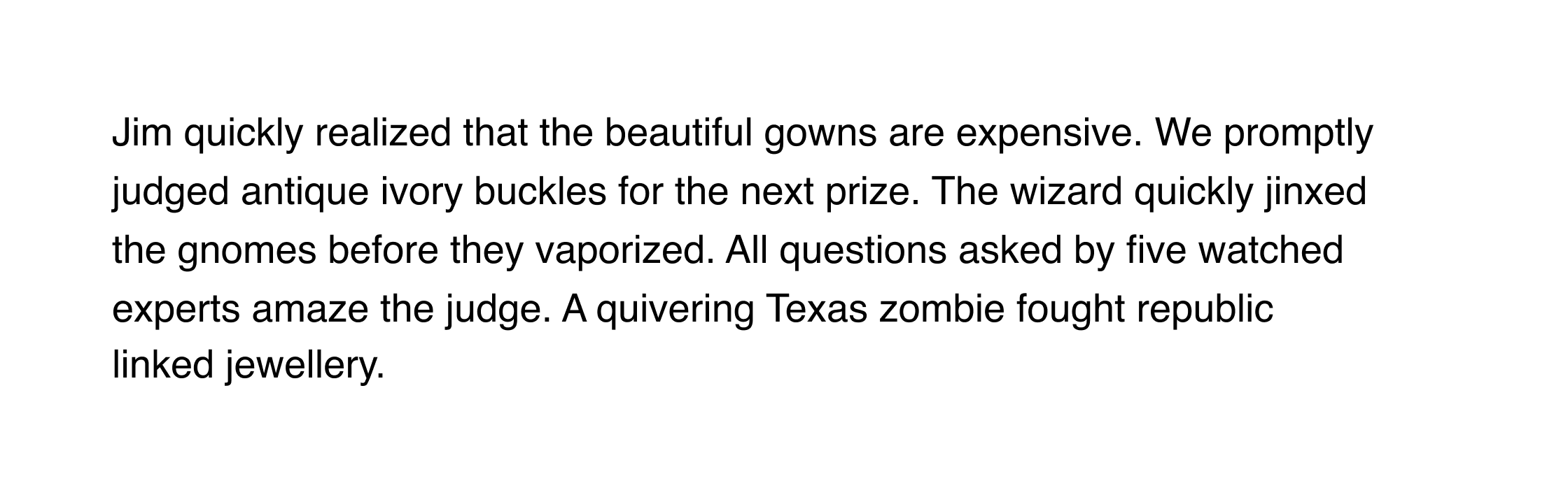
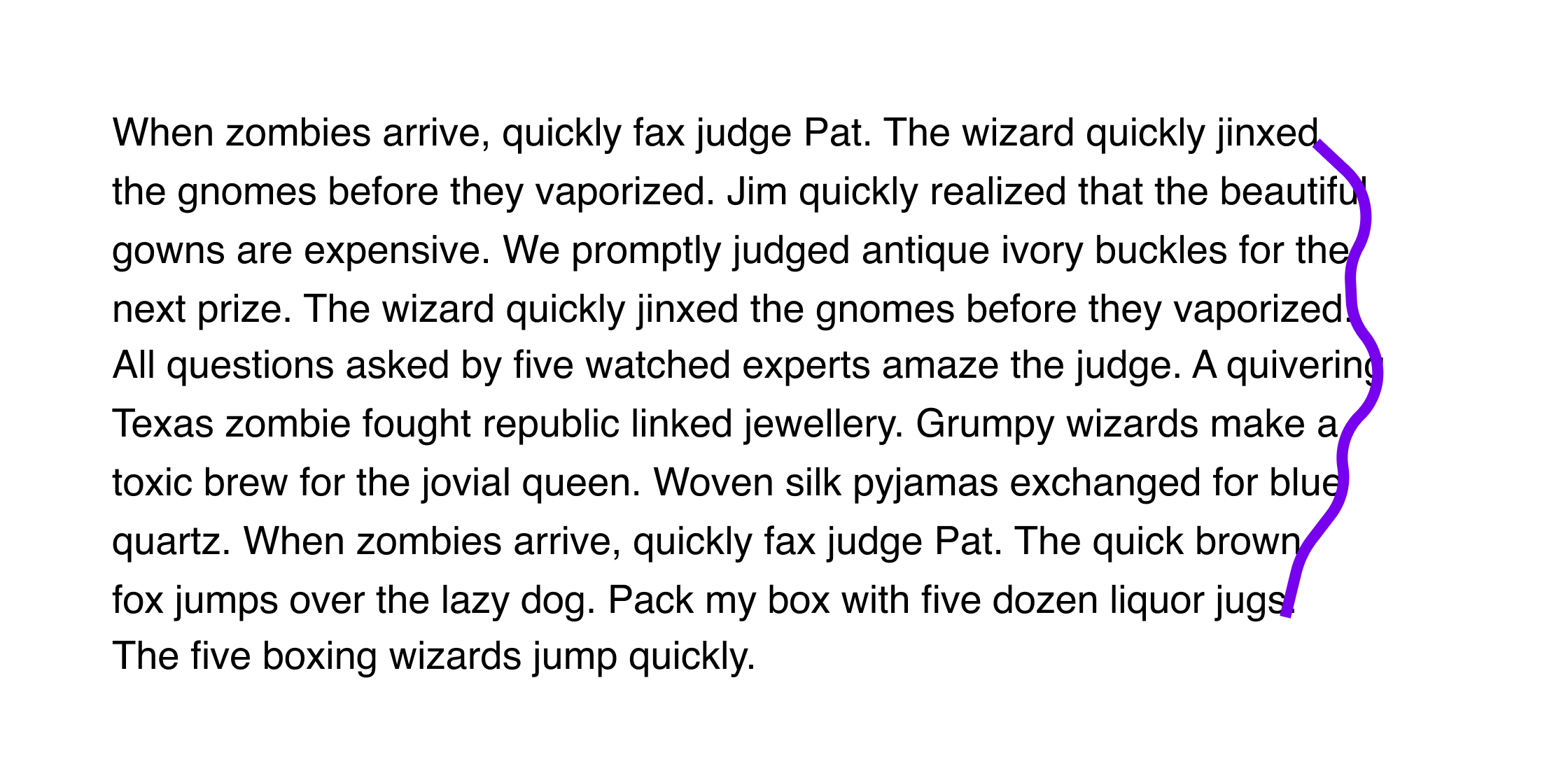
Here’s an example:
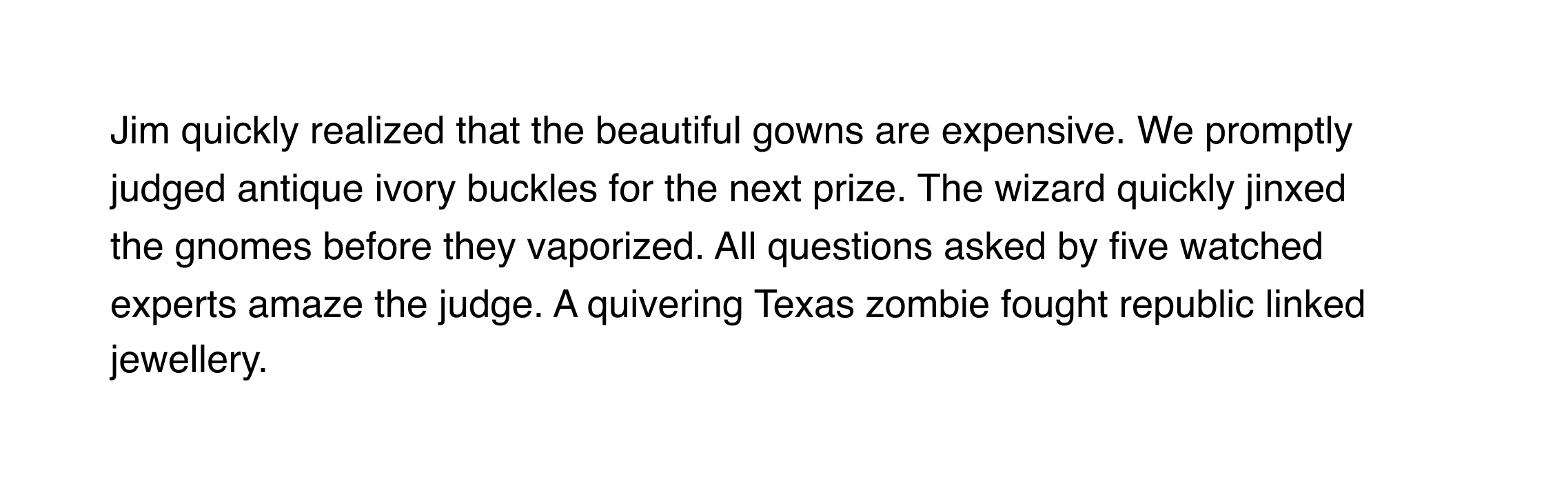
Currently, the word “linked” is hanging precariously over the end of the line before it, and the word “jewellery” is all by itself on the last line. We can fix both of these issues by replacing the space between those two words with what’s called a “non-breaking space”. That will force them to stick together, resolving both problems.
To insert a non-breaking space in any software on a Mac, press option spacebar . On PC, press alt and type 0 1 6 0 . Different pieces of software also have their own keyboard shortcuts and special character menus you can use.
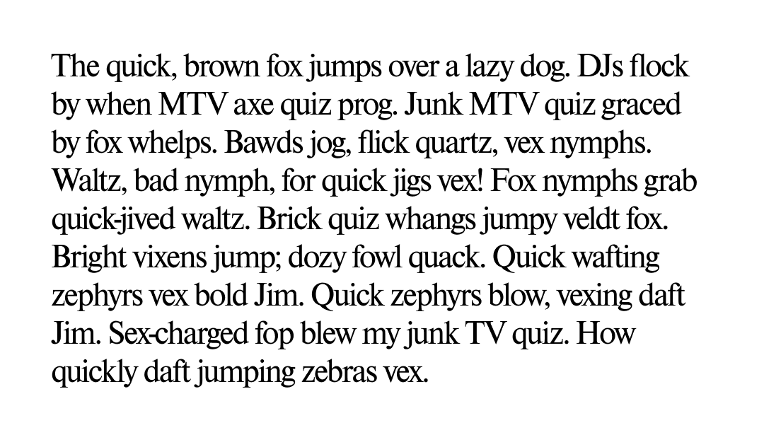
Here’s the result:
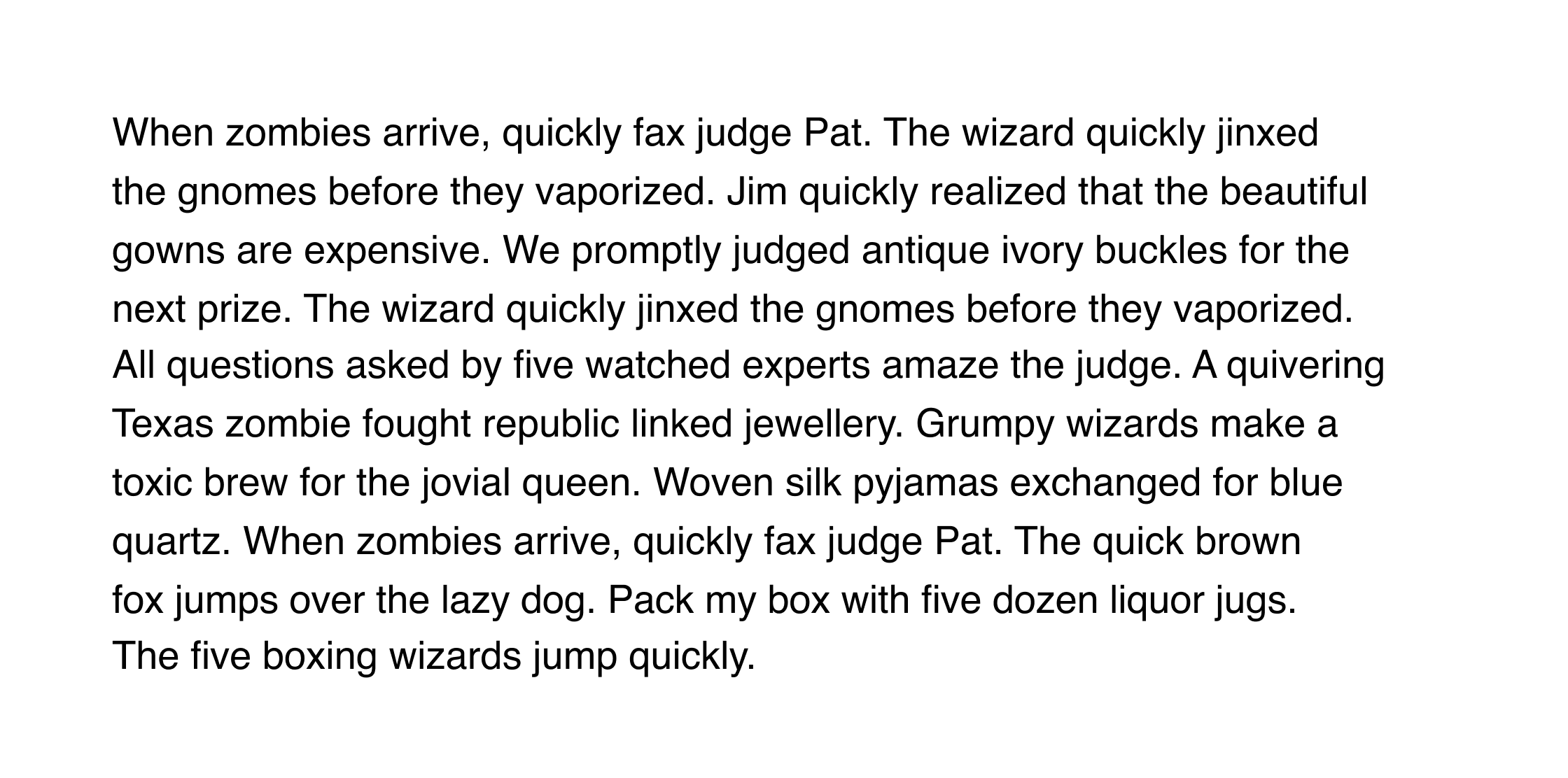
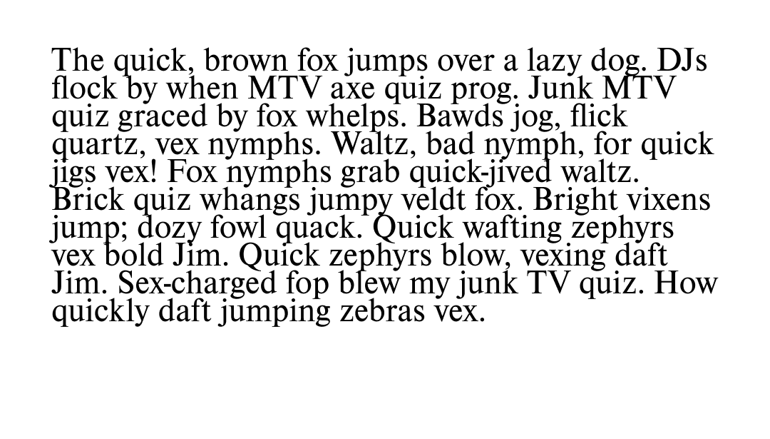
When ragging the rest of the paragraph, aim for a gentle convex shape, with no sudden changes in line length. For example, we could take this:
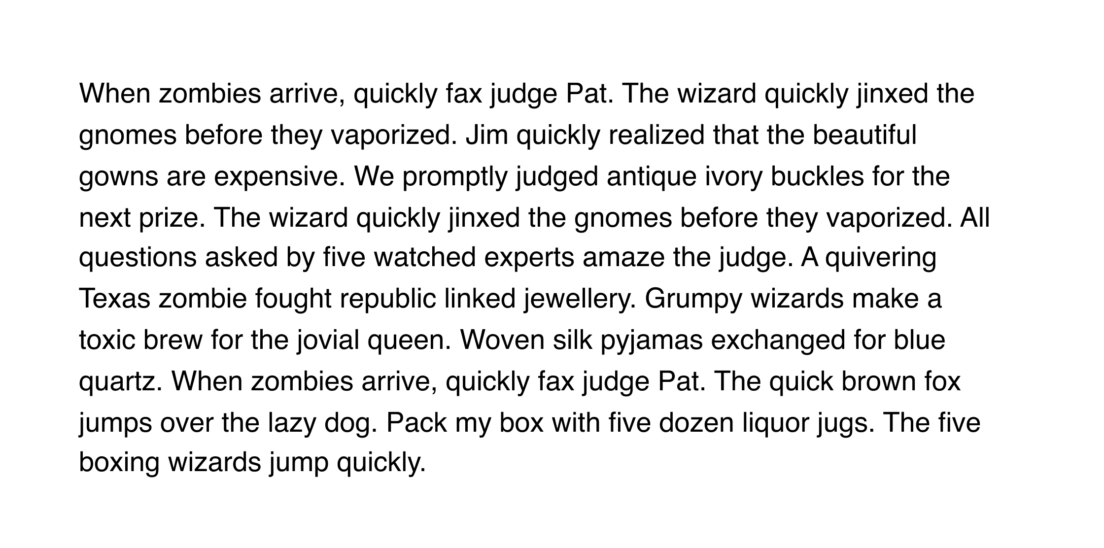
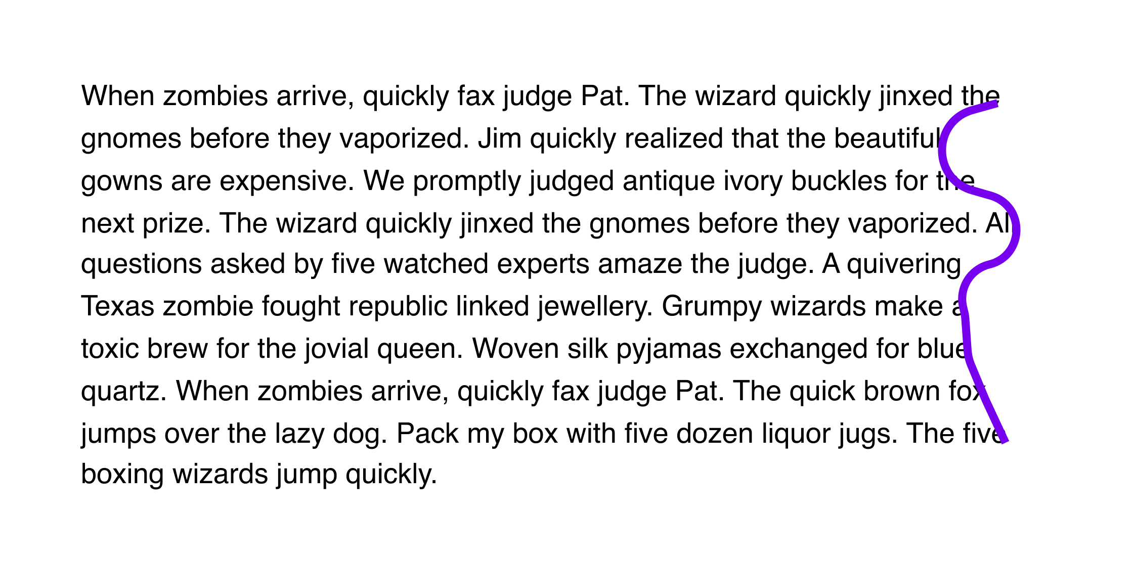
And adjust the lines to look like this:
Unfortunately, it’s not possible to rag text for the web, although you can control the last two words of each paragraph by inserting a non-breaking space.
6. Take care with text colour contrast
When setting text, the most important consideration is that it is legible not only for people with good vision, but also for those with visual impairments. Make sure to use colour combinations that have a contrast ratio of at least 7:1 to meet WCAG guidelines.
You can use the WebAIM contrast checker to ensure your colour scheme is accessible.
Jargon Buster
The term contrast ratio refers to the perceived difference in brightness between two colours. Selecting colours with a high contrast ratio is important for text, because low contrast makes reading harder, especially for those with visual impairments.
Contrast ratio ranges from 1:1 (for example, white text on a white background) to 21:1 (black text on a white background). Web Content Accessibility Guidelines (WCAG) require a contrast ratio of at least 7:1 for body text.
7. Avoid negative tracking or line spacing
Back in the days of letterpress, when text for printing was assembled using rows of metal letters placed into a frame, it wasn’t physically possible to condense letter spacing or line spacing.
Of course, the technical constraints of the past shouldn’t necessarily determine what we do today. However, for body text, using condensed letter spacing or line spacing below 100% will be less readable and less aesthetically pleasing.
Negative tracking
Negative line spacing
When you’re working on things like logos, or projects that use letterforms more graphically, it can be effective to break this rule.
8. Customise type when using it graphically
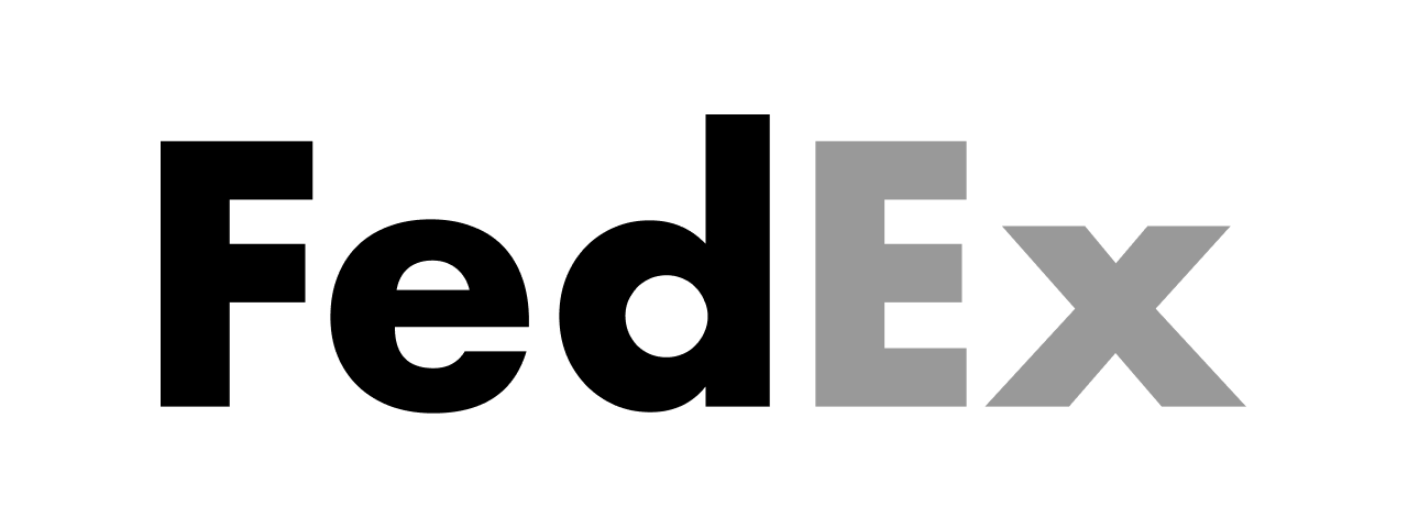
The place where we see type used graphically the most is in logos. If you’re using an existing font in a logo design, it’s important to customise it in some way. This adds to the distinctiveness of the design, and can also make things like trademarking easier.
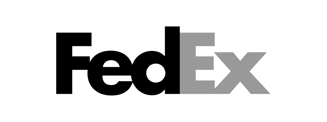
A simple but clever example of customising type in this way is the FedEx logo. Here’s our simplified reconstruction of the steps involved in customising the font Futura Bold to get to the FedEx logo.
Step 1
Start with the default Futura Bold letters, and default letter spacing (tracking):
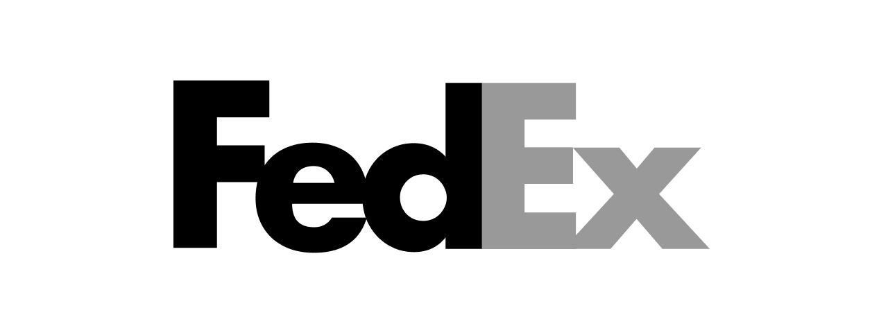
Step 2
Remove the letter spacing so that the letters touch (in the case of the “d” and “E”) or overlap:
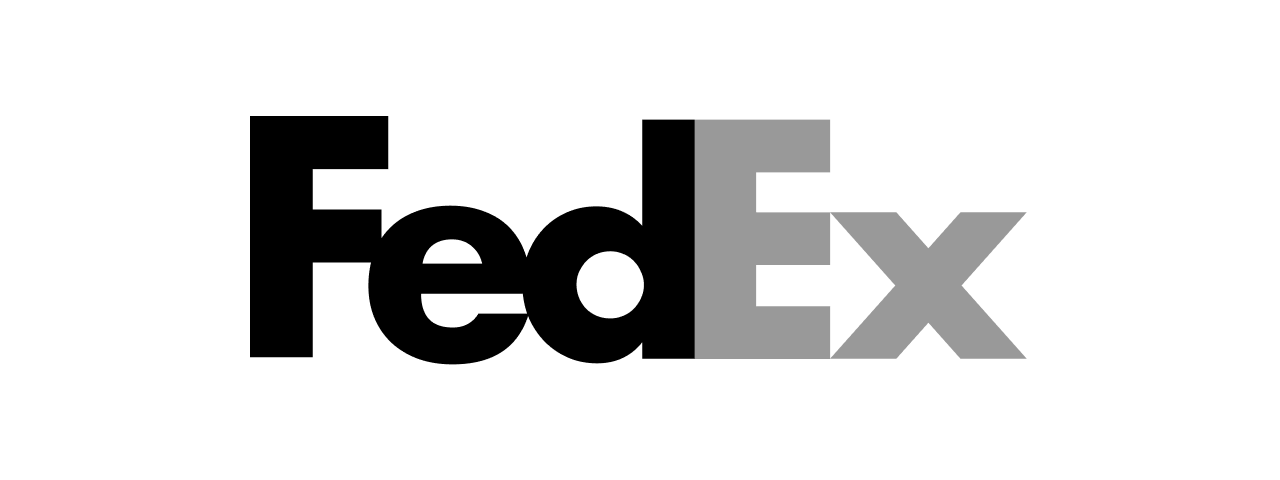
Step 3
Scale down the lowercase letters by about 10%:
Step 4
Tweak the shape of the “x” so that it forms an arrow with the E:
The real FedEx logo
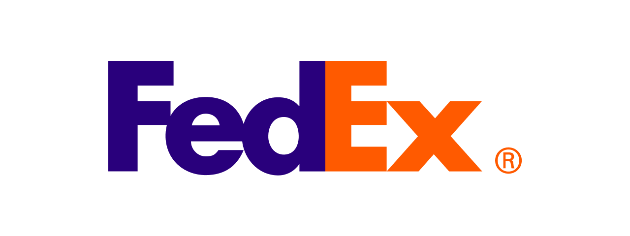
Although the final logo is simple, to get to this design and to discover the potential for the enclosed arrow, the process would have been far more complex. The path to a simple result is not often easy or obvious.
There are also some more subtle modifications present in the FedEx logo, including small changes to the shape and weight of the uppercase letters. We’ve omitted those here so that you can see the fundamental progression in how this typographic logo was created through type customisation.
9. Look beyond the standard options
There’s nothing wrong with choosing a tried and tested font like Helvetica, Georgia, or Times in your project. However, it’s important that you consider all options before making that decision.
As we covered in the previous lesson, there are thousands of high-quality free and inexpensive fonts available now via resources like Google Fonts. Choosing something that’s seen less often can add some more character and depth to the project or brand you’re working on.
10. Use independent type designers and foundries
When you need something distinctive or unusual, it’s worth looking into what typefaces independent designers and foundries have available. Although these often carry premium price-tags, there are also lots of less expensive options.
Here are some sites to bookmark.
Budget options
Premium options
- Grilli Type
- Dinamo Typefaces
- Klim
- Camelot
- AlfaType
- Fatype
- Tightype
- Milieu Grotesque
- Family Type
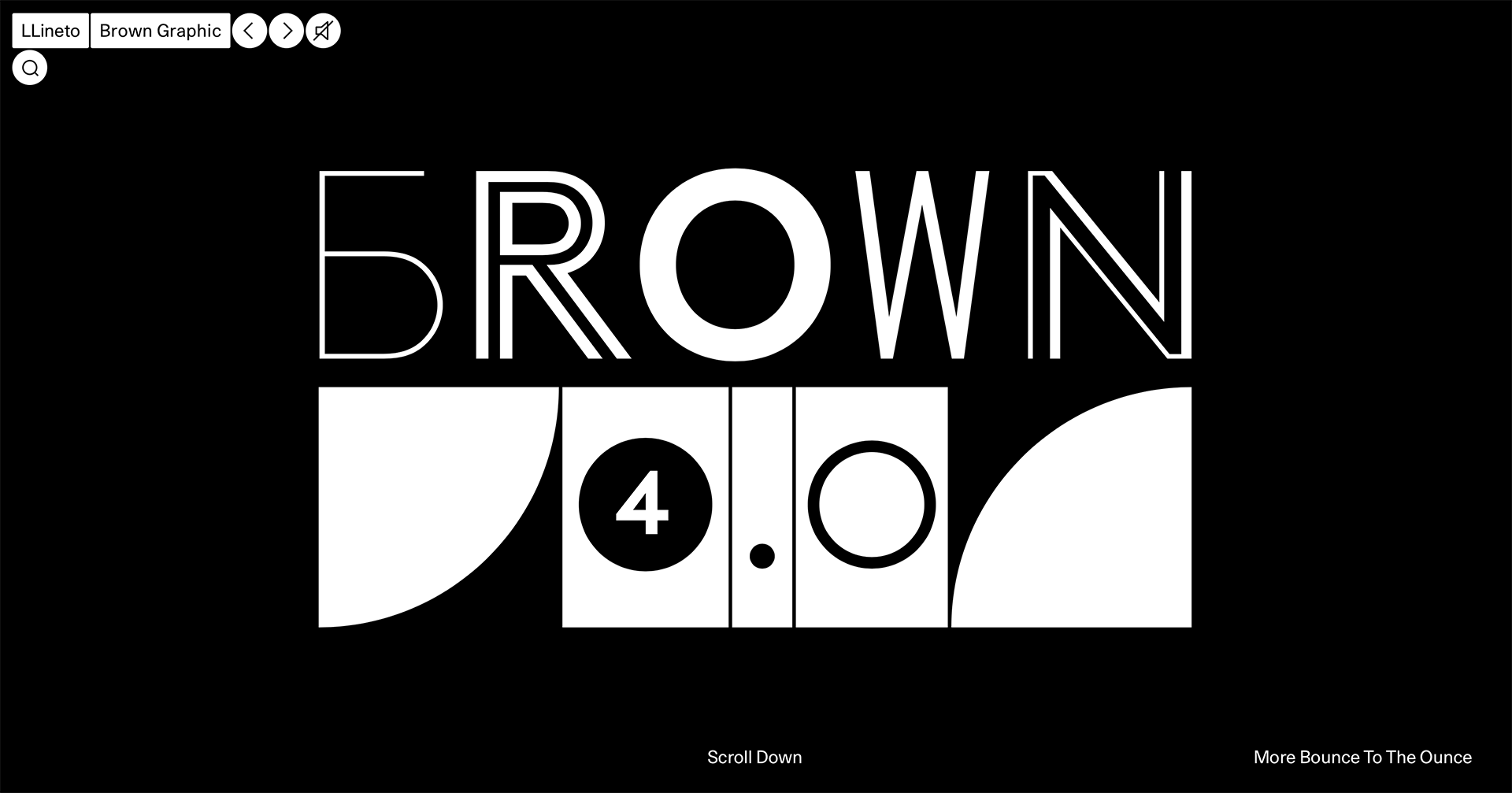
- Lineto
- TypeType
- Kobu Foundry
- Swiss Typefaces
- Good Type Foundry
- Pangram Pangram
- A2 Type
- TypeTrust
- &Discover
- FontFabric
In conclusion...
Following that banquet of font goodness, let’s move on to some hands-on assignments — starting with an exercise evaluating some different typeface choices.