Course · Part 4 · Assignment 7
Practise ![]()
Assess These Font Choices
![]() Time limit: 1 hour
Time limit: 1 hour
Remember to use your visual timer! We recommend the inventor’s iOS and Android apps — just search for “Time Timer” in the app store.
Explanation
In this short exercise, you’ll look at the details of some font choices, determine its classification, and make some suggestions for how you think it could be used.
Instructions
Assess these font choices
 Set your timer: 50 minutes
For each of the font choices pictured below, answer the following three prompts in your notebook.
❯ Note down three details about this typeface that you think are important or interesting.
It could be something about the shape of the letters, or the personality that you think the font conveys, or a small detail that makes the font distinctive.
❯ What kind of font is it?
Remember that fonts can fall into more than one category (for example, many script fonts are also display fonts). The font classifications we’ve covered are:
- old style serif
- transitional serif
- slab serif
- didone serif
- grotesk sans-serif
- geometric sans-serif
- humanist sans-serif
- display
- monospaced
- script
- novelty
❯ What do you think this font would be suitable for? Why?
You could choose a brand that you think the font would work well for, or think what sort of website or publication it might appear in, or an industry it could be suited to.
Feel free to refer back to the typography basics lesson to help with this assignment.
Font 1
Font 2
Font 3
Font 4
Font 5
Font 6
Font 7
Font 8
Font 9
Font 10
Review the example solution
Once you’ve completed your work on this assignment, take a few minutes to review the example solution below.
Example solution
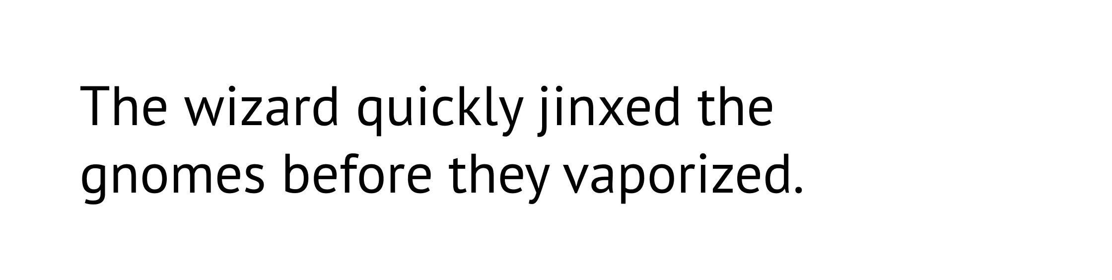
Font 1
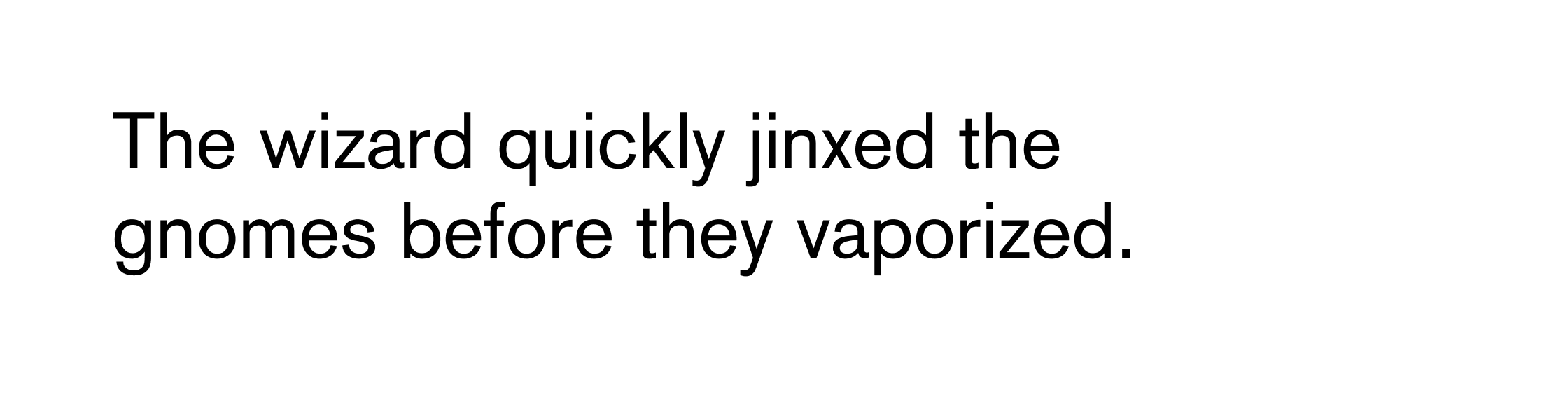
This font is Akzidenz Grotesk, the first true sans-serif, released in 1898.
Details: Very clean and rational, but has interesting, almost decorative details, like the tail on the lowercase “a”, and the bottom of the lowercase “y”. It also has square dots on the “i” and “j”.
Classification: Grotesk sans-serif
Use: Its modern appearance would make it suitable for anything that needs to look contemporary. Its quirky details could also support projects that are a bit edgy.
Font 2
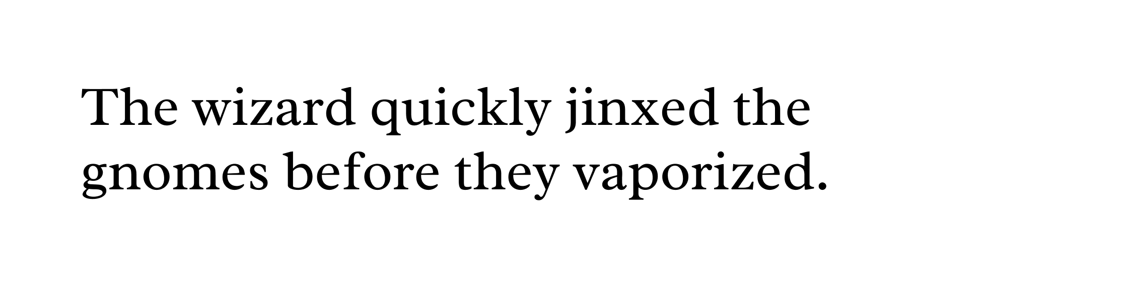
This font is Radley, a transitional serif similar in appearance to Plantin. Radley was designed by Vernon Adams and released in 2012.
Details: It has a soft, almost rounded appearance, with clean verticals and angular serifs that evoke carved letterforms.
Classification: Transitional serif
Use: Its bold shapes and beautifully crafted curves make Radley suitable for use at larger sizes. It is also legible enough to be used for body text. It would work well in projects that need to evoke tradition or history.
Font 3
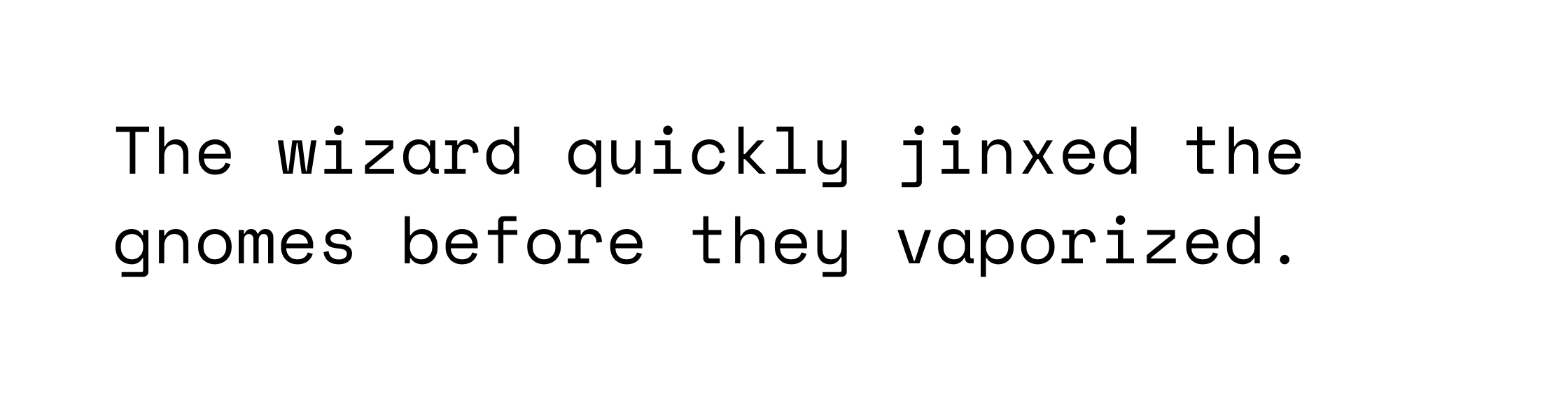
This font is Space Mono, a monospaced typeface designed by Colophon Foundry and released in 2016.
Details: It’s monospaced (all the characters are the same width), geometric (there are lots of circles and right-angles), has square and wide serifs on thin letters like “i”, “I”, “j”, and “R”, and circular dots on the “i” and “j”.
Classification: Monospaced
Use: As a monospaced font, it could be used in code editors or any other setting where equal character width is important. It could also be used graphically for any projects that want to make an association with technology, computing, or even old-fashioned word-processing.
Font 4
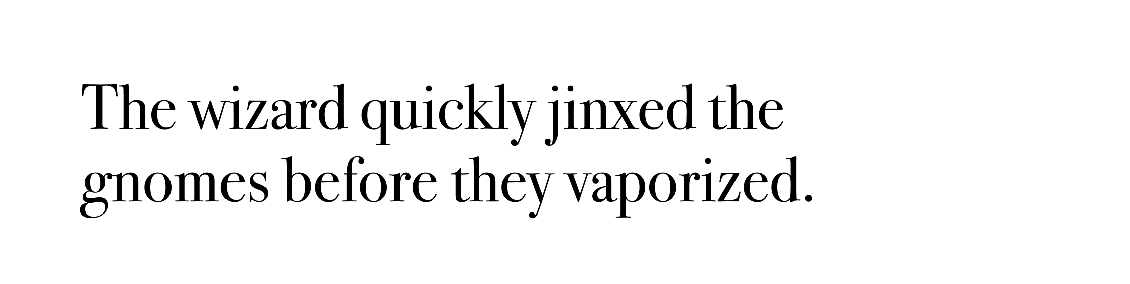
This font is Bodoni, a didone serif typeface originally designed by Giambattista Bodoni in 1798.
Details: Its letterforms are quite thin and tall, have very high stroke contrast (contrast between thick and thin), and “ball terminals” (circular stroke endings) on letters like “a”, “j”, and “r”.
Classification: Didone serif
Use: Bodoni is suitable for use at large sizes, or for other graphical uses like logos. Its refined, classy appearance means it is often chosen by higher-end fashion brands.
Font 5
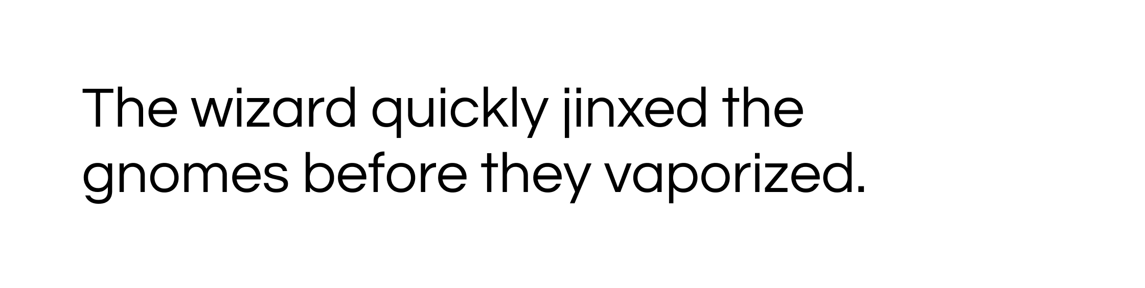
This font is PT Sans, a humanist sans-serif with influences from Russian type. It was released by ParaType in 2009.
Details: It has a friendly appearance, thanks in part to handwriting-like details including the kick on the lowercase “l”, and the single-storey “g”. It also has a large x-height.
Classification: Humanist sans-serif
Use: Thanks to its large counters, clear letterforms, and large x-height, PT Sans is highly legible, and perfect for screen use on web and mobile.
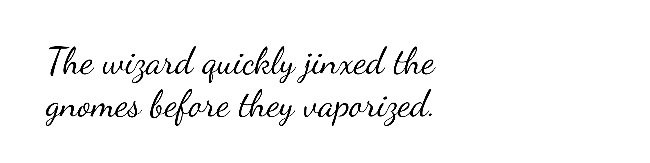
Font 6
This font is Dancing Script, a script font designed by Pablo Impallari and released in 2011.
Details: It has a casual appearance, with capital letters that dip below the baseline, high stroke contrast, and quirky, slightly inconsistent letter shapes.
Classification: Script
Use: Any application that needs to evoke informal handwriting.
Font 7
This font is Roboto Slab, a slab serif font designed by Christian Robertson for Google.
Details: Like most slab serifs, Roboto Slab has very low stroke contrast, and squared-off serifs. It conforms to the letterforms of Roboto, so can easily be paired with that sans-serif font.
Classification: Slab serif
Use: Its high x-height make it suitable for both screen and print. It is more suitable for headings than for body text, as long passages set in a slab serif can be visually tiring.
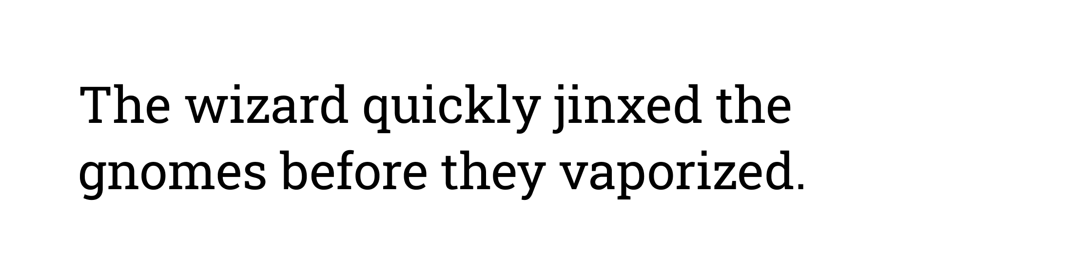
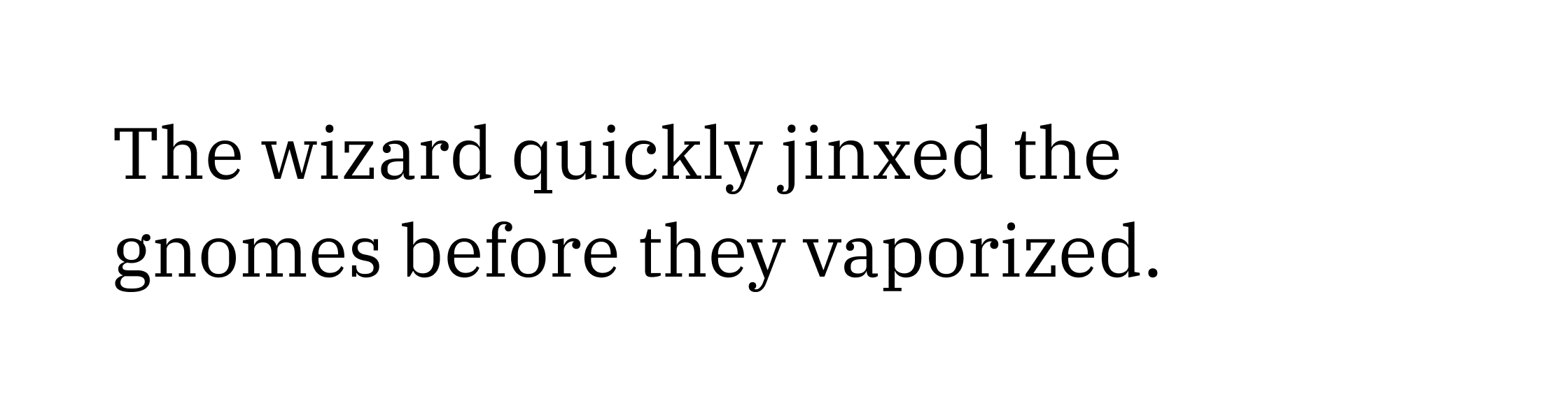
Font 8
This font is IBM Plex Serif, a transitional serif designed for screen use. It was created by IBM’s Mike Abbink and his team, and is inspired by Bodoni (a didone serif) and Janson (an old-style serif).
Details: It has an upright, formal appearance, and features strong, thick vertical strokes, combined with elegant details like ball terminals and slanted serifs.
Classification: Transitional serif
Use: This font’s clarity and large x-height make it an excellent choice for screen use, both for titles and body text.
Font 9
This font is Questrial, a geometric sans-serif designed by Joe Prince and Laura Meseguer.
Details: Its letterforms are strongly based on a combination of circles, horizontals, and verticals, with low stroke contrast.
Classification: Geometric sans-serif
Use: Its geometrical appearance makes this typeface more suitable for large text and headings than for body text.
Font 10
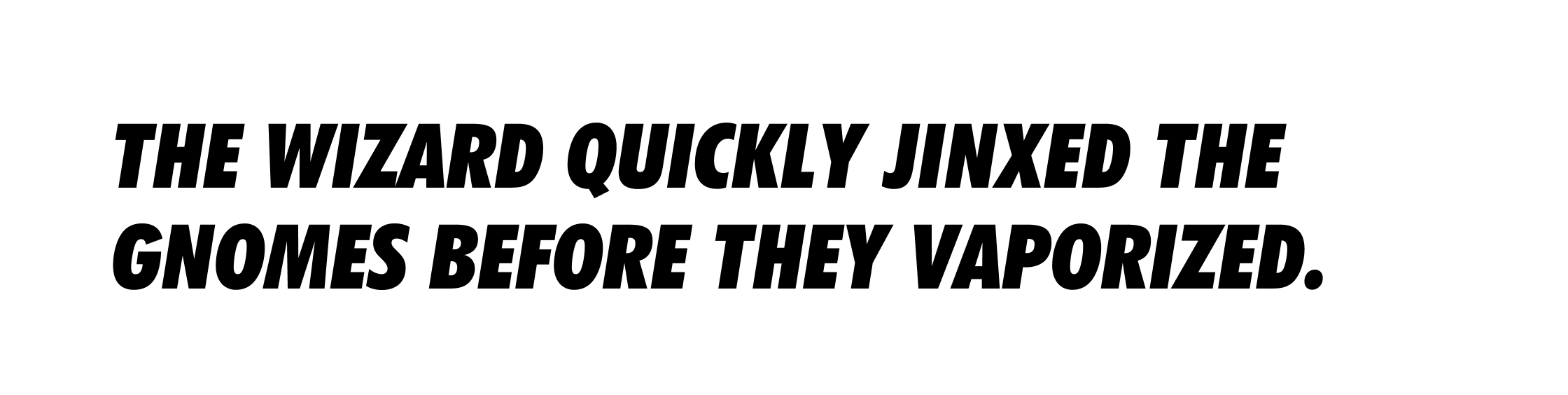
This font is Futura Condensed Extra Bold Italic, shown here using all-caps. Designed by Paul Renner, it was first released in 1936. Its most famous usage is
Details: It is formed of very thick, italic strokes, which are all squared-off at the end (for example, the tail of the Q and J). The full-stop is circular and contrasts with the blocky appearance of the letters.
Classification: Geometric sans-serif
Use: This font would be suitable for high-impact headlines or other display applications.
In conclusion...
Now that you’ve had some practice assessing font choices, in the next assignment it’s time to get creative — by selecting some typeface options for a new cycling brand!