Course · Part 4 · Assignment 3
Read ![]()
Typography Basics
KeyThree
The key points from this assignment.
- Typography is about understanding typefaces, choosing them intelligently, and using them effectively
- Important typography terms include stroke, weight, stress, x-height, kerning, and tracking
- Categories of font style include serif, sans-serif, script, and monospaced
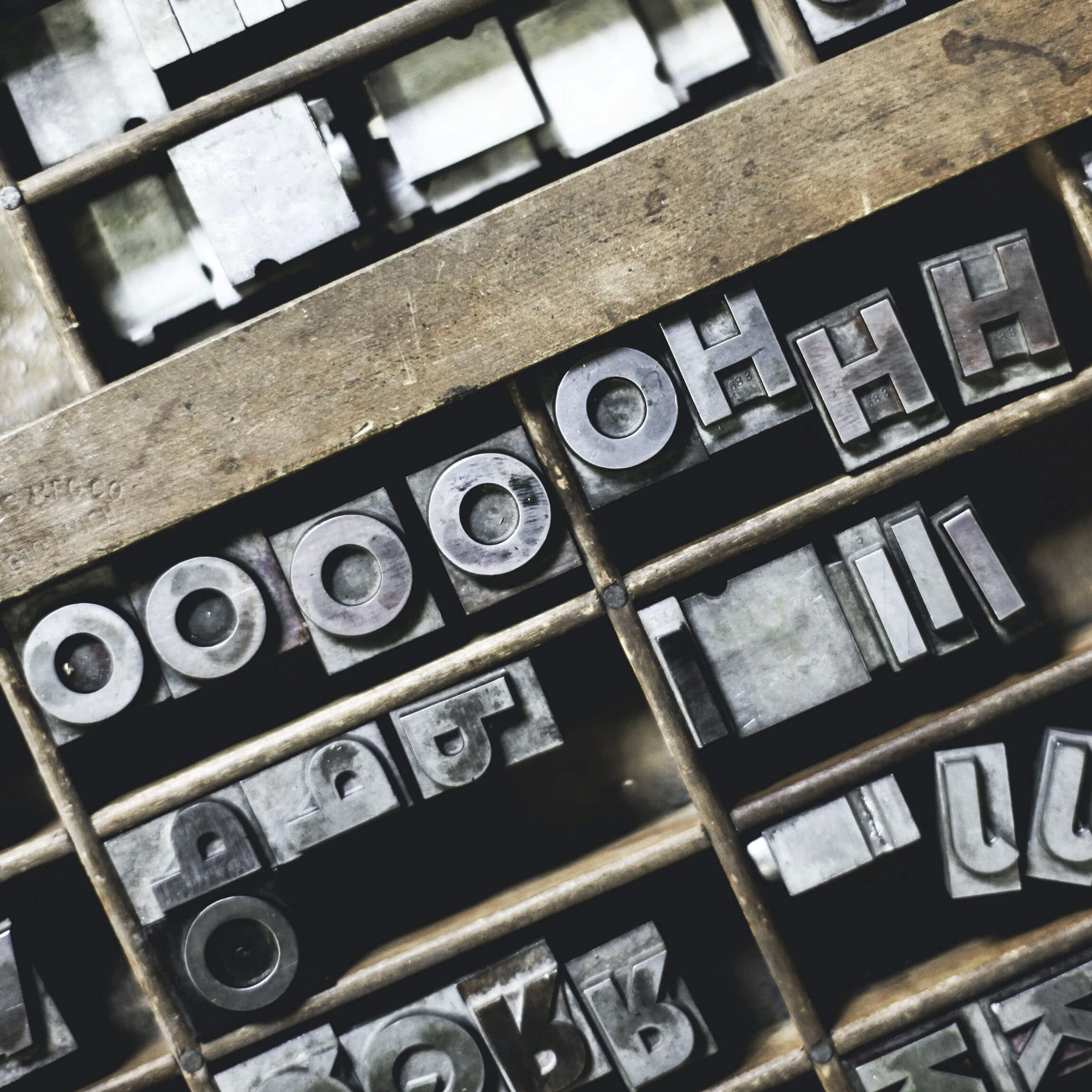
Image credit: Kristian Strand
Introduction
It’s often said that design is 90% typography — or 95%, or 99%, depending who you ask. The exact percentage, of course, doesn’t matter. The point is simply that design relies heavily on text — so the decisions that we make about how text is presented have a big impact on the overall look and feel of a design project, and on its ultimate success.
The good news is that an army of type designers from the 1400s to the present day have done most of the typographic work for us. There are thousands — or possibly millions — of typefaces available for today’s designers to use.
In this assignment and the eight that follow (yes, typography is that important), you’ll establish a basic practical understanding of typefaces, and learn some principles for how to choose fonts intelligently, and use them effectively.
Before we start talking about typefaces themselves, let’s cover some important typography terms.
Key typography terms
Typeface vs font
Purists often insist that a typeface and a font are not the same thing. Technically, they are correct: “typeface” is the name given to a specific type design (for example, Times New Roman), whereas “font” used to refer to a specific size of metal type for a typeface (for example, Times New Roman, 12 points).
However, in the digital age, these two terms effectively mean the same thing — and it’s more common for digital typefaces to be referred to as fonts.
Kerning vs tracking
Kerning refers to the space between two individual letters. Tracking refers to the general letter spacing throughout a passage of text. Sometimes people say “kerning” when they mean “tracking”.

Kerning is a spacing adjustment between two letters

Tracking is a spacing adjustment across a whole stretch of letters
Stroke
This term comes from type design’s roots in handwritten lettering, which is created with strokes of a pen or brush. Strokes can be thick, thin, or somewhere in between.

Didot is a font with a mixture of thick and thin strokes
Stroke contrast
A font that is made up of a mixture of very thick and very thin strokes is described as having high “stroke contrast”, and a font with strokes that are all similar in thickness has low stroke contrast.

Didot Bold has very high stroke contrast: thick vertical strokes and thin horizontal strokes

Helvetica has very low stroke contrast: vertical and horizontal strokes are almost the same
Stress
“Stress” refers to the axis on which stroke width changes in a letter or font. In older fonts like Jenson (designed around 1470), stress tends to be diagonal, mimicking handwriting. In more modern fonts like Didot (designed around 1800), stress tends to be vertical, creating a more engineered feel.

Jenson (left) has diagonal stress; Didot (right) has vertical stress
x-height
The x-height of a font is a measure of how high the lowercase letters in a font are compared to the uppercase letters. The lowercase “x” is used because it tends to be flat at both the top and bottom, making it a reliable letter for comparing different typefaces.
This metric is important when choosing type, because a font that has a larger x-height relative to capital letters can appear a lot bigger than a font with a smaller x-height — even if both fonts are set to the same size.
Here’s an example. Mr Eaves is a font with a small x-height. Basier Circle is a font with a large x-height. Setting both fonts to the same pixel size (20px) results in very different optical sizes:

Small x-height: Mr Eaves, text size 20px

Large x-height: Basier Circle, text size 20px
Typeface classifications
The easiest way to think about different typeface options is in broad categories. You’ll probably have heard of “serif” and “sans-serif” fonts. Serif fonts have right-angled “feet” at the end of strokes; sans-serifs don’t.


However, there are a few more categories that you might not have encountered. Some of these are sub-categories of serifs and sans-serifs; others form special categories of their own; and many fonts belong in more than one category.
Old style (serif)
Old style serifs date from the earliest days of western printing presses. Their overall form and feel is derived from handwriting: they tend to have left-to-right stress, and they feel more “human” than “machine”. Their stroke contrast is relatively low, meaning that the thin and thick lines are still quite similar in weight.


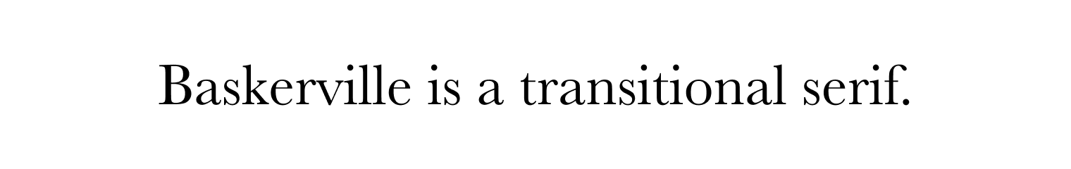
Transitional (serif)
Transitional serifs emerged later, and have a more technical, engineered feel. They have higher stroke contrast than old style serifs, meaning that the thin lines are significantly lighter than the thick lines. They also have vertical stress, meaning that each letter has a more balanced, upright appearance.

Slab (serif)
Slab serifs tend to have a bold, blocky appearance. Their serifs are usually thick and square.

Didone (serif)
Didones get their name from the 18th–19th century type designer, Firmin Didot. Didones are very visually distinctive. They typically have high stroke contrast: the vertical strokes are very thick, and the horizontal strokes are very thin.
Like transitional serifs, they have vertical stress and an upright appearance. Didones like Bodoni are often used to signify luxury and refinement.

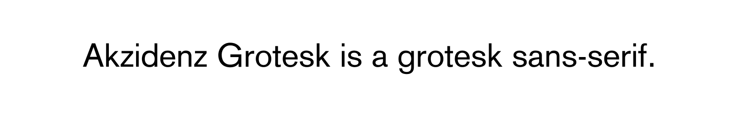
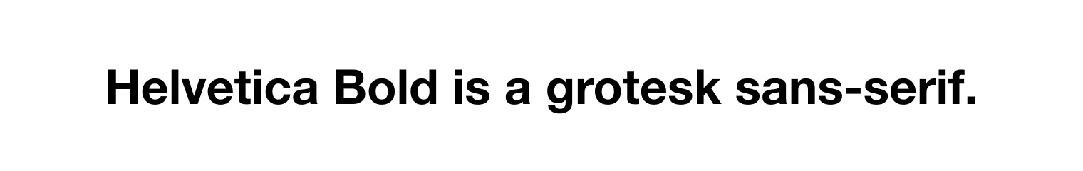
Grotesk (sans-serif)
Emerging towards the end of the nineteenth century, “grotesks” were the first sans-serifs to be designed — Akzidenz Grotesk was an early example.
Grotesks have very even stroke weight, no serifs, and a very neutral appearance. Helvetica, perhaps the best-known of all fonts, was a refinement of Akzidenz Grotesk.
Helvetica became a very successful font — ubiquitous in brand design — largely because its neutrality meant it could be used for almost any project.
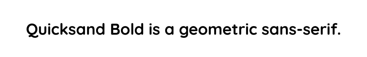
Geometric (sans-serif)
Geometric sans-serifs emerged in the early twentieth century. Unlike grotesks, they are built around a stricter “geometric” structure — primarily around the circle. Futura is probably the best known geometric sans-serif, with Futura Bold being particularly popular for logos and branding.

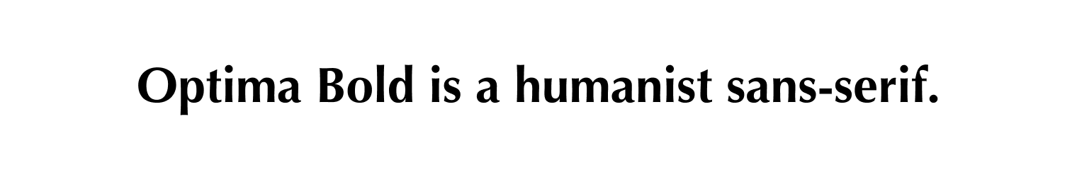
Humanist (sans-serif)
Humanist sans-serifs usually have a taller, thinner, and friendlier appearance than grotesks and geometric sans-serifs. They often incorporate nods to handwriting, including slight diagonal stress.
Importantly, many humanist typefaces have a tall x-height, which makes them effective for large applications like signage systems (where distance legibility is important), and at small sizes, too.

Display
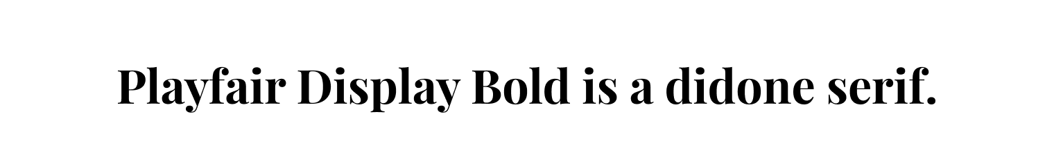
Display fonts can be hard to define precisely. They can be thought of as any typeface that was designed to be “displayed”, often at large sizes, like in banners or headlines. In general, any type of font — serif, sans-serif, or other — can be a display font if its features are sufficiently bold, quirky or exaggerated. Fonts intended for display will often have the word “Display” in their name. For example, Playfair Display (pictured above) is a didone serif which has exceptionally high stroke contrast, meaning that it will only work at large sizes (at small sizes, the thin lines become invisible).

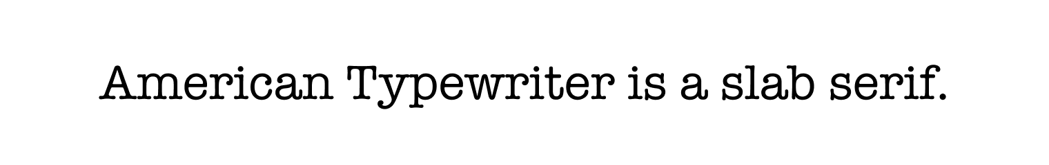
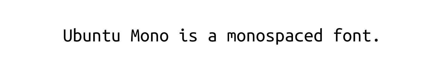
Monospaced
Monospaced fonts became commonplace with the mechanical typewriter. The quintessential “mono” typeface is, therefore, arguably the slab-serif typewriter font that dominated those machines. Examples include Courier and American Typewriter. However, today there is a huge range of monospaced fonts available. They’re typically used for coding, but can also be used to create specific effects in graphic design.
Script
Script fonts inhabit all sorts of aesthetics, including comic book script, grungy digitised handwriting, graffiti, calligraphy, and highly engineered copperplate script. In spite of this wide variation, you’ll generally know a script font when you see one.

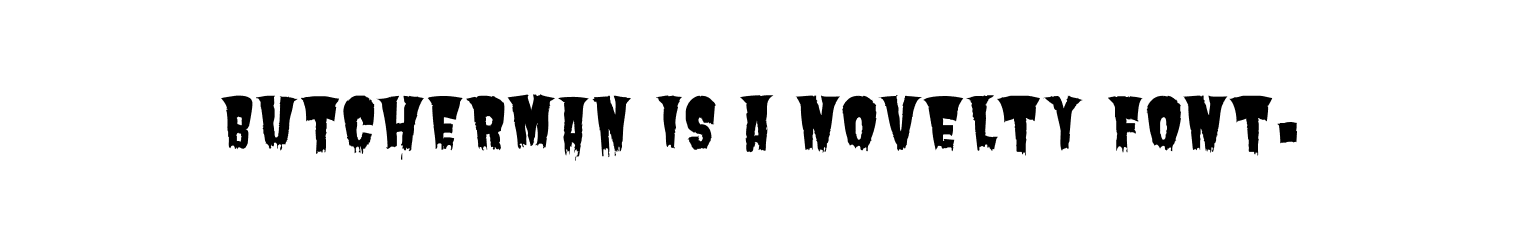
Novelty
In terms of sheer number available, novelty fonts may now be type design’s largest category! However, novelty fonts need to be used carefully, sparingly, and for a specific purpose. They are almost never suitable for body text, and are best treated as a special kind of display font.
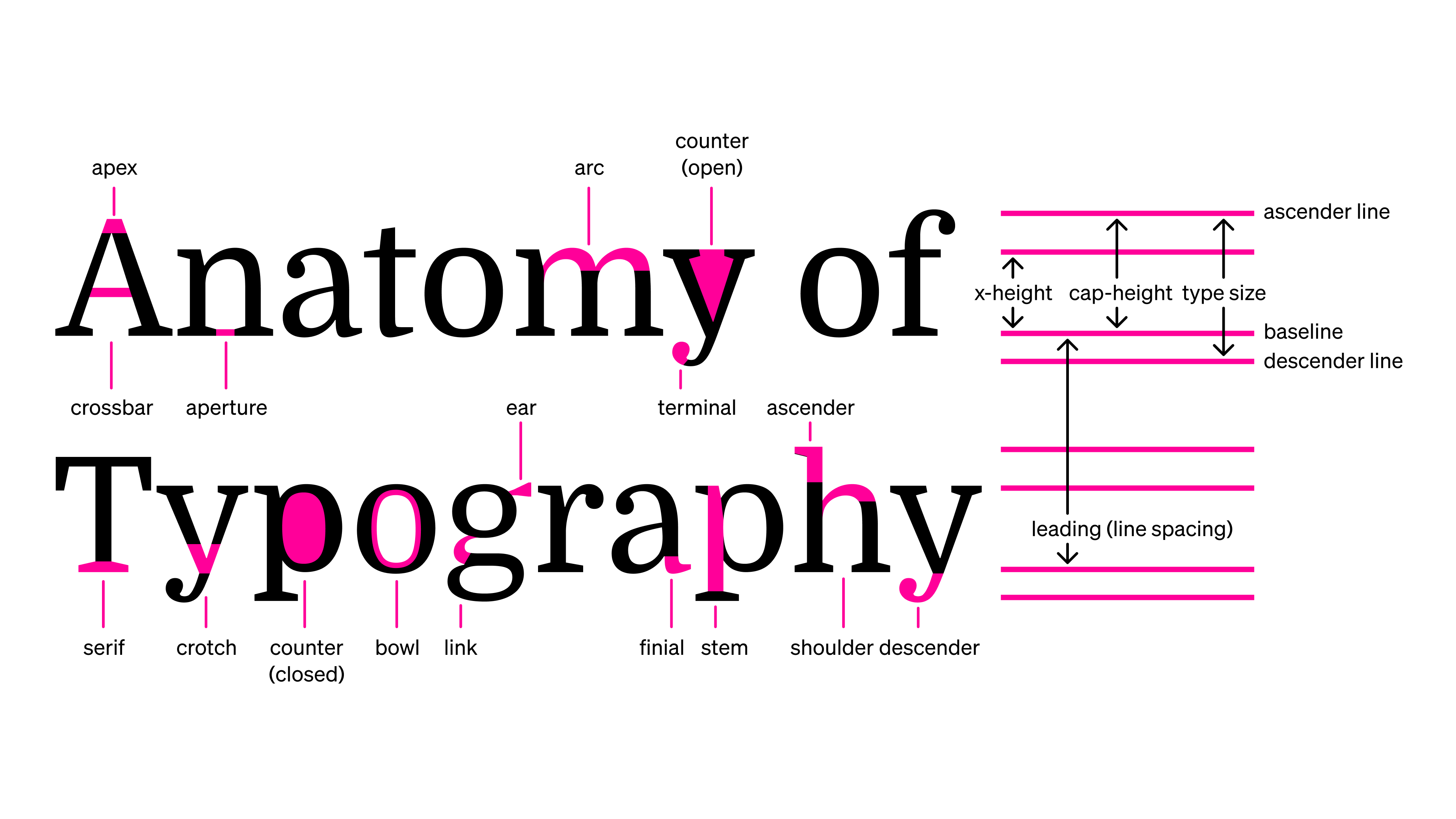
Poster download: the anatomy of typography
To help you learn about the details of type design, we recommend you print this poster or download this desktop wallpaper (light version /dark version ).
Getting familiar with the “anatomy” of fonts will help you to make more sophisticated choices in your designs.
In conclusion...
Now that we’ve run through the basics of typography terminology and font classifications, in the next assignment let’s cover how to choose the right font for a project.