Course · Part 4 · Assignment 19
Apply 
Create a Colour Palette
![]() Time limit: 1 hour 30 minutes
Time limit: 1 hour 30 minutes
Remember to use your visual timer! We recommend the inventor’s iOS and Android apps — just search for “Time Timer” in the app store.
Explanation
In this assignment, you’ll use the five-step process for creating a colour palette to develop a palette for the Summit cycling brand.
Instructions
Create a colour palette
 Set your timer: 50 minutes
Following on from your earlier work choosing fonts for the Summit cycling brand, they’ve asked you to develop a colour palette that can be applied across their product range.
Their products include fast-paced, competition-grade road racers and mountain bikes, as well as leisurely city bikes and children’s tricycles. So above all, the palette needs to be flexible and versatile.
Tips
Remember to follow the five-step process we covered earlier:
- Choose a base hue
- Adjust the saturation and value of your base hue
- Explore standard colour palettes
- Pick a palette, and fine-tune each colour
- Create a colour scale
You can refer back to the earlier assignment on how to create a colour palette if you need a more detailed refresher.
Export your colour palette to PDF
Set your timer: 30 minutes
Next, place your colour palette and colour scales into a frame in Figma, take a few minutes to lay them out and present them nicely, and then export the frame to PDF so that you can easily share them with the client. (We’ve included this step, because it’s a good habit to get into.)
Review the example solution
Once you’ve completed your work on this assignment, take a few minutes to review the example solution below.
Example solution
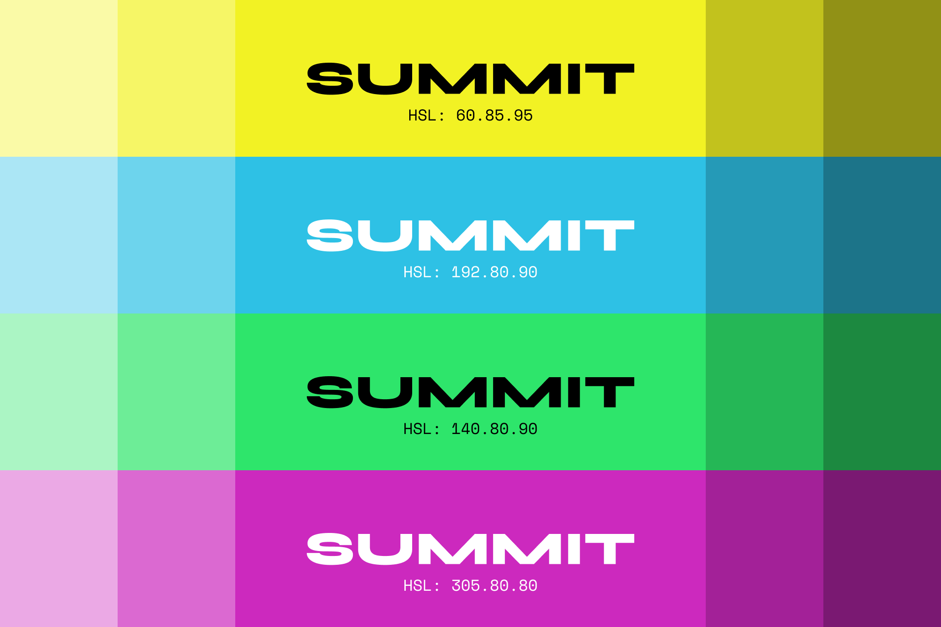
We chose bright yellow as our base hue, as it could be important to accommodate fluorescent yellow within the colour palette, given that city bikes and children’s bikes often feature this option.
We then went for a square colour palette to create an inclusive, “rainbow” colour scheme, and continued slightly shifting the hue, saturation, and value of each colour.
In order to avoid stereotypically gendered colours, we shifted the blue hue towards green, and the pink hue towards purple.
Finally, we created a simple colour scale, and presented each colour as a large, solid block, combined with the main brand font. This should give the client an idea of how each colour might apply to, for example, a bike frame.
In conclusion...
This assignment brings to a close our work on colour, for the time being. Next up, let’s learn about layout and grids!