Course · Part 4 · Assignment 21
Read 
Grid Systems
KeyThree
The key points from this assignment.
- Grid systems have been in use for thousands of years, dating back to ancient manuscripts
- The rapid development of graphic design during the twentieth century led to the development of more complex modular grid systems
- Although grids create helpful constraints, it’s still important to deviate from the grid when the content or project demands it
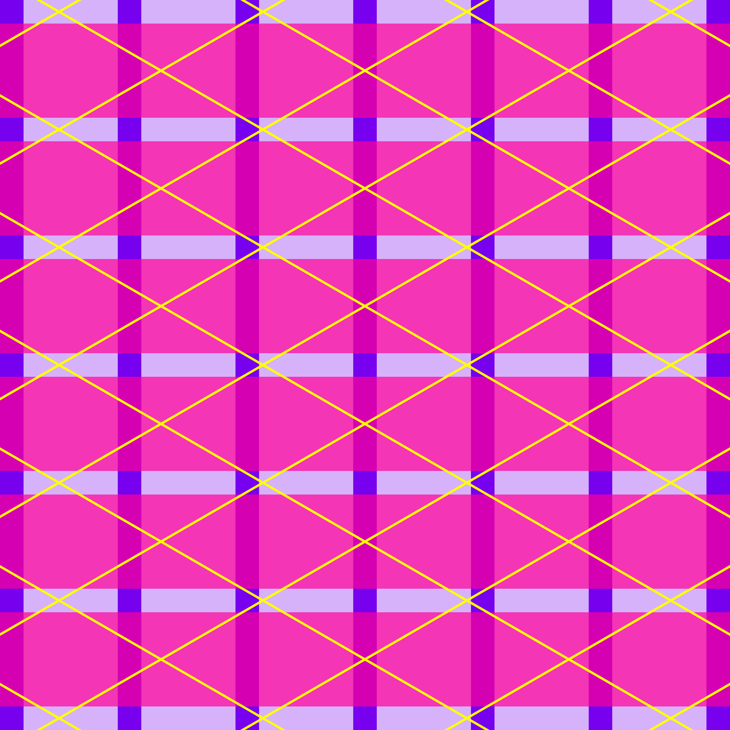
Image credit: Baseline Team
Introduction
In design, a grid system is an underlying structure that helps us make decisions for the position and size of elements within a design. Grids are used in the vast majority of graphic design and product design projects.
Although grids work by creating constraints, they are also extremely flexible, and allow for a lot of creativity.
The grid itself is not usually visible in the final design, but lots of design software allows you to display your chosen grid as faint columns or lines to help guide your work.
A brief history of grids
People first used layout grids over a millennium ago, to organise writing on hand-lettered manuscripts.
This page from the Lindisfarne Gospels (around 700 CE), which we first earlier in Part 4, uses both a two-column grid and a baseline grid (which we’ll explain in a moment):
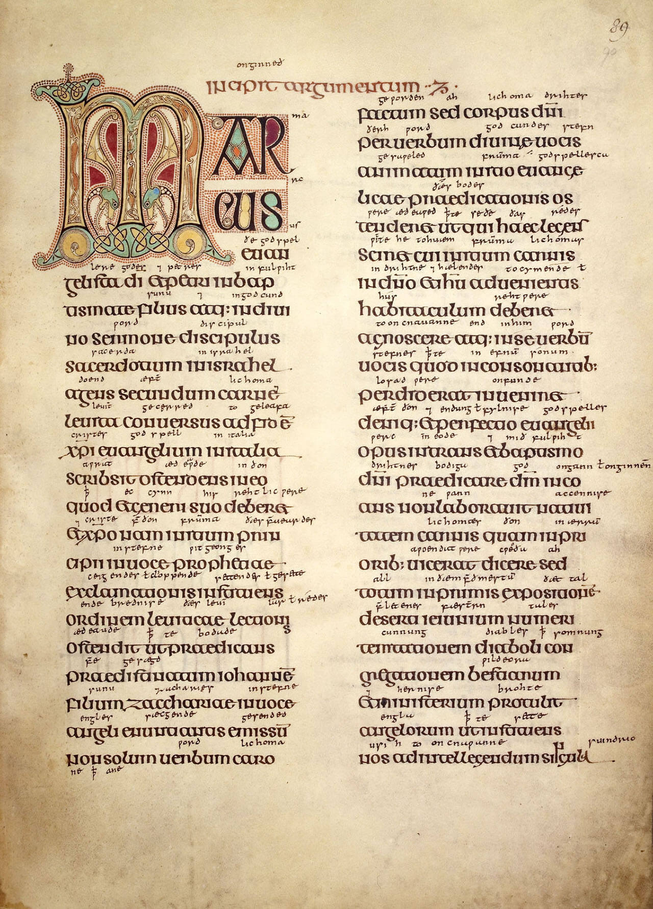
Image courtesy of The British Library, Cotton MS Nero D IV
Later, when the western printing press was invented, grids were used to to organise text on pages in books, pamphlets, and newspapers.
By the mid-nineteenth century, newspaper printing presses were capable of printing on large paper (broadsheet) using many columns. Here is the first edition of the New York Times (1851):
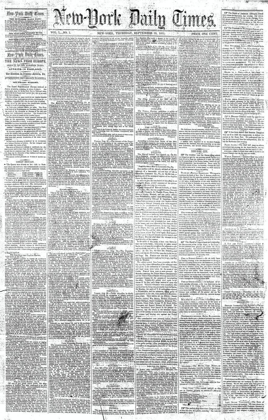
The first edition of the New York Times (1851). Image credit: Wikimedia Commons
As graphic design emerged as a distinct discipline in the twentieth century, the use of layout grids became widespread. The Bauhaus movement, which began after the first world war, emphasised rationality and functionality.
The designers Jan Tschichold (pronounced chick-alt) and Josef Müller-Brockmann were both influenced by Bauhaus principles, and they each published comprehensive works on grid systems.
In his book “The New Typography”, Tschichold constructed layout grids based on the golden ratio, while Müller-Brockmann demonstrated in “Grid Systems” the sheer flexibility of modular grids — not only for graphic design, but for the layout of buildings and other spaces too.
Tschichold’s “golden canon of page construction”. Image credit: Wikimedia Commons
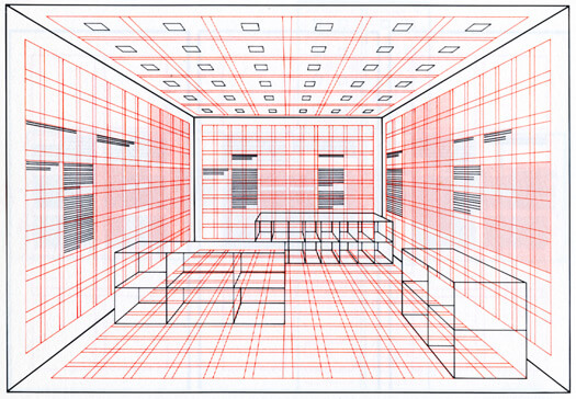
Müller-Brockmann shows how a grid system can help plan an exhibition space
Even though we now consume most information through computer screens or smartphones, grids remain an essential tool for designers to organise content, and in particular to plan how content will be displayed on different devices.
On that note, let’s go through the main types of grid you need to know about as a designer today.
Types of grid
Baseline grid
Although it’s not talked about much, especially in digital product design, the baseline grid is the most fundamental grid. That’s because it’s about where lines of text sit — and the majority of content remains text-based, even in our multimedia age.
A baseline grid is formed of a series of horizontal lines. Ideally, in projects which use a baseline grid, all the text should align to a baseline.
Notepads and exercise books often print baseline grids to guide people’s writing. People who lettered ancient manuscripts used the same technique — drawing faint guidelines to make sure their text was level and evenly spaced.
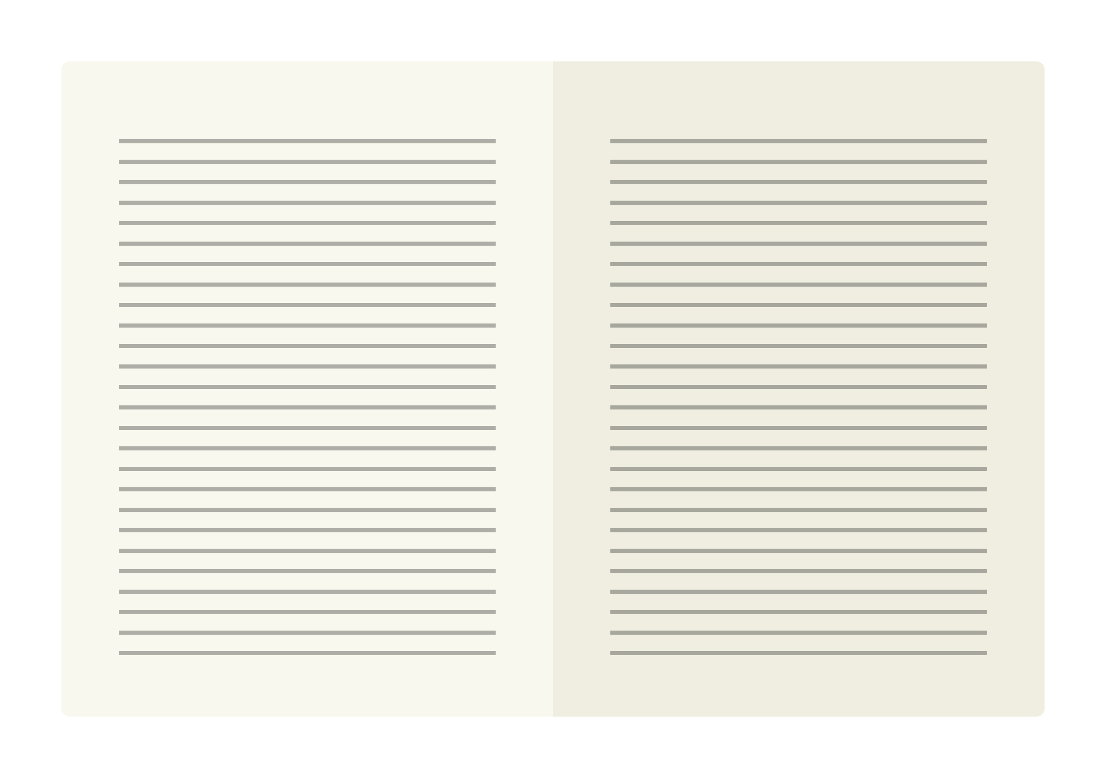
A baseline grid
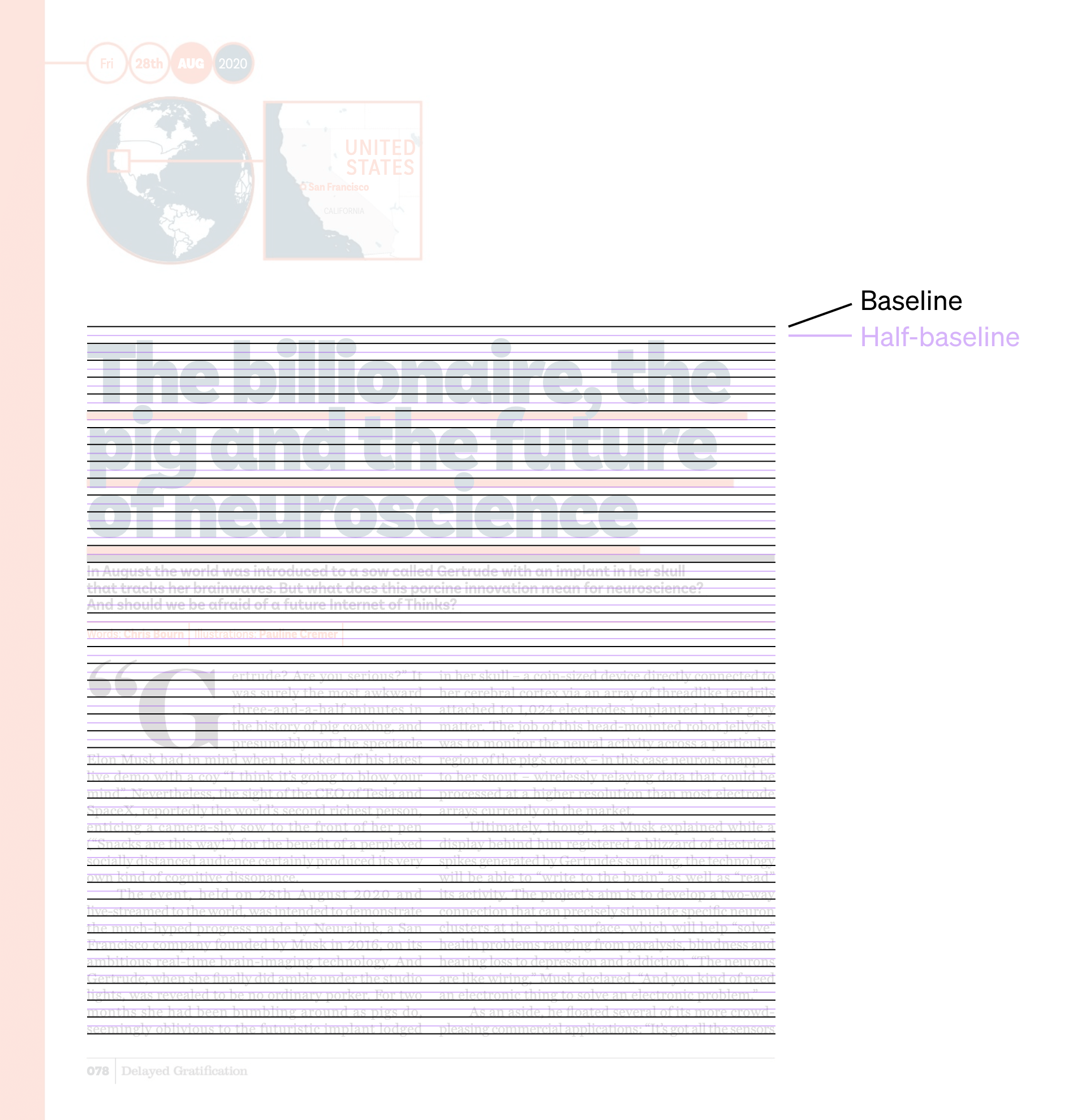
Below is a spread from an issue of the “Delayed Gratification” quarterly. In the second image, you can see how every text element aligns to a baseline.
This example uses a common technique of halving the baseline increment. That means that there are two baselines for every line of body text. Doing this creates more layout options, while retaining the discipline of a baseline grid. Note how the main heading (“The billionaire...”) and the byline (“Words: Chris Bourn...”) both sit on one of these “half” baselines.
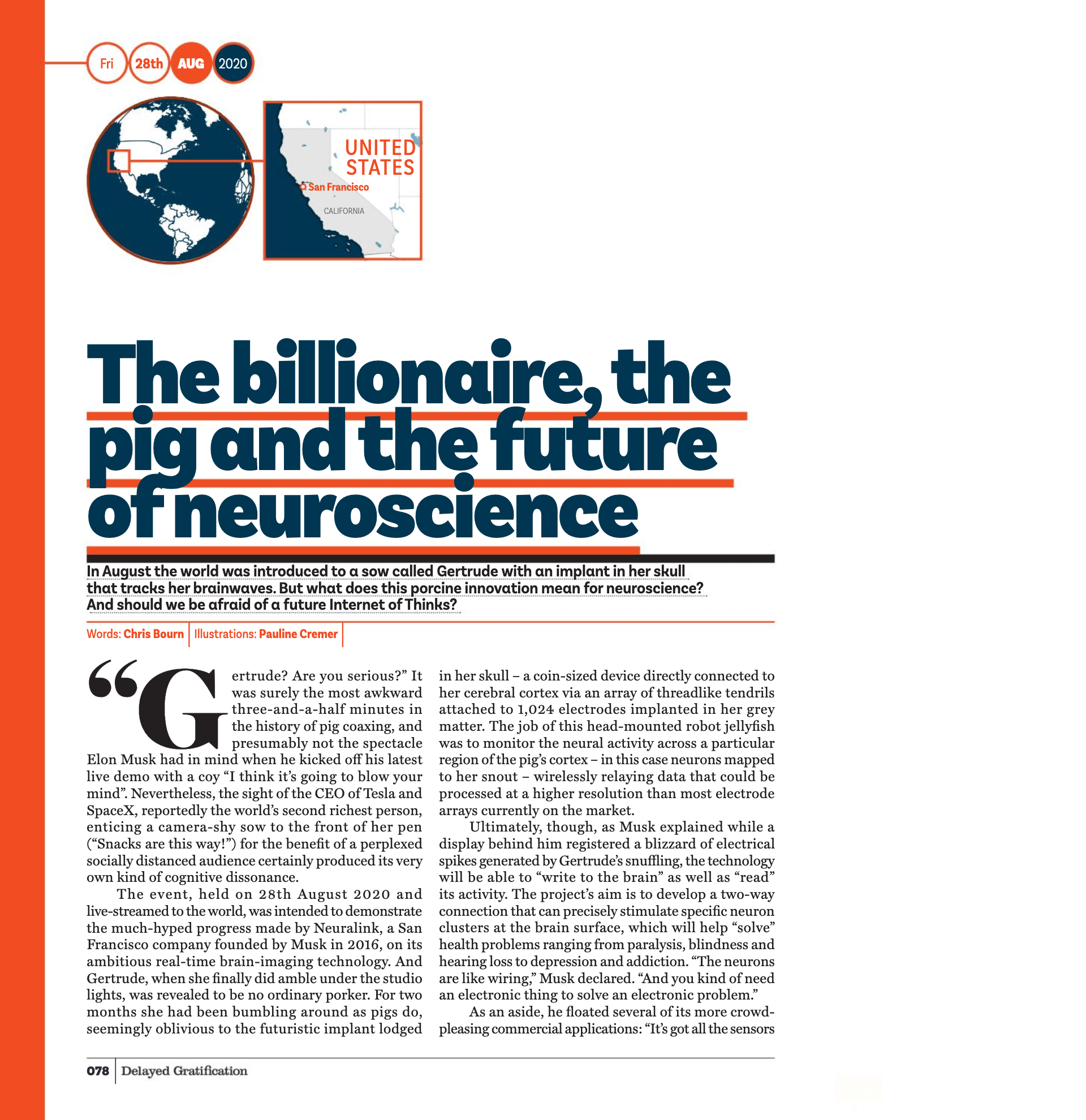
Image credit: Delayed Gratification
Column grid
The next most fundamental is the column grid, the most simple of which is a single column on each page. A single-column grid like this is also called a manuscript grid, because it’s often used for book manuscripts.

A single-column grid, or manuscript grid
You might be wondering, can a single column of text really be called a grid at all? The answer is yes — because grids consist not only of the space where content goes (in this case, a single column), but also the space around it, called margins and gutters.
Jargon Buster
In the context of grid systems, the margin is the space between the edge of the grid and the edge of the page or screen. The gutter is the space between two columns or two rows.
Here’s an illustration of a book with a three-column grid on each page. In the following image, we’ve marked the margins and gutters.

A design with a three-column grid on each page
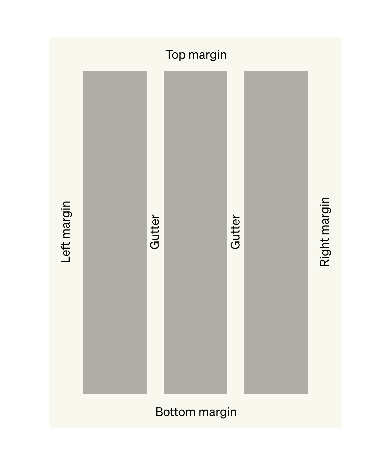
Margins and gutters in a page with a three-column grid
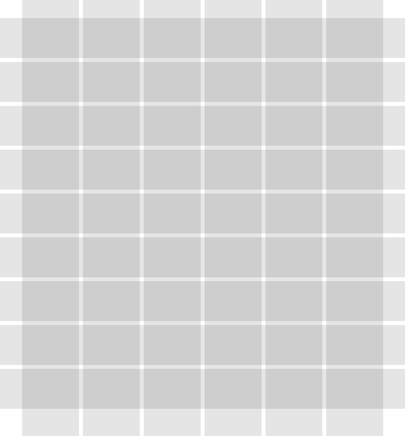
Modular grid
As well as columns, grids can also have rows. Usually, columns are often combined with rows to create what’s called a modular grid.
A “module” is produced wherever rows and columns overlap. In the illustration below, each page has three rows and four columns, producing 12 modules.
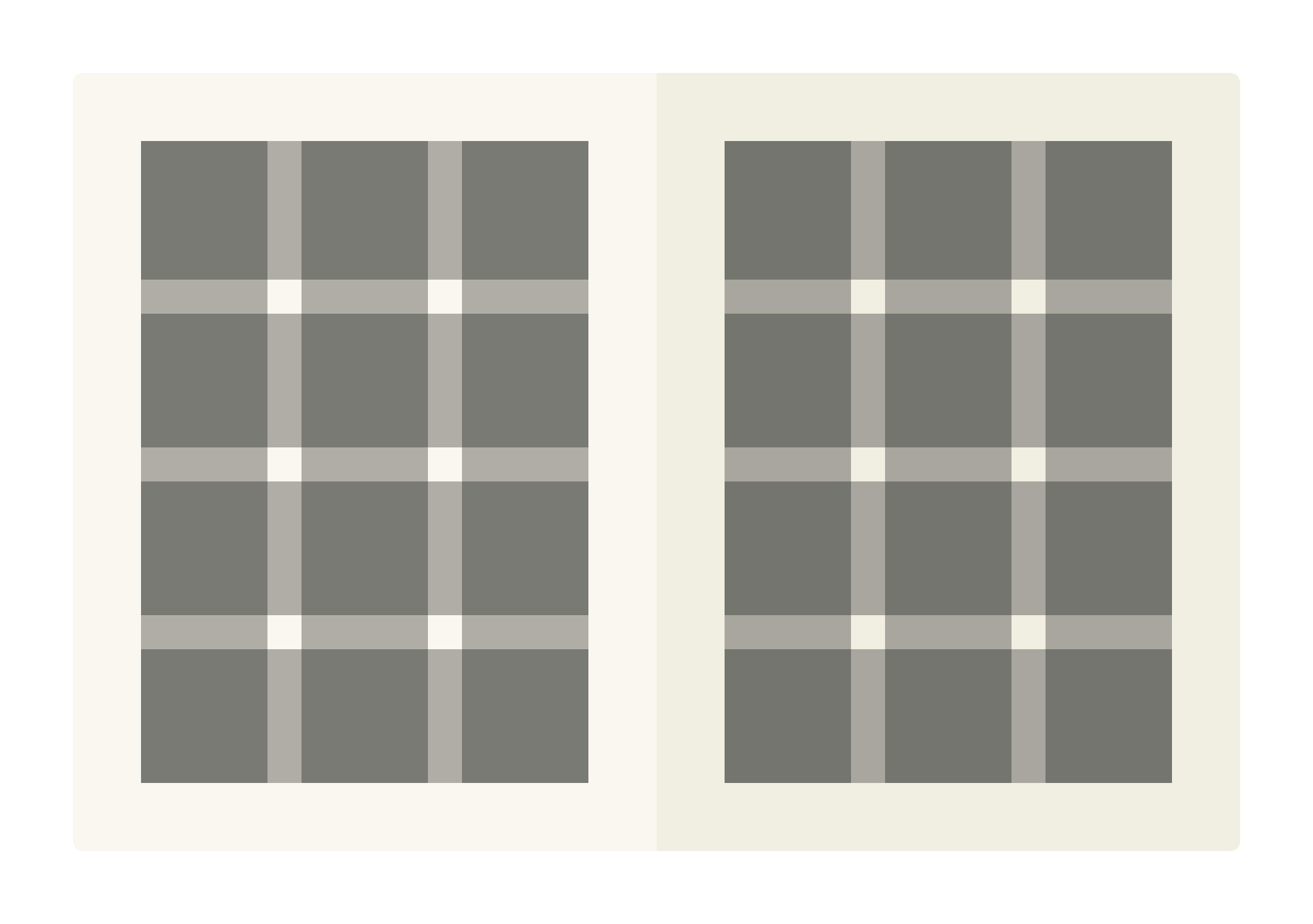
A modular grid
For a couple of reasons, modular grids are more useful in print design than in digital design.
First, in print, there is always a fixed amount of vertical space available — every page has a defined height. But in apps and websites, the amount of vertical space is theoretically unlimited — people could keep scrolling down forever.
Second, in digital design, layout has to be “responsive”, which means re-sizing and re-flowing on different devices and screen sizes. That makes it very difficult to use rows, because we can’t always control how the content will adapt to different devices, or predict how much space it will take up.
Modular grids are especially useful in projects that have mixed content like images, charts, and tables, as well as standard text. They’re often used for things like catalogues, magazines, and posters.
Conversely, modular grids are also useful for making text-heavy projects more visually interesting. They’re therefore also used for things like business reports.
Here’s an example of a modular grid in use in the 2021 IKEA catalogue. It uses six columns and nine rows on each page, creating many thousands of possible layouts.
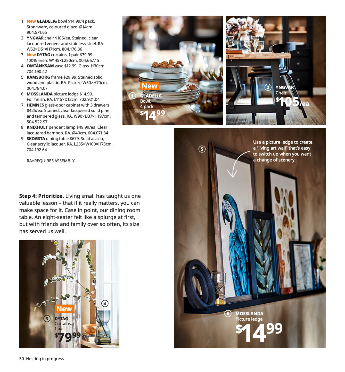
A page from the 2021 IKEA catalogue. Image credit: IKEA
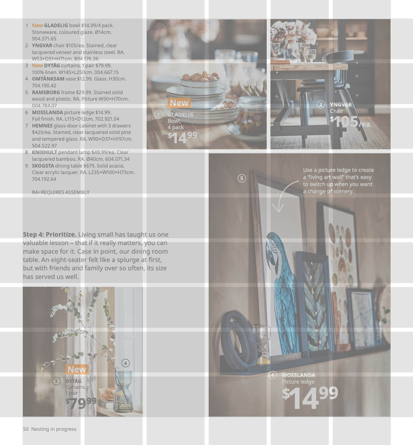
It uses a six-column, nine-row modular grid
The grid viewed separately
Breaking with the grid
It’s important to remember that grids originate in typesetting, because that knowledge can help us to decide when it’s important to stick to a grid strictly, and when we can break away from it (which means, allow certain elements to deviate from the grid, or ignore it completely).
As a general rule, when starting a new project, choose your grid carefully, and ensure that it can meet all of the project’s needs. Then, observe that grid strictly and consistently, but allow the occasional element to be an exception.
For an example of this, look back at that page from the IKEA catalogue and note how that text and graphics overlaid on the photos does not align with the grid. This is a way of creating an attractive contrast between rigidity and flexibility within a design.
In conclusion...
There are a few more advanced types of grid, too, but you can learn about those later. We recommend adding Timothy Samara’s book, “Making and Breaking the Grid” (second edition), to your bookshelf.
In the next assignment, let’s talk about the importance of spacing and whitespace in successful layouts.