Course · Part 4 · Assignment 4
Read ![]()
How to Choose a Font
KeyThree
The key points from this assignment.
- When choosing fonts, always begin with the needs of the project — not with a desired aesthetic
- Use our six-step method as the starting point for your own process
- Be prepared to change your font choices as each project develops
Image credit: Amador Loureiro
Introduction
In the previous assignment, you learned about key typographic terms, and the different categories of typeface.
Now, let’s cover how to choose a font. The six-step process below provides a starting point that you can adapt for each project and customise as your practice develops.
Step 1: Always begin with the needs of your project

Image credit: Jan Kahánek
Particularly if you’re someone who enjoys typography and the diversity of font designs out there, it’s tempting to start with a specific aesthetic in mind, or even to just begin with your favourite typeface.
It’s important that you resist this urge. Being led by an aesthetic makes it more likely that the aesthetic you choose won’t be right for the project you’re working on.
Instead, be led by the needs of the project. That means asking questions like:
- Who will see or use this design?
- What age group is it for?
- What tone does it need to strike?
- What feelings should the design evoke?
- Is it for print, screen, or both?
- If for screen, will it be used mainly on desktop or on mobile?
- Will the font be used for interface copy, body text, or display?
Step 2: Define constraints based on those needs

Image credit: Vlad Sargu
Let’s suppose that the project we’re working on is a medication tracking app for older people who have to remember to take many different medications each day. We might note the following constraints for the project.
- App will be used by older people and their family or carers
- Some older people may have visual impairment
- Some older people may find the use of tech challenging
- The tone of the design needs to be clear, reassuring, calming
- The design is for screen only – for use on tablet computers
- The font will be used for interface text only
These constraints tell us that:
- The font needs to be clear and highly legible
- It should also be friendly, but not decorative
- It’ll be okay to use a font that wouldn’t work well for longer passages of text, because it’s only going to be used for short pieces of interface text
Step 3: Create a longlist of fonts based on those constraints
Image credit: Amador Loureiro
The next step is to create a “longlist” of fonts that might meet the needs of the project. To do this, you can use your existing knowledge of fonts, and add to that knowledge using quality online font catalogues.
Let’s continue with our example. Almost all of the time, it’s best to use sans-serif fonts in user interface design.
This means we can already narrow down our field of possible fonts to the high-level category of sans-serifs — so we can exclude serifs, script fonts, display fonts, monospaced fonts, etc.
That gives us three categories of sans-serifs to choose from: grotesk sans-serifs, humanist sans-serifs, and geometric sans-serifs.
At this point, we can begin hunting for options. Here are some good places to start:
- Google Fonts . This is a very extensive resource of fonts that can be used for free in print, apps, and websites.
- Adobe Fonts . This contains lots of high-quality and classic fonts from established type foundries. You need to have an Adobe subscription to be licensed to use these fonts.
- The fonts you have installed on your computer. Bear in mind that you might need to buy additional licenses to be allowed to use these fonts in apps and websites.
- Type foundries. Buying premium fonts from type foundries can be a great way to find something distinctive and unique, but this is usually the most expensive option.
For this example, let’s just create our longlist from what’s available on Google Fonts. We’re going to filter for just sans-serifs, and then visually browse the list looking for fonts that we think might satisfy the constraints and needs outlined above.
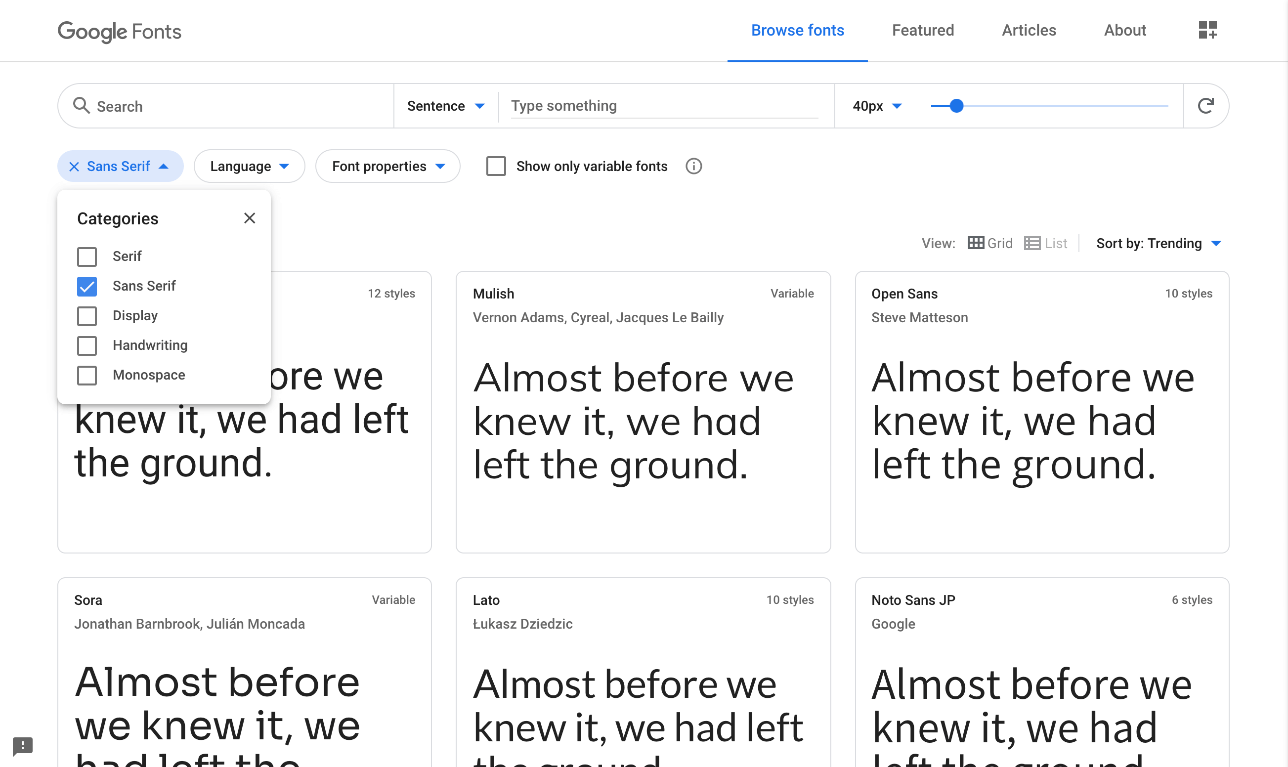
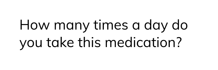
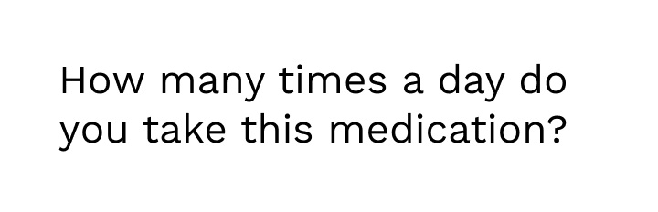
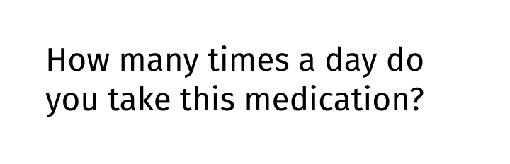
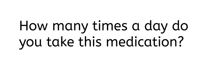
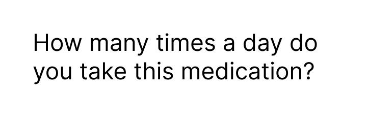
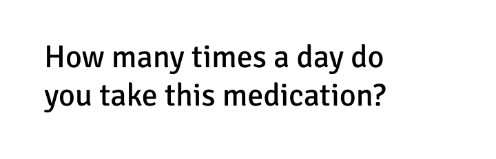
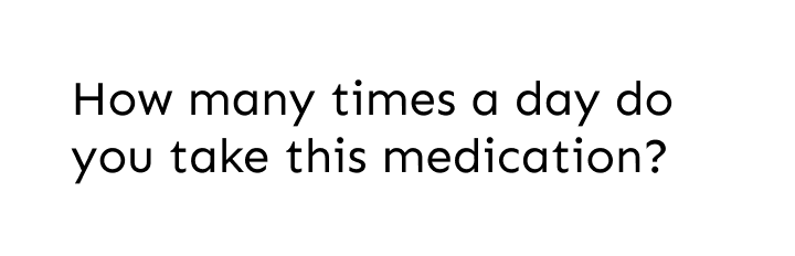
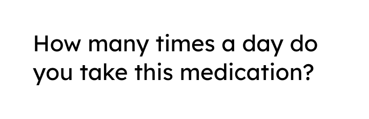
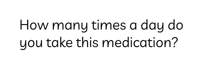
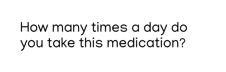
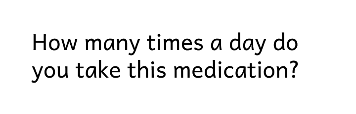
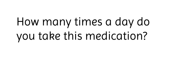
For this task, it can be helpful to add some more meaningful tester text into whichever tools you’re using. We decided to use a sample line from the app interface: “How many times a day do you take this medication?”
It can also be helpful to adjust the size so that it’s similar to how it will be used. The app isn’t designed yet, but we could guess that instructional text in this app might be around 24-32px, so that it’s clear for users to read.
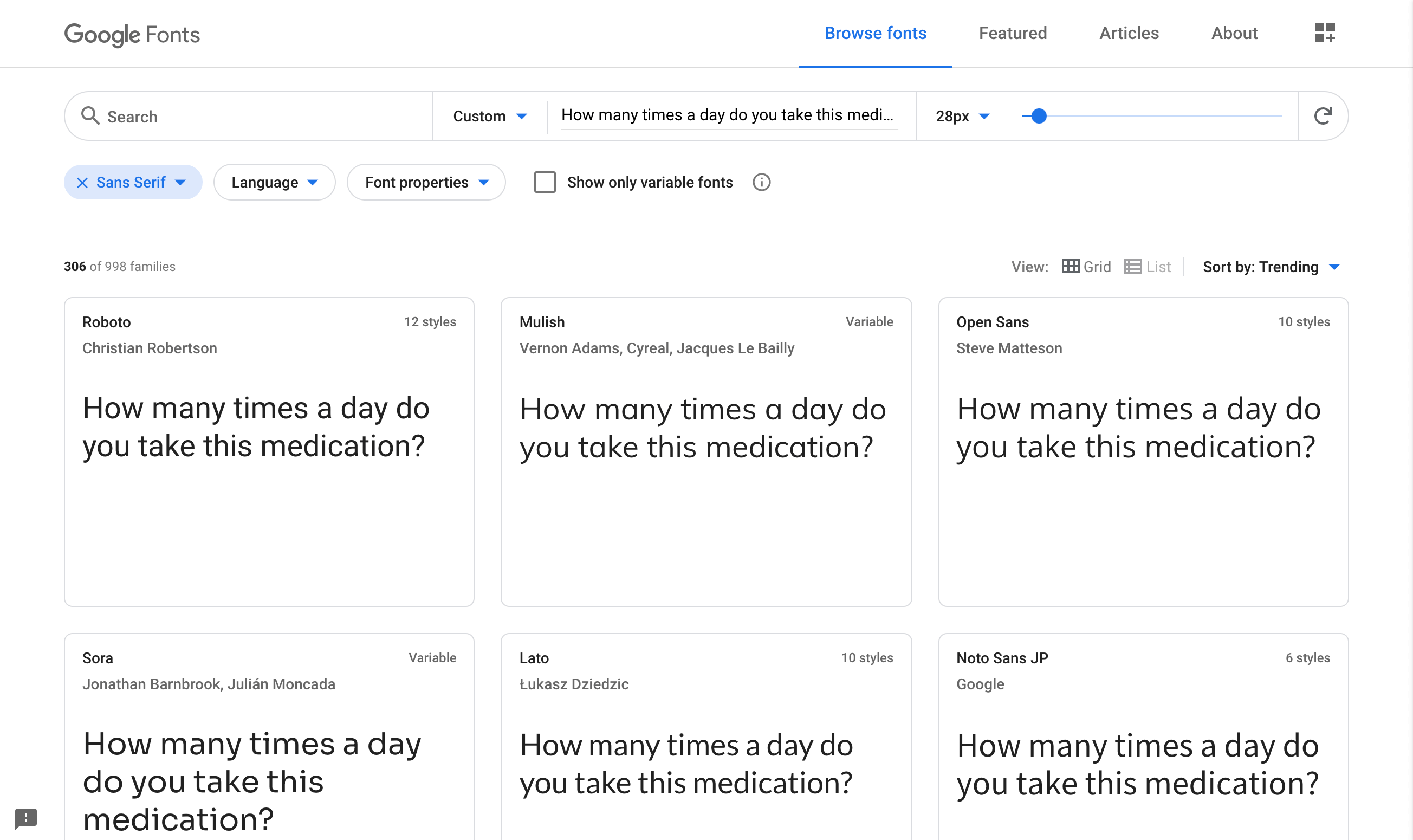
Here’s the longlist. We included fonts that looked particularly clear and friendly, and excluded ones that looked a bit more angular, “system-y”, or austere. We ended up with 16 fonts.
Step 4: Analyse the pros and cons of the longlisted fonts
16 fonts is still a lot of options, so the next step is to look at the strengths and weaknesses of each font in relation to the aims of the project. That will allow us to eliminate some.
Montserrat
Letterforms are quite wide, which might affect legibility. Reject.
Source Sans Pro
Friendly and legible. Keep.
Ubuntu
Friendly but feels a bit too techy. Reject.
Muli
Friendly and legible. Keep.
Work Sans
Friendly but the small counters in the “a” and “e” could affect legibility. Reject.
Fira Sans
Friendly and clear. Keep.
Quicksand

Very geometric, which could feel austerer and affect legibility. Reject.
ABeeZee
Very friendly with subtle hints of handwriting. Keep.
Inter
Clear, but not so friendly, and could feel a bit techy. Reject
Signika
Friendly and clear. Keep.
Sen
The sharp corners are a bit unfriendly. Reject.
Lexend Deca
Pretty geometric, but the thickness means it might still work. Keep.
Livvic
Very friendly, but handwriting style might be too childish. Reject.
Manjari
Geometric but the thickness and soft corners might work. Keep.
Andika
Feels a bit too stylized, which could affect legibility. Reject.
Imprima
Friendly and clear with subtle, grown-up handwriting hints. Keep.
That step has eliminated 8 of the 16. One thing that came through is that very geometric sans-serif fonts generally didn’t seem such a good fit — seeming quite technical and not as friendly as other sans-serifs.
The evaluation at this stage is also quite subjective: what feels unfriendly to one person might feel more friendly to someone else. You’ll rarely have the resources to focus-group font choices, so don’t worry too much about subjectivity; there are usually many different right answers in design decision-making.
If you’re struggling to eliminate typeface options in a professional project, ask a design colleague on your team or in your network for a second pair of eyes. The more times you go through this process, the more easily you’ll trust your own judgements.
Step 5: View the shortlisted fonts in a more realistic setting
The purpose of this step is to create a simple mockup of the device where the font will be used, so that we can get more of a feel for how each font would look once applied.
This is also an opportunity to look at each font in more detail. In our example, we’ll need to use numbers a lot, so we can take the chance to evaluate how the numbers in each font are performing visually.
When you’re designing for a website, app, or other digital interface, the performance of the font is especially important. You could even consider doing some user testing to get feedback on your shortlist.
Finally, if you’re choosing from Google Fonts, you can easily test out your shortlist in Figma, because the app loads Google Fonts automatically.
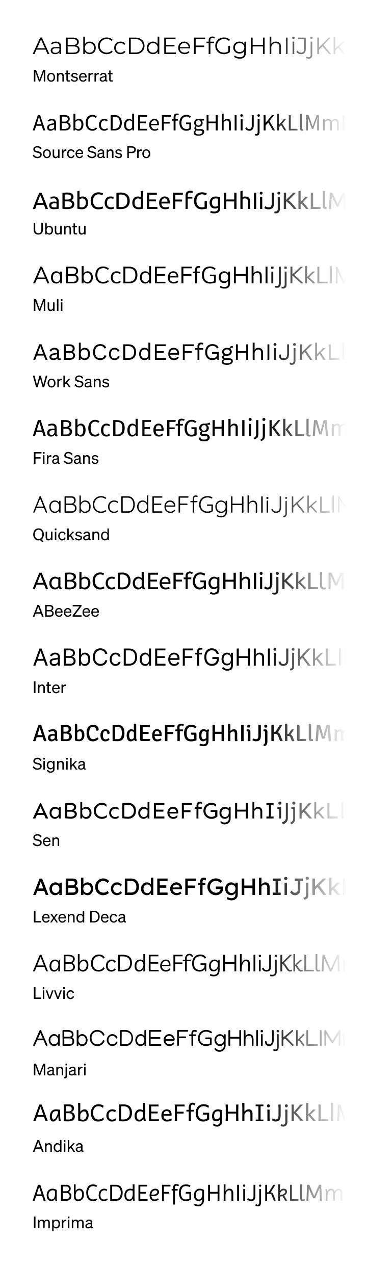
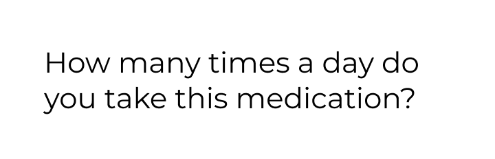
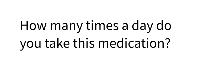
Here’s a simple tablet mockup of our eight remaining options:
Source Sans Pro

Muli

Fira Sans

ABeeZee

Signika

Lexend Deca

Manjari

Andika

Step 6: Choose an option
Mini-challenge
If you want an extra challenge, spend 5 minutes reviewing the tablet mockups above and think about which font you would choose and why. If you’re finding it hard to choose, try to narrow it down to two or three.
You can click below to see our notes and find out which one we went for.
Example solution
We chose ABeeZee:
We felt that this font was very clear and easy to read. It has hints of handwriting, for example the finial on the bottom-right of letters like a, d, and u — but the handwriting style is very subtle, which means it still feels grown-up and appropriate to the demographic. Another strong contender was Andika, but letters like the lowercase k made it feel a bit too childish.
We rejected some fonts because they felt a bit too sharp and pointy (Lexend Deca and Manjari, for example). Others felt a bit too impersonal (like Source Sans Pro and Fira Sans) — more suited to signage than a conversational interface.
The final thing to say is that there are usually many “right” answers when choosing a font. Any of the eight options we identified in Step 5 would work. And by broadening out your search beyond Google Fonts, you might be able to discover some even stronger font choices for this project.
In conclusion...
Choosing the right font is just one ingredient in using type effectively. In the next assignment, let’s cover how to use font size, weight, and spacing to support your font choices.