Course · Part 4 · Assignment 5
Read 
Working With Type
KeyThree
The key points from this assignment.
- Working with type isn’t just about choosing fonts well — it’s also about using them well
- Size, style, weight, letter spacing, line spacing and line length all help create structure, hierarchy, and emphasis
- If in doubt, keep things simple!

Image credit: Jamie Street
Introduction
As designers, we can spend hours, days, weeks, or even months choosing the right typeface for a project. But to get the best results, we also need to make good decisions about how we use that font.
In this assignment, we’ll cover how text size, font weight, tracking, kerning, line spacing, and line length all contribute to the effectiveness of a font choice.
Font size
In the digital age, text can be set to any size. The versatility of digital type is great, but the range of choice can also make it more difficult to understand and observe best practices. Here are are a few rules of thumb to help you get started.
Font size in print design
In print design, font sizes are usually measured in points.
Jargon Buster
Point size is an imperial unit of measurement used in typography. One point is equivalent to 1/72 of an inch, or 0.3528 millimetres. Although it’s still widely used in print design, in digital design fonts are often now measured in pixels.
Sometimes using small text is unavoidable, but it should be an occasional exception, not the rule. For body text in print, aim to meet the CNIB Clear Print guidelines , which require text size to look at least as big as 12-point Arial.
Note that fonts with a larger x-height can be set at a smaller point size and still be optically equivalent. For example, 11pt Verdana looks about the same size as 12pt Arial.
Conversely, fonts with a smaller x-height need to be set to a larger point size. For example, for Mr Eaves to look like 12pt Arial, it needs to be set to 14.5pt.
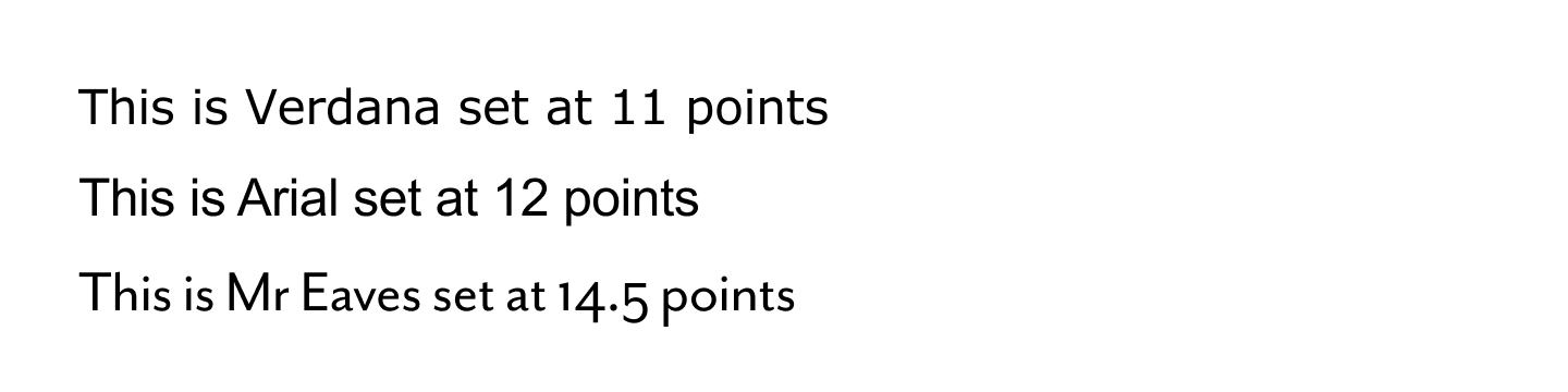
Optically equivalent point sizes in different fonts. (These sizes will be similar to actual point size in print if you’re viewing this site on most laptops or on an external monitor.)
Small text in print
There are some types of document or project that necessitate the use of small text. An obvious example is, of course, the printed newspaper. The traditional size of newsprint is 8 points — if space is at a premium and you have to use small text, treat this as the absolute minimum.
Something else you can do to make small text as accessible as possible is to choose a font that has a large x-height. Remember, that means a font where the lowercase letters are quite tall relative to the uppercase letters.
An excellent example of a serif font with a tall x-height is Tiempos, which you can see below. Note how close the x-height is to the cap height. This means that the text will appear to be much bigger than its point size, and will remain legible at small sizes.
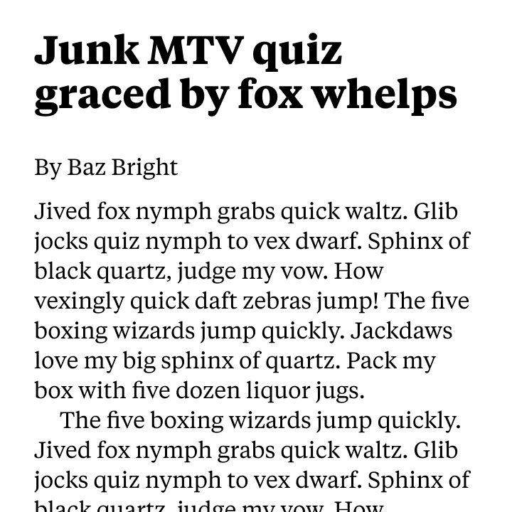
Tiempos Text
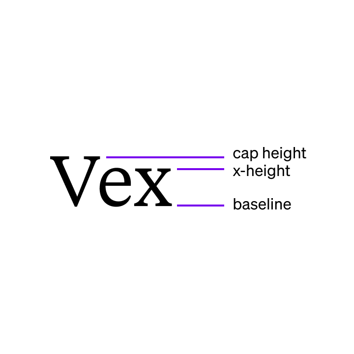
Tiempos’ x-height is close to its cap height
Font size in screen design
In screen design, font sizes are usually measured in pixels.
Jargon Buster
Pixel size is a unit of measurement used in digital design. As a measurement, one pixel used to correspond to one pixel on someone’s screen. Today, high-definition screens are in use. For those screens, one “traditional” pixel will be mapped onto a grid of either 2-by-2 (“2x”) or 4-by-4 (“4x”) pixels.
Here’s an illustration that shows how text set to 16px size maps to physical pixels on regular (1x), high-definition (2x) and ultra-high-definition (4x) screens.
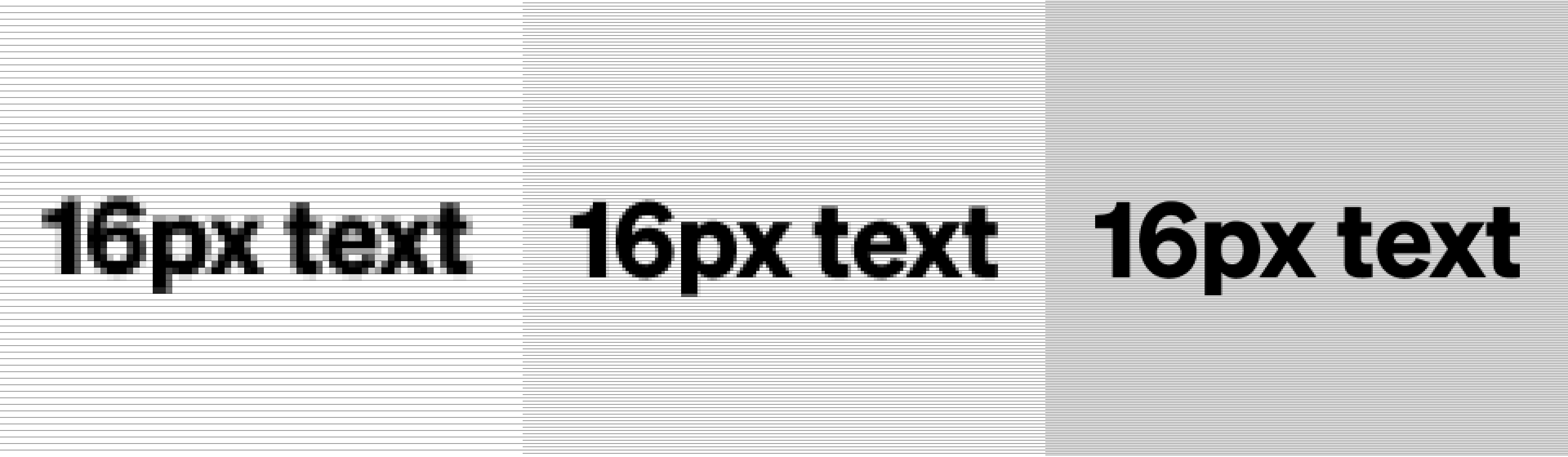
A zoomed-in view of 16px text on standard, HD, and UHD screens.
Open image in new tab
When it comes to designing for screens, Web Content Accessibility Guidelines (WCAG) do not currently define a minimum body text size, but a minimum font size of 16 pixels is widely practised in the industry.
Unlike the printed page, websites and apps allow people to scroll. This means that there are no technical constraints on the vertical space available for on-screen text.
Therefore, particularly in text-heavy projects where reading is the main focus, it is a good idea to make the font larger if possible — try experimenting with body text between 18px–24px.
The text you’re reading now is set at 21px on desktop, and 19px on mobile.
Using font size to create visual hierarchy
Generally, headings work well when they’re a bit bigger than body text, because this lifts them up the visual hierarchy of the page. If, for example, you’re designing a report, the text might have sub-sections and sub-sub-sections. For that, you can create different heading styles that use different sizes. For example:
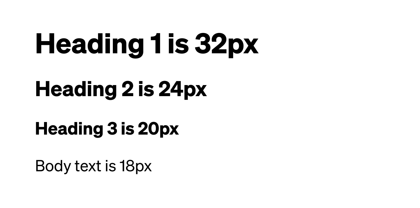
Create hierarchy using different heading styles
Font weight
As well as choosing appropriate font sizes, another key tool when working with type is choosing the right weight and style.
Weight refers to the thickness of the strokes that make up each letter. Most typefaces have at least a “regular” weight and a “bold” weight. Larger font families include a wide range of weights, ranging from “extra light” to “extra heavy”. You may have seen some of these terms in your font menu before:
- Hairline
- Thin
- Extra Light
- Light
- Regular
- Book
- Medium
- Semibold
- Bold
- Extra Bold
- Heavy
- Black
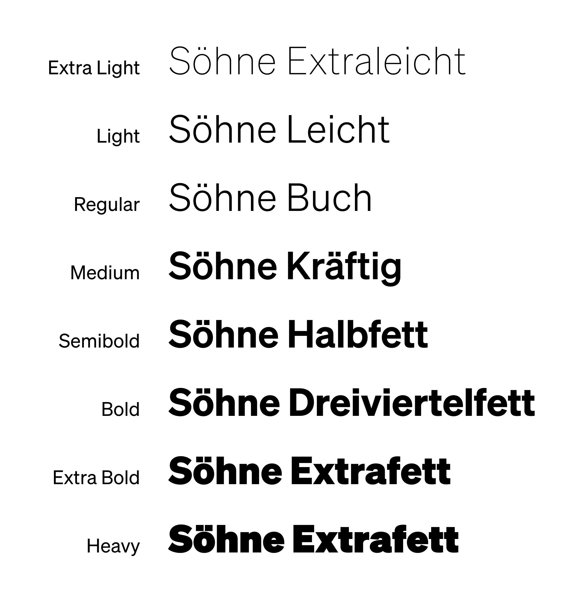
The exact weights available, and how they’re named, vary from typeface to typeface. For example, Söhne, one of the fonts we use on this site, has eight weights:
The purpose of using different font weights is to create hierarchy and emphasis.
- Heavy text can be used for headlines to create a high-impact, “shouting” effect
- Both bolder and lighter weights can help differentiate headings from the surrounding text
- Bold text can be used to highlight key words or phrases, as we do throughout this course
- Body text should almost always use a regular or book weight for ease of reading
Tracking and kerning
Tracking (the spacing between all letters in a stretch of text) and kerning (a spacing adjustment between two individual letters) can make or break the appearance of a typeface.
Tracking
If you’re using a high quality font, there should be no need to adjust the tracking on body text. You might, however, want to make tracking adjustments for the following:
- Headlines and headings. Sometimes the default tracking can leave too much space between letters when a font is used at larger sizes.
- Small text. This often benefits from slightly expanded tracking, both on screen and in print, because it helps the reader distinguish letterforms and word shapes.
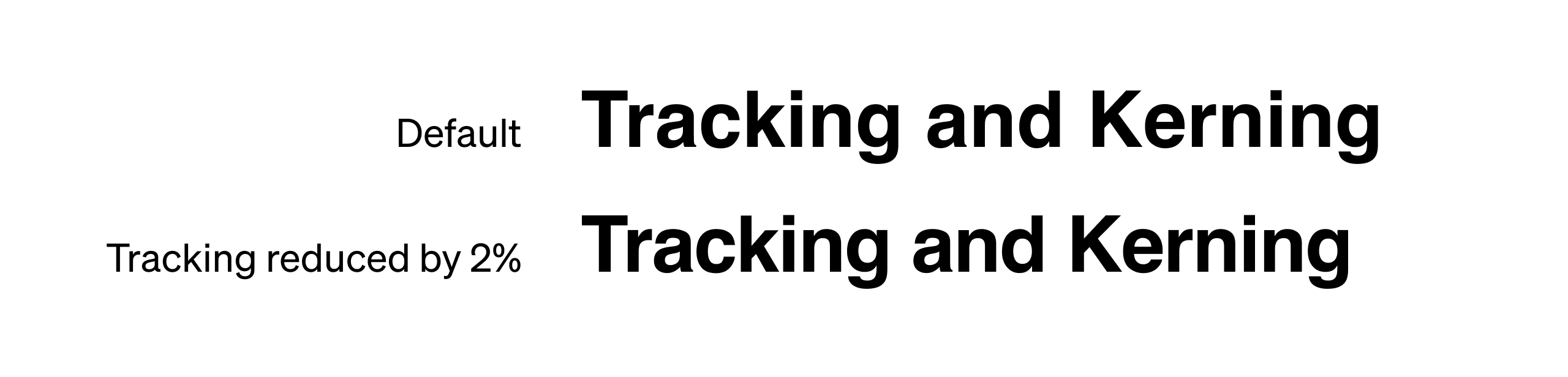
As you experiment with tracking, be aware that even the smallest tracking adjustments have a big impact on the appearance and legibility of text. Tracking is definitely a case of “less is more”. Here’s an example of the impact of just a 2% tracking reduction in Figma:
Always make sure that you’re happy with your tracking settings before starting to kern text.
Kerning
The amount of manual kerning you need to do depends on the tracking you’ve chosen, the quality of the typeface you’re using, and the number of “kerning pairs” included with that font.
Jargon Buster
When type designers create fonts, they can save kerning pairs within the font file. Each kerning pair is a bit of information that tells your computer how much space to put between specific letter pairs wherever they occur. For example, a type designer might create a kerning pair for “ko”.
If kerning pairs are not included, or if the default kerning of the font you are using is poor, you’ll need to kern those letter pairs manually.
In general, manually kerning long stretches of text is impractical and shouldn’t be attempted. However, it’s more realistic to kern headlines, headings, and other lines of larger or more prominent text.
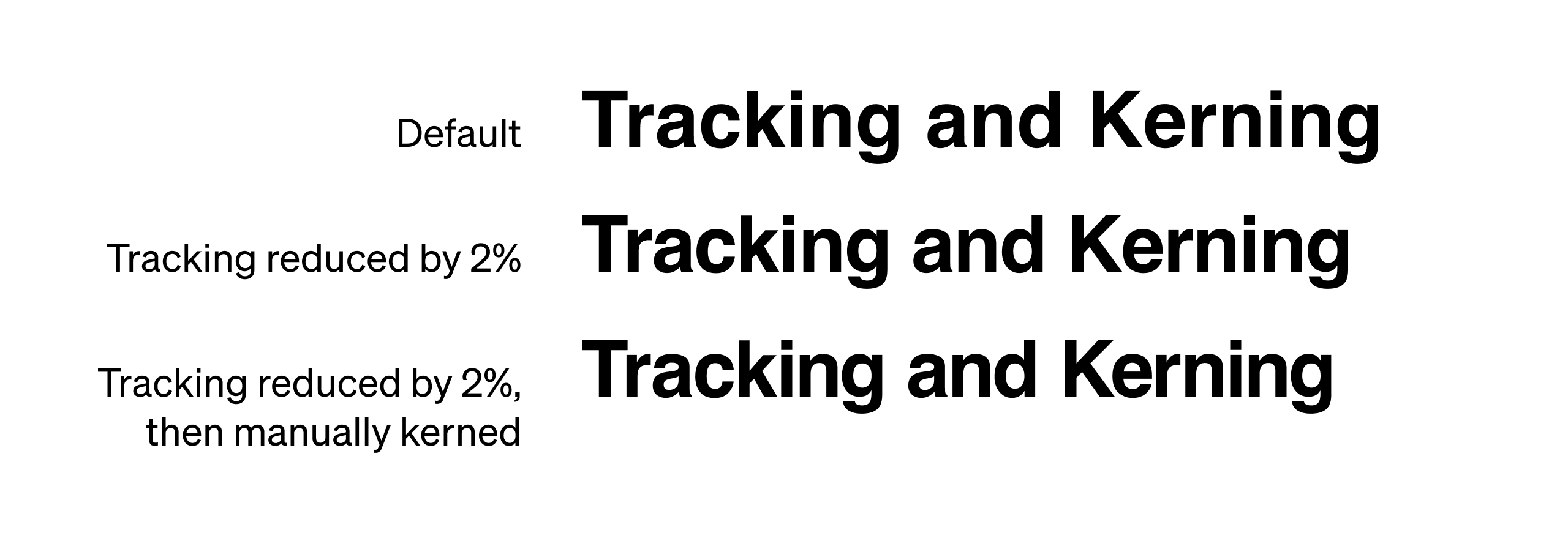
The goal of kerning is to regulate the amount of negative space between letters. Here’s manual kerning applied to the previous example:
You can practise your kerning using the free Kerntype game!
Line spacing and line length
A font is more than just a set of letterforms, and the success of a font choice can often be determined by the decisions surrounding it, including line length and line spacing.
In print, aim for 135% line height (for example 12pt Arial with a 16pt line height). On screen, WCAG recommends a minimum of 150% line height (for example 16px Arial with a 24px line height).
In terms of line length, aim for a maximum of 12-14 words per line for print, 10-12 words per line for large screens, and around 8 words per line for mobile. Keeping lines short means that the eye can easily travel back to the start of the next line.
A brilliant font like Helvetica can feel clean and elegant if it’s given space to breathe. But if you stick to default margins and line spacing, it’ll feel oppressive and claustrophobic instead.
Here’s 14px Helvetica with 14px line spacing and narrow margins:
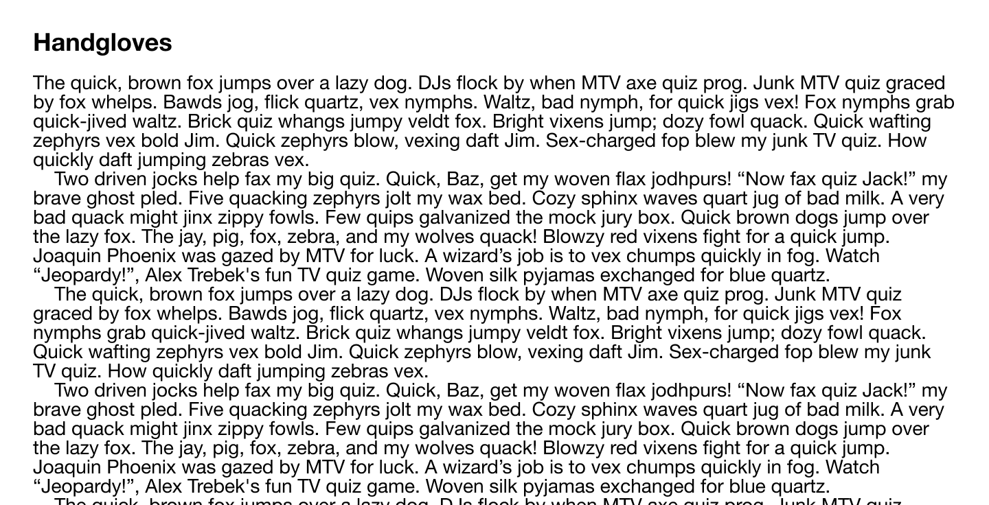
A passage of text with too many words per line, and too little line spacing
And here’s 14px Helvetica with 21px line spacing and generous margins:
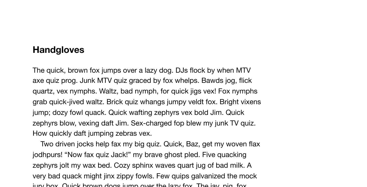
Adjusted to reduce line length and expand line spacing
In conclusion...
When choosing a typeface for a project, remember the power of all the factors covered in this assignment — text size, font weight, tracking, kerning, line spacing, and line length.
In the next assignment, let’s stick with fonts, and run through ten typography tips!