Course · Part 5 · Assignment 19
Practise ![]()
Analyse an Editorial Design
![]() Time limit: 1 hour
Time limit: 1 hour
Remember to use your visual timer! We recommend the inventor’s iOS and Android apps — just search for “Time Timer” in the app store.
Explanation
In this assignment, you’ll analyse why and how the magazine feature below works, and identify as many details as you can about its design.
Instructions
Analyse this magazine feature
 Set your timer: 50 minutes
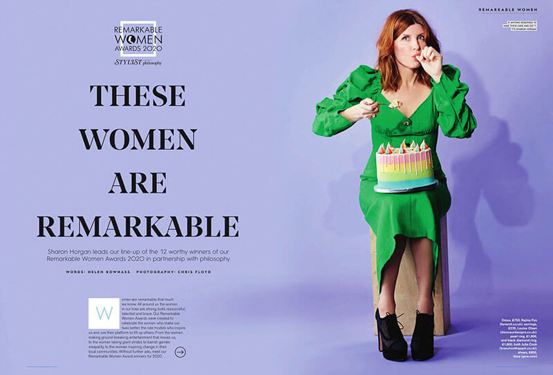
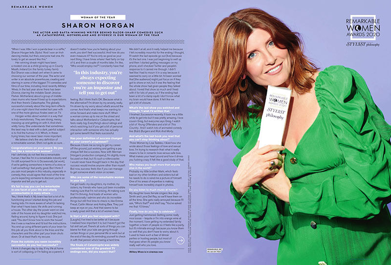
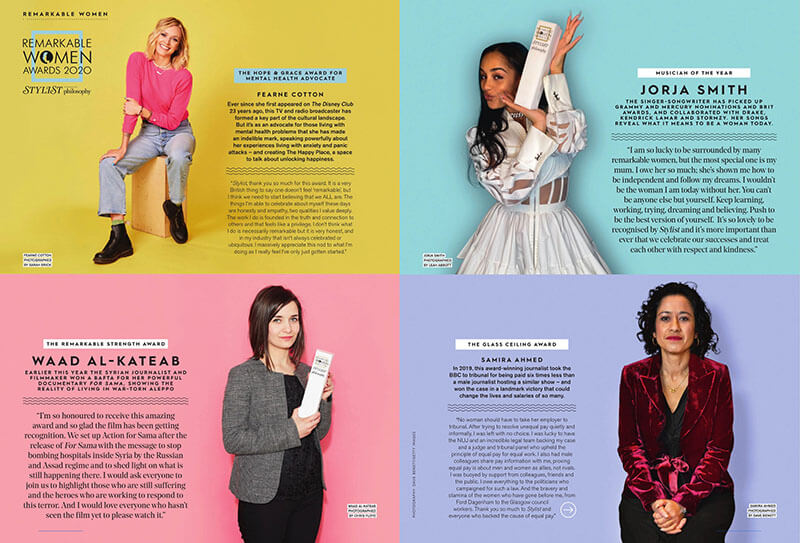
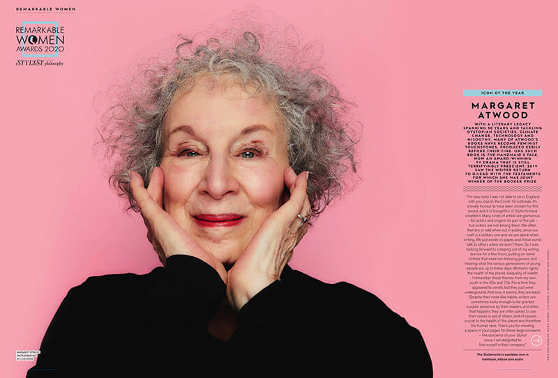
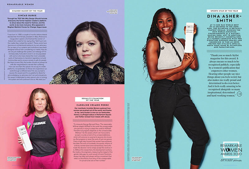
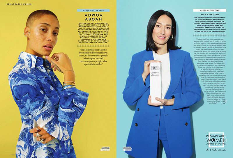
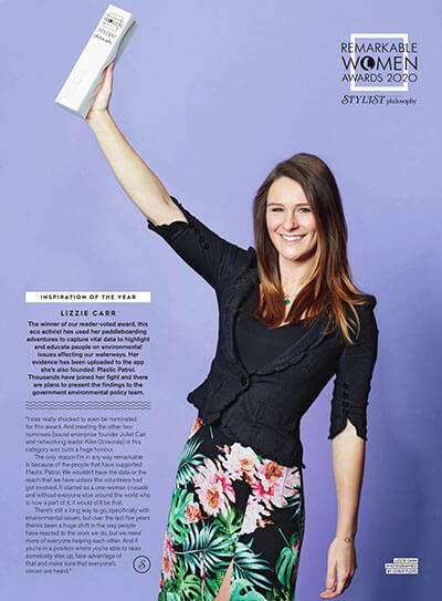
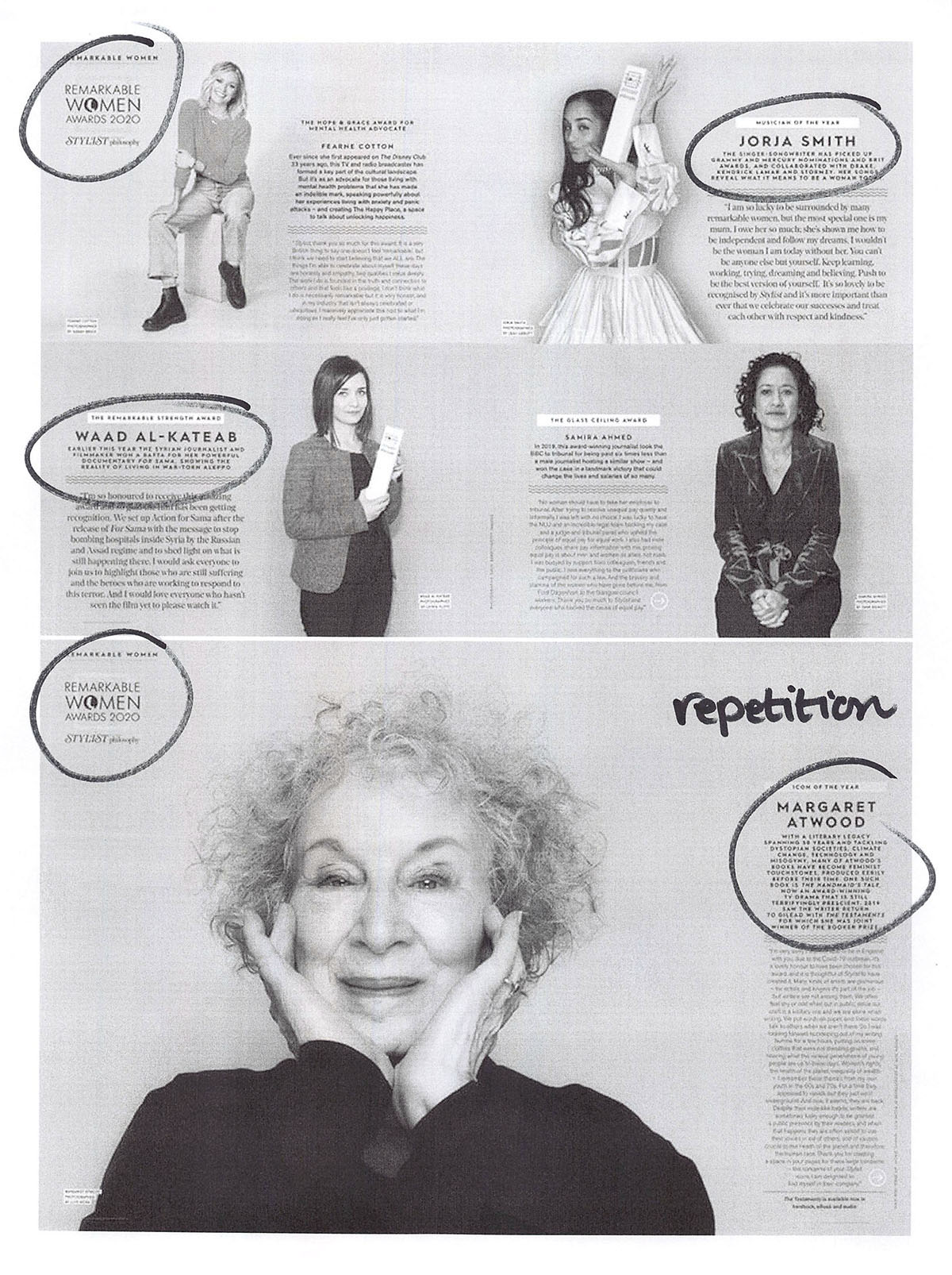
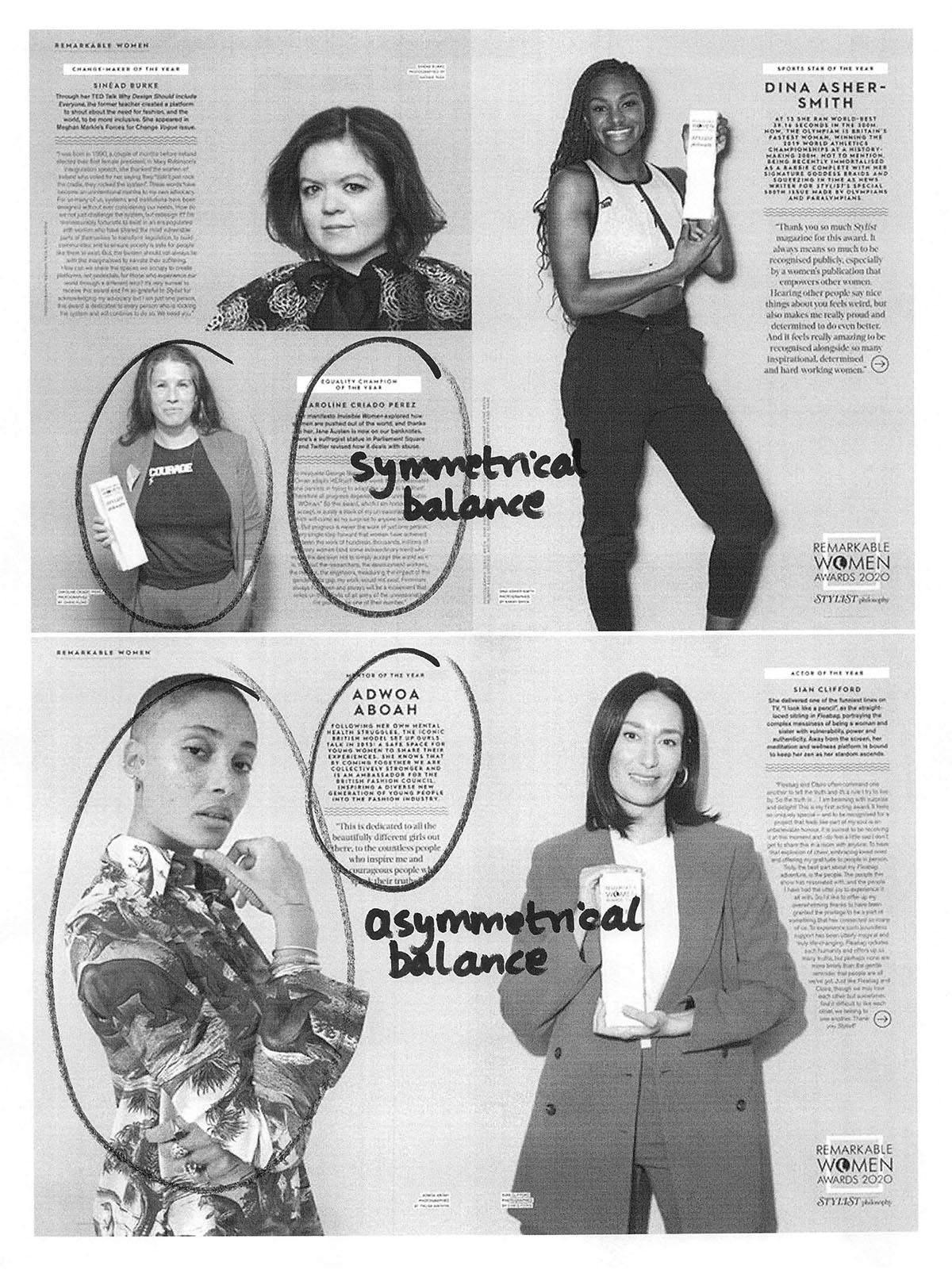
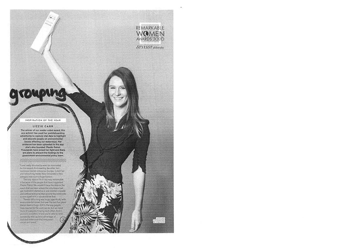
Study the spreads below from a feature in the UK fashion magazine, Stylist. The images are deliberately at a low resolution to help you focus on the graphic design of the feature, rather than the text.
Thinking about what you learned in the last few assignments on editorial design, and also about the visual principles you covered in Part 2, make as many observations as you can about how these spreads have been put together.
There’s a “Tips” section below, but try not to use it unless you get stuck — this is all about improving your own design eye through careful analysis of what’s in front of you.
Tips
Here are some prompts in case you get stuck:
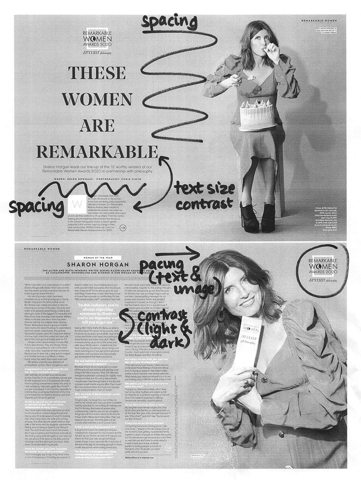
- Try to find examples of each of the visual principles we covered in Part 2. Here they are again: proximity and grouping; visual hierarchy; spacing; alignment; contrast; balance; repetition and consistency; and pacing
- How does this magazine feature use text and typography?
- What kind of colour palette does it use?
- How does this design create consistency between the different photos?
- What do you think is the strongest feature of this layout?
- Is there anything that you think could be improved, or approached differently?
Review the example solution
Once you’ve completed your work on this assignment, take a few minutes to review the example solution below.
Example solution
See below for our annotations about how this feature uses visual principles.
In addition to that, notice how the different background colour of each section helps to form that content into a distinct visual group. The design also uses a rectangular colour palette (meaning it forms a rectangle on the colour wheel): yellow, purple, blue, green.
In conclusion...
Next, let’s begin the next guided brief!