Course · Part 5 · Assignment 31
Read ![]()
Infographics
KeyThree
The key points from this assignment.
- We suggest distinguishing between data visualisations and infographics
- Infographics are designs that combine multiple visualisations into a single layout...
- ...or which present simple information in an illustrative way
Image credit: Baseline Team
Introduction
Although the terms “data visualisation” and “infographic” are often used interchangeably, we’re going to use “infographic” more specifically to refer to the following:
- Designs that combine multiple data visualisations into a single layout
- Designs that present information primarily through illustrations
The distinction is a bit arbitrary, but it can provide us with more precise language when discussing information design projects.
This short assignment covers some examples of common infographic conventions that can inspire your own designs.
Examples of great infographics
This infographic by Reuters combines a map and copy with scale illustrations of the mountains of plastic bottles we use.
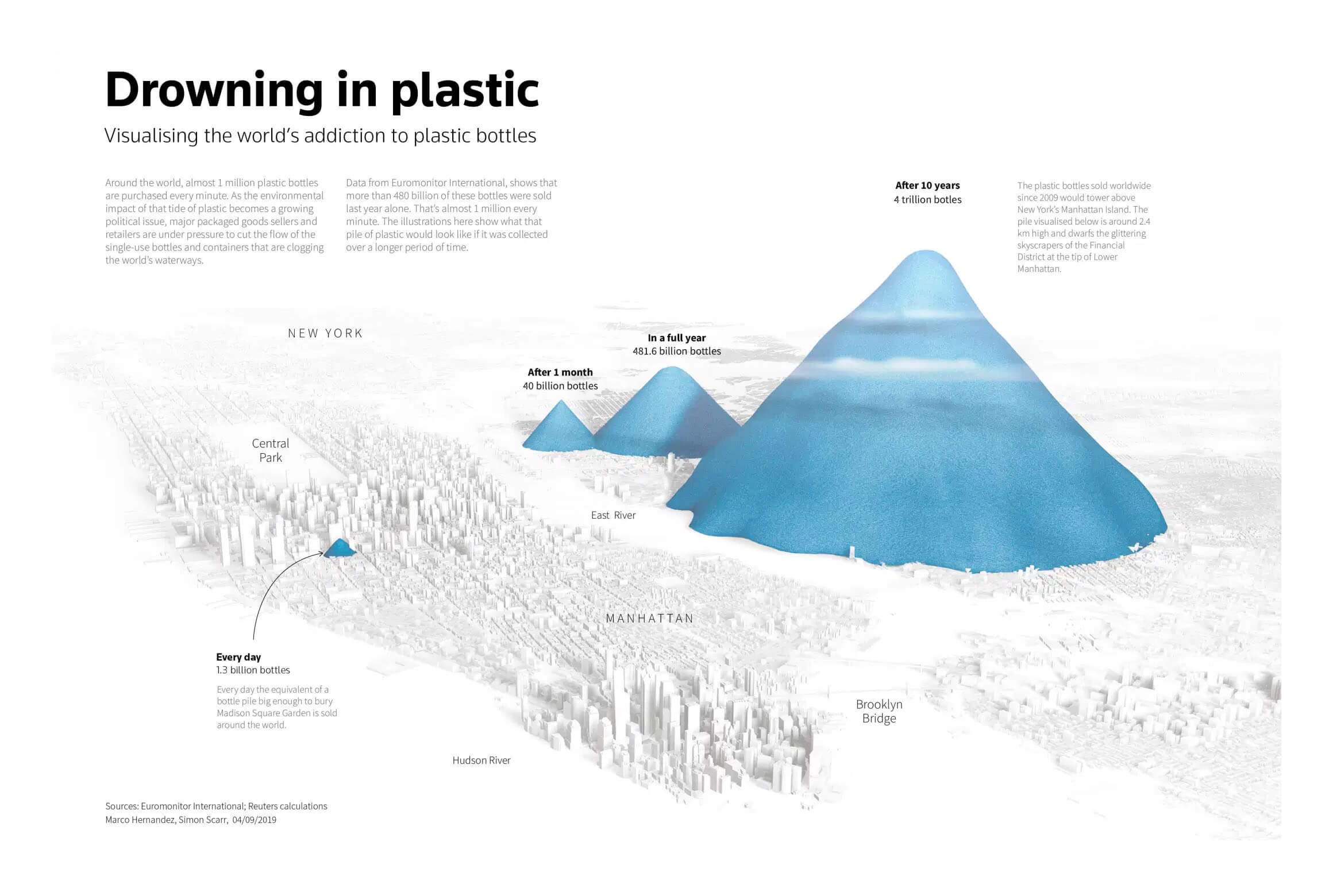
Image credit: Reuters
Here, the American Stroke Association presents key information about stroke and how to respond when someone is experiencing one.
Note how the supportive illustrations — combined with the graphical use of typography for the headline numbers and the “F.A.S.T.” mnemonic — give the information more impact and memorability than it would have as text.
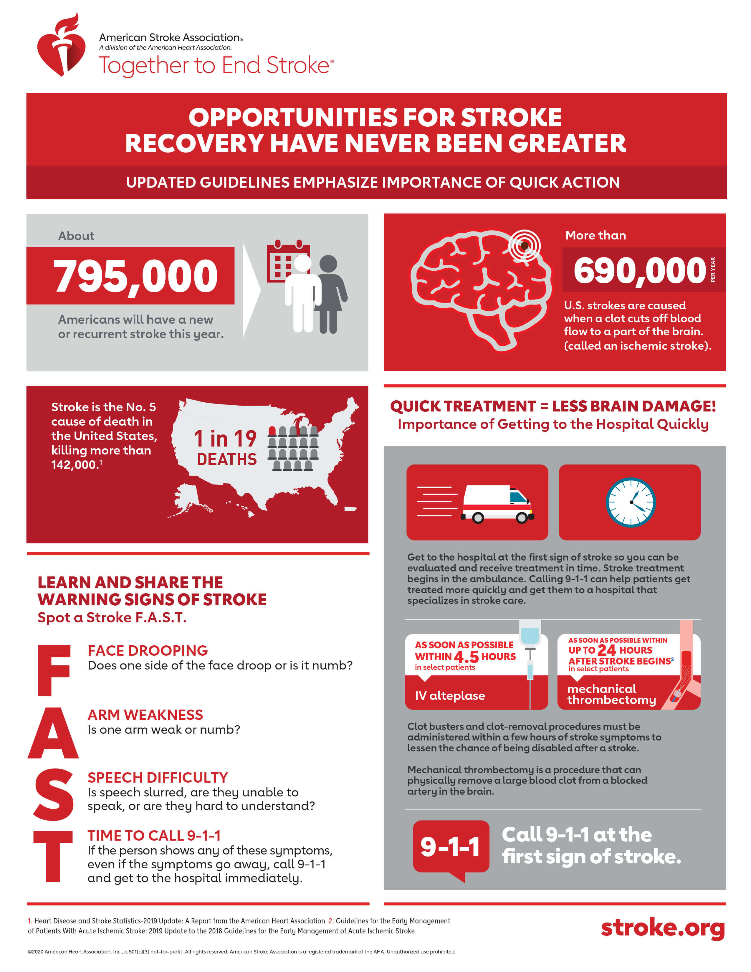
Image credit: American Stroke Association
In this centre-fold infographic about the 2012 Olympic Games, The Guardian combines many separate data visualisations with photographs, illustrations, and copy.
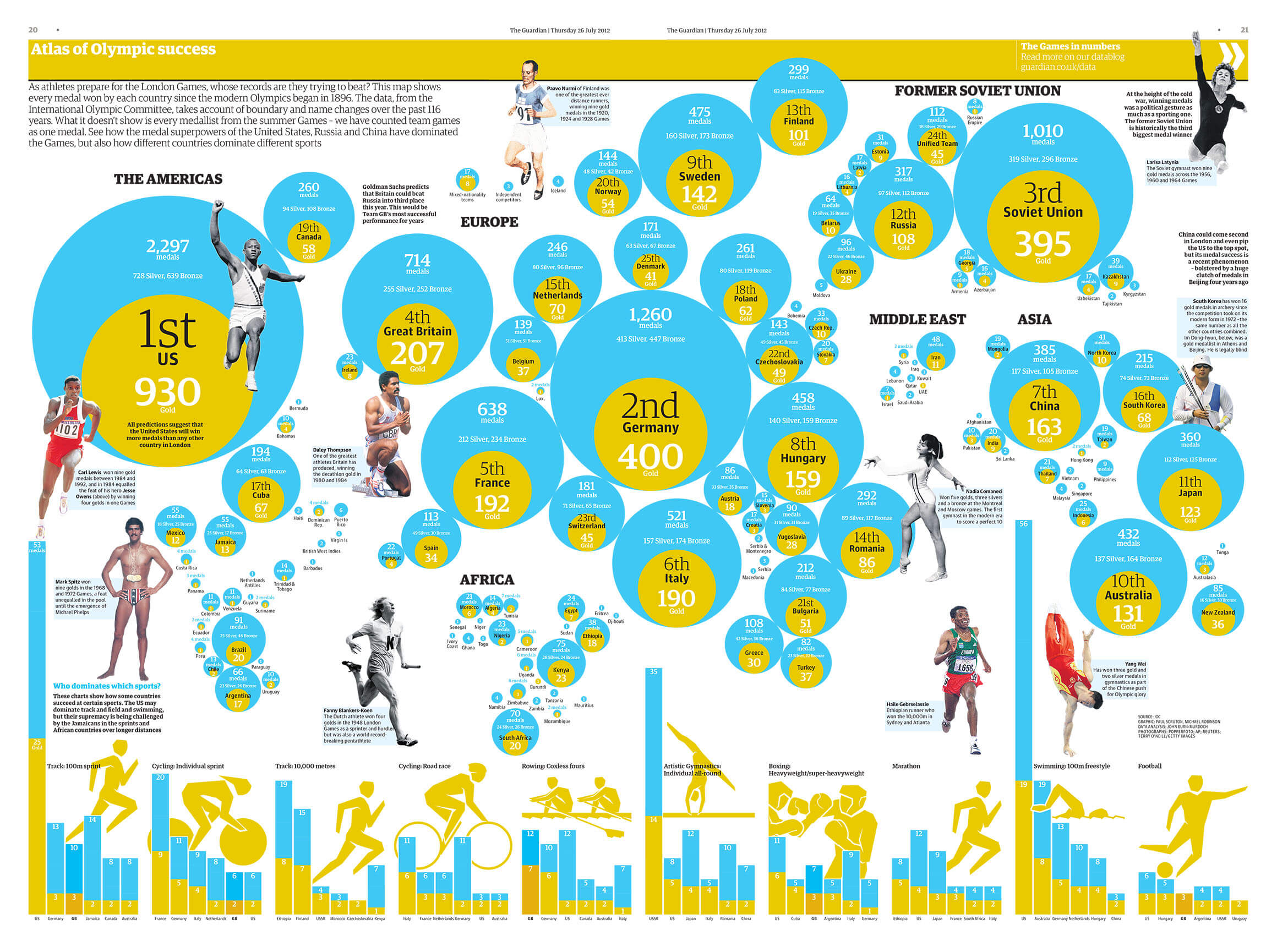
Image credit: The Guardian
The European Centre for Disease Control and Prevention issues this infographic to update people on the progress of SARS-CoV-2 vaccination in EU/EEA countries.
Notice how, although the data visualisation itself is formed of simple horizontal bar charts, the infographic also includes simple illustrations to aid understanding at-a-glance, as well as a QR code and a clear indication of the date when the graphic was last updated.
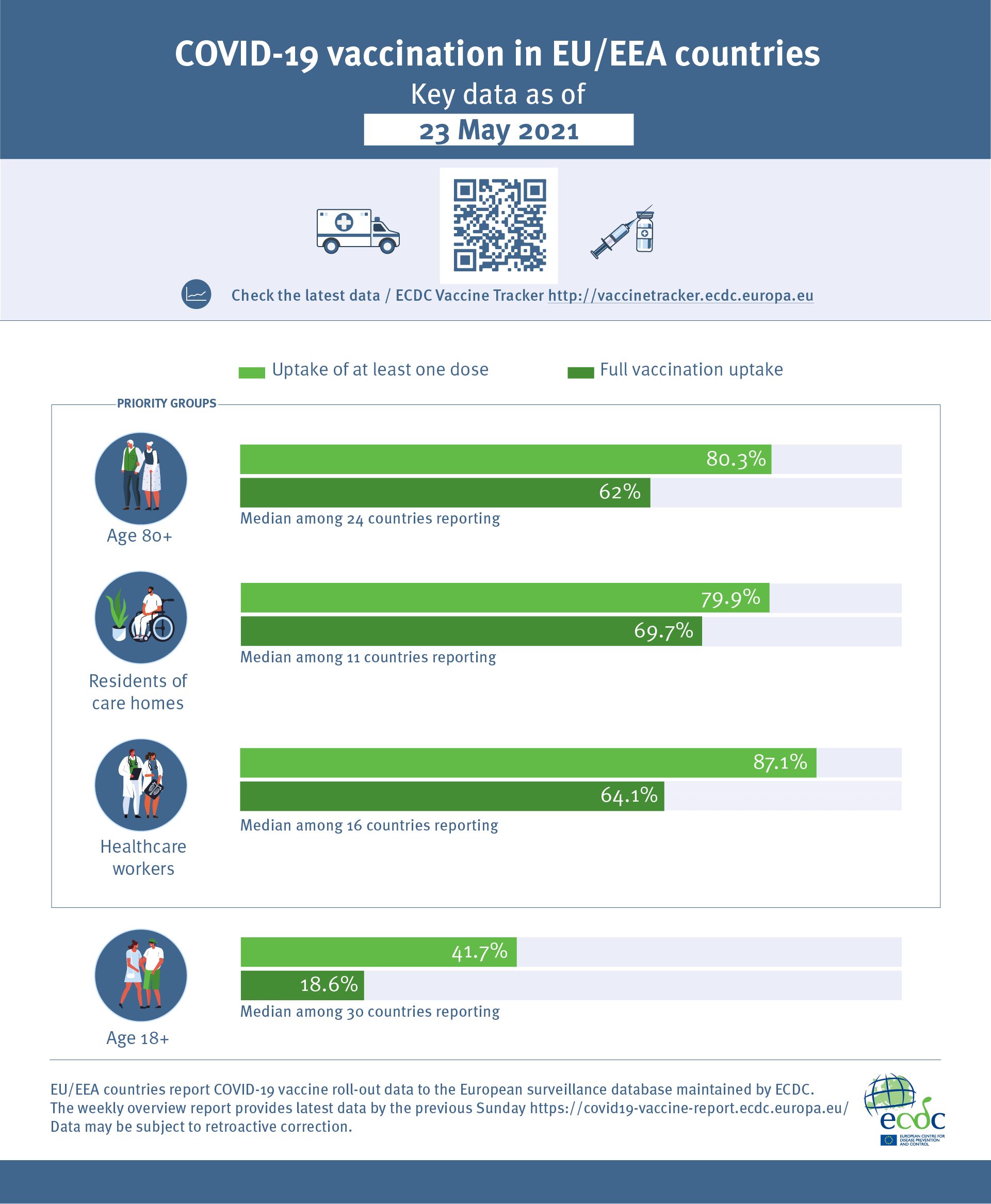
Image credit: European Centre for Disease Control and Prevention
In this page from Oatly’s 2018 Sustainability Report, the company combines text, illustrations, and data visualisations to present the ecological benefits of oat milk over cow’s milk.
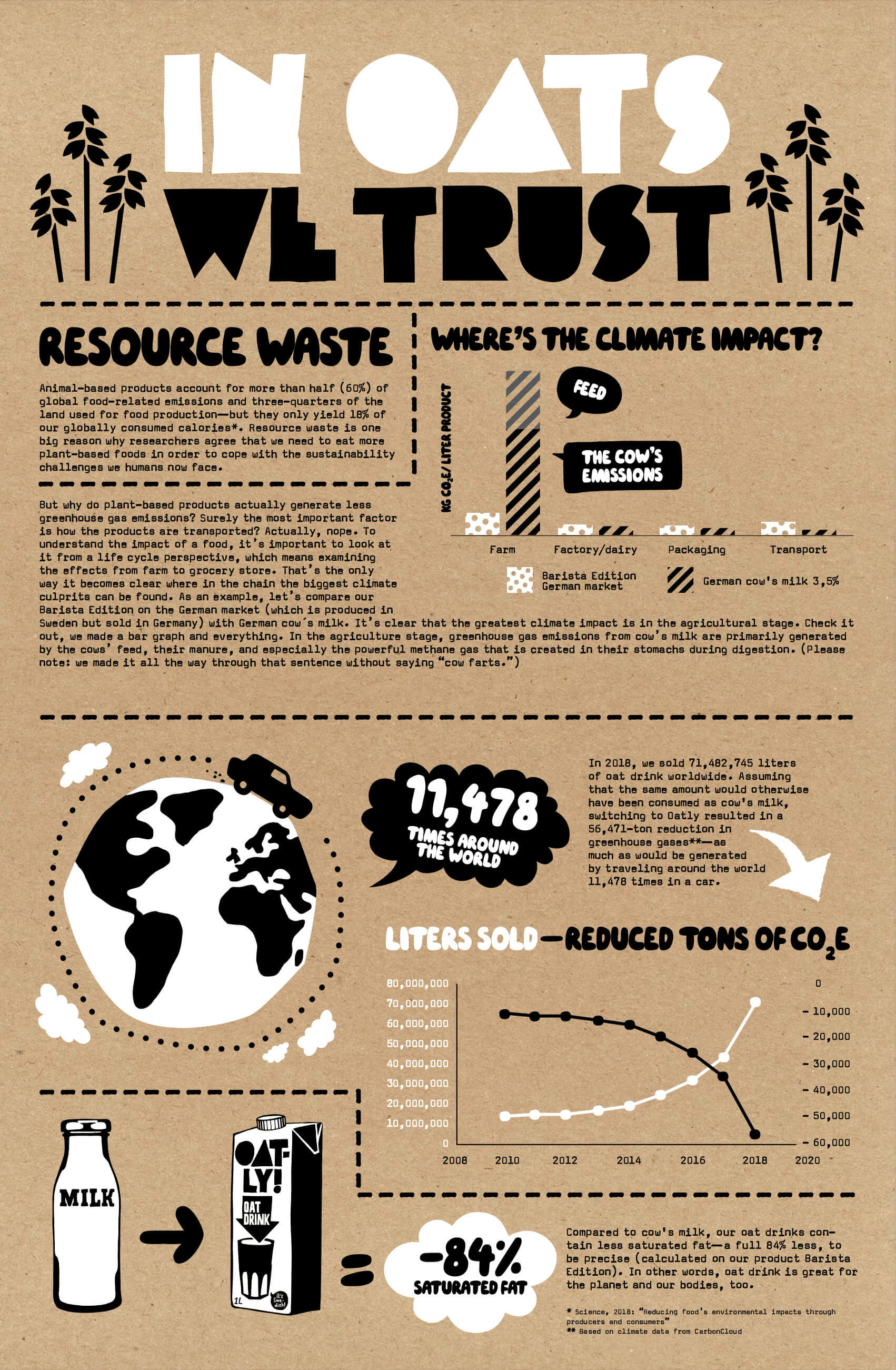
Image credit: Oatly
This infographic from Johns Hopkins Medicine transforms what would otherwise be a text list of Covid-19 symptoms and countermeasures into an easily understandable set of annotated illustrations.

Image credit: Johns Hopkins Medicine
Finally, this spread from the organisation New American Economy (which we looked at in an earlier assignment about editorial design) shows how to seamlessly incorporate infographics into a larger document.
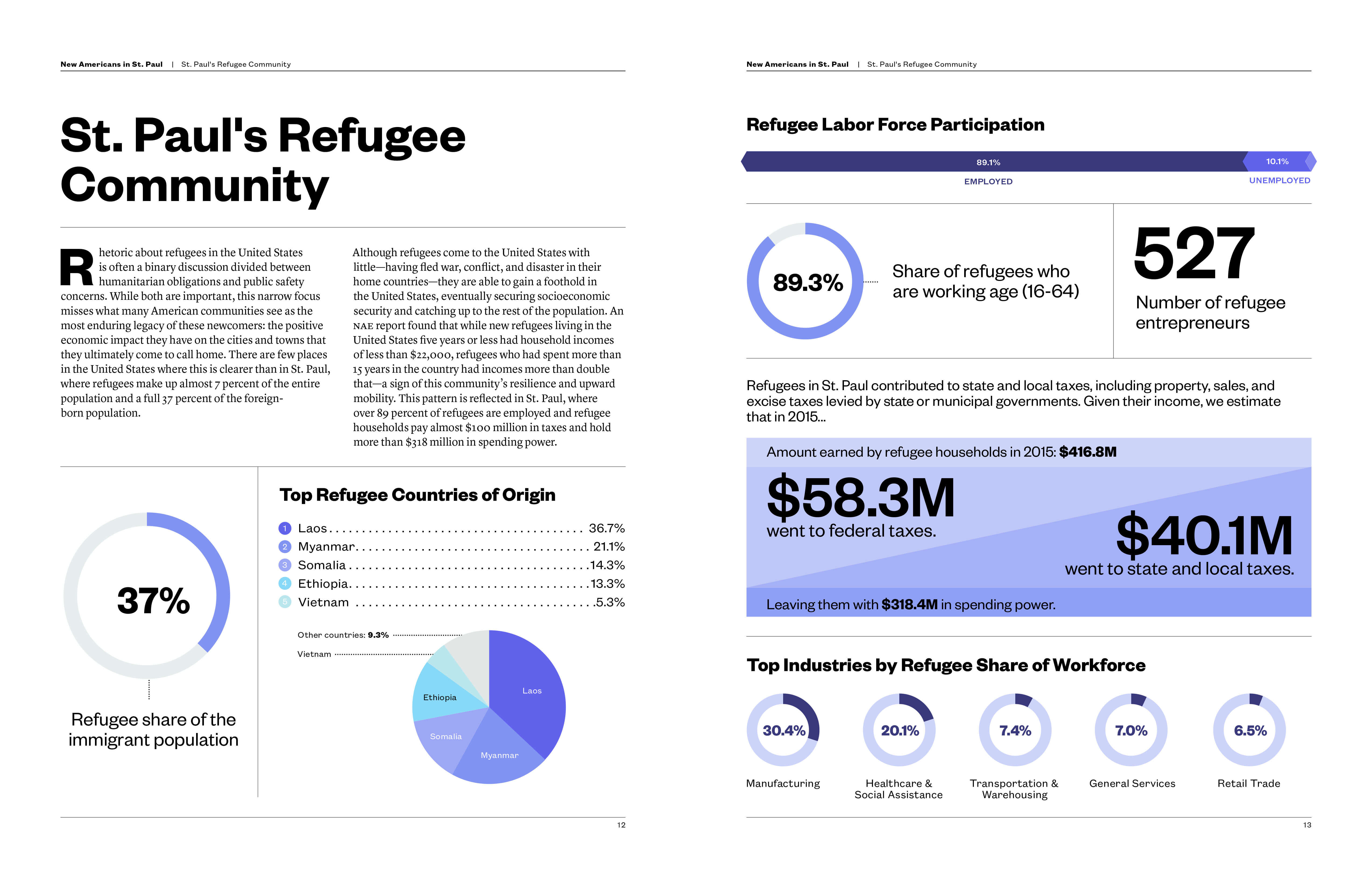
Image credit: New American Economy
In conclusion...
Next, it’s time to apply your knowledge of information design, data visualisation, and infographics in another guided brief.