❮ Blog
When Designing With Text, Don’t Make This Embarrassing Mistake

Andrew Wilshere
Founder & Lead Coach
10th July 2021

Image credit: Karatara
Before we begin, can you see a problem with this image?
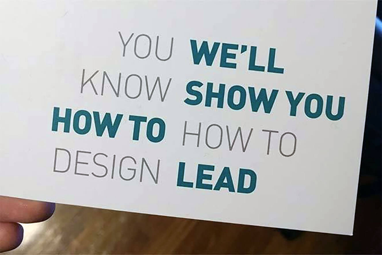
That’s right. You we’ll know show you how to how to design lead.
You might be surprised by how often this kind of design mistake happens. But first, how does it happen?
Visual hierarchy
The problem is caused by text layouts that don’t take account of how the human eye follows text.
In common with readers of most languages that use Latin script (meaning the kind of letters you’re reading now), English readers naturally “begin” at the top-left of an area of text, and then try to read it as a sequence of horizontal lines, one below the other.
While it’s possible for designers to send the eye on a different visual journey, doing so requires very careful control of what’s known as “visual hierarchy”.
Visual hierarchy is the order in which the eye sees different elements in a layout. You can read more in this assignment about visual principles .
Text hierarchy disasters
Here are some more examples of where visual hierarchy has failed in text-based graphics, leading to nonsensical (and often comedic) messages:
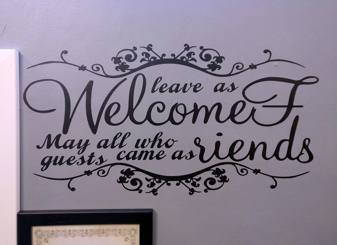
“Leave as welcomef may all who guests came as riends.”
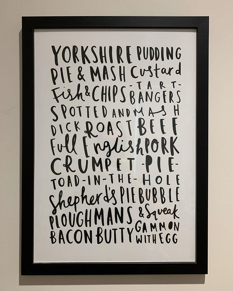
We’ll have the mash custard, then some crumpet pie, and finish with the ploughmans & squeak.
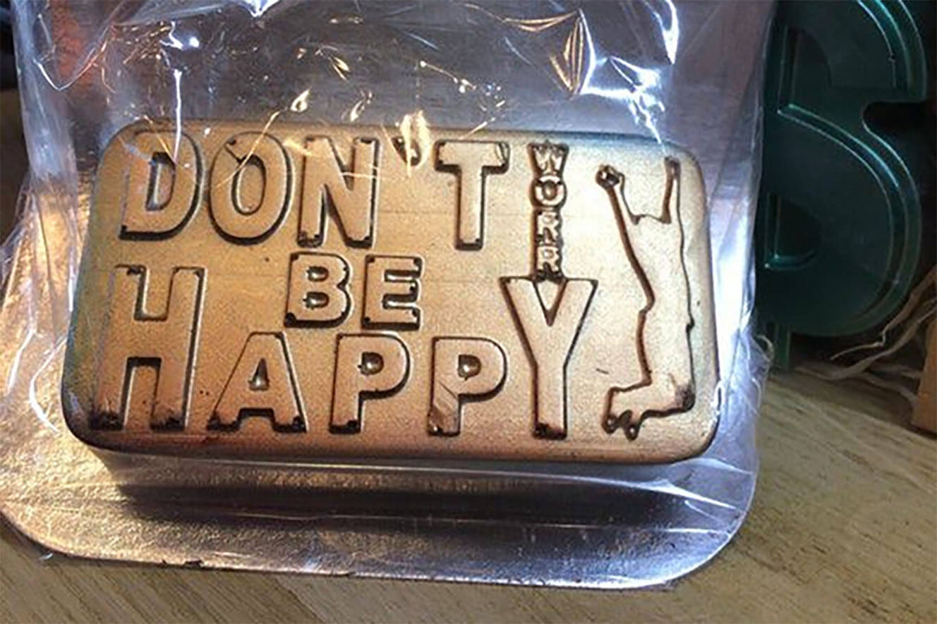
“Don’t be happy, worry.”
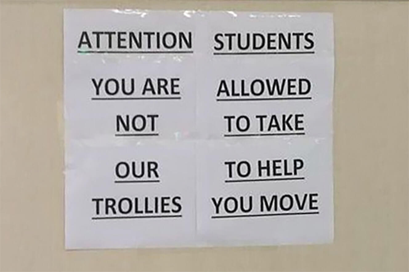
“Attention students: you are allowed not to take our to help trollies you move.” No, wait! “Attention: you are not our trollies. Students allowed to take to help you move.”
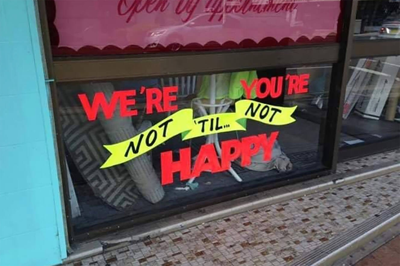
“We’re you’re not ’til not happy.” Or alternatively, “We’re not ’til you’re not happy.”

Right. Here goes: “When you order, grill to we smash sear that fresh ball of beef on a hot-buttered the burger you can taste and delicious burger.”
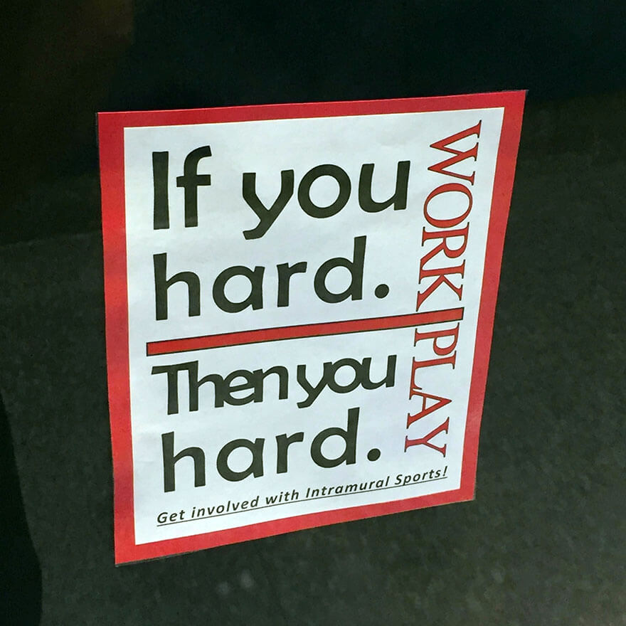
“If you hard. Then you hard. Work play.”
A related problem
Although it’s not usually as disastrous, designers can also run into problems when they fail to create enough visual separation between two or more bits of text that should be read separately.
Here are a few examples:
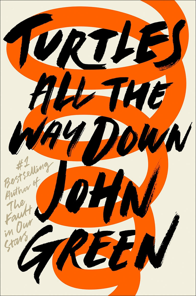
“Turtles all the way down John Green.”
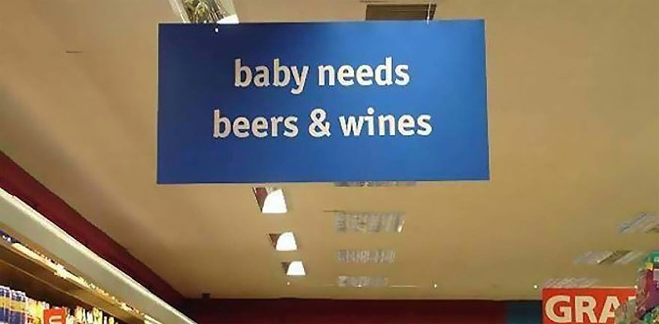
“Baby needs beers and wines.”
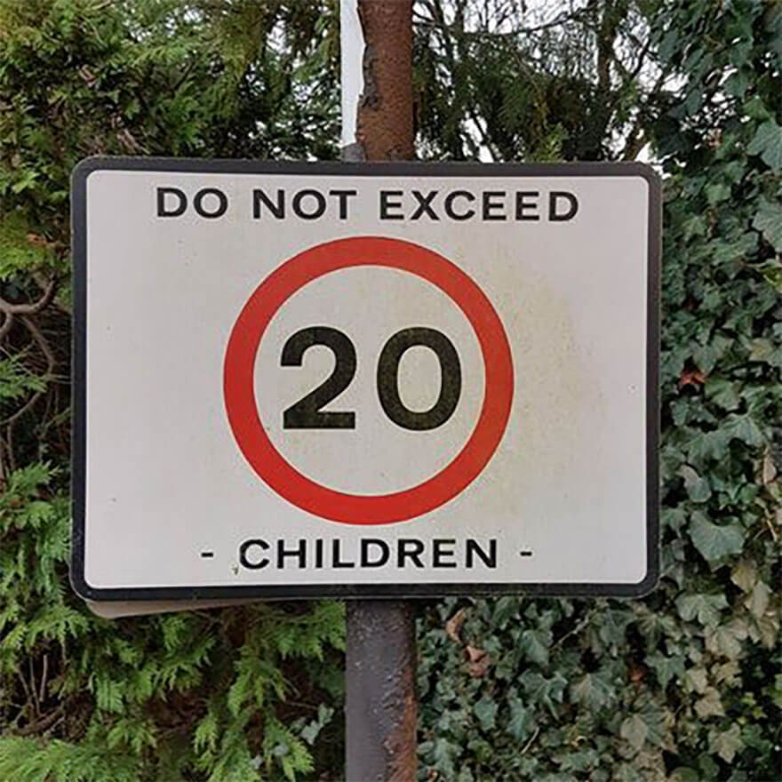
“Do not exceed 20 children.”
Don’t let it happen to you!
Here are some tips to help you avoid any... misunderstanding... of your designs.
- Try reading your design as horizontal lines of text, and check that the word order is correct.
- If you’re arranging your text as separate columns or blocks, make sure that there is enough space to separate them clearly.
- Check that there is enough space between words, and look for any unintended meanings.
- Test your design by asking other people to look at it before it’s finalised.
- Don’t try to be too clever! Simplicity wins every time.
Want to learn about design?
Baseline is a free design bootcamp with 100% in-house course materials. You can start at the beginning or check out the design principles assignments to get a feel for things.
Prefer to subscribe?
RSS/XML Feed
Been considering a design course?
All of our course materials have been created in-house by expert educators. They’re available, in full, for free.
We don’t ask for your email address, or make you create an account.