Course · Part 5 · Assignment 11
Apply
Guided Brief: Build a Brand Identity
Digitise the Logomark
![]() Time limit: 1 hour 30 minutes
Time limit: 1 hour 30 minutes
Remember to use your visual timer! We recommend the inventor’s iOS and Android apps — just search for “Time Timer” in the app store.
Explanation
In this assignment, you’ll choose the strongest logo from your sketches, then digitise it in Figma. But before you get started, we’ve got some tips on how to digitise logos in Figma that will save you a lot of time.
Instructions
Choose a logomark concept
Review the sketches you made in the previous assignment, and choose the logomark concept that you think responds to the brief best.
Digitise the logomark in Figma
 Set your timer: 1 hour 20 minutes
Create a digital version of your logomark sketch in Figma. Here are some tips:
Tip 1: Scan or photograph your sketch, and paste it into the Figma file
You can directly copy and paste image data into Figma. Alternatively, you can press command shift K on Mac, or control shift K on PC, to bring up an import image dialog.
Tip 2: Use built-in shapes and Boolean groups
Wherever possible, don’t draw shapes from scratch with the pen tool. Instead, use the built-in shape tools (ellipse, rectangle, polygon, etc.), and the Boolean groups feature you tried out in Part 3. If you want a reminder, here’s the assignment where we covered Boolean groups.
Tip 3: Keep things simple
As we saw in the lesson on the different types of logo, there are wonderful logo designs with very complex, illustrative graphics — think of the Starbucks mermaid, or Ferrari’s prancing horse. However, that’s pretty advanced and time-consuming stuff, and not something you should attempt in this assignment. Instead, aim to keep your logo simple, and if you need to, build up complexity using those Boolean groups.
Tip 4: Work in black and white
It’s important to work in black and white for two main reasons. First, every logo should function in black and white, as it will need to be used in silhouette form. And second, trying to choose colours at the same time as developing the graphic will mean your attention is divided — and also, if you don’t like what you’re looking at, you won’t know whether it’s because of the colour or because of the form.
Tip 5: Iterate, and keep all of your versions
Digitising your logo doesn’t mean you’re setting it in stone. In fact, moving from sketch to screen is often a great time to explore lots of variations on the concept you’ve chosen. Make sure to keep duplicating your work with command D on Mac, or control D on PC. That means you’ll be able to review and compare all of the versions you tried.
Review the example solution
Once you’ve completed your work on this assignment, take a few minutes to review the example solution below.
Example solution
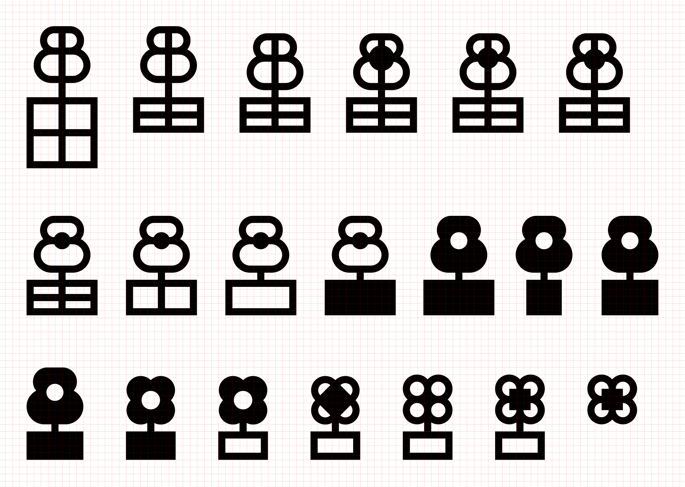
We chose the combined box-and-flower-and-two-Bs idea from our sketches.
From that starting point, we explored a few different avenues of development.

In conclusion...
Now that you’ve got a fairly clear idea of your logo design, let’s create a wordmark to go with it.