Course · Part 5 · Assignment 28
Read ![]()
Some Hazards of Data Visualisation
KeyThree
The key points from this assignment.
- While data visualisations can help an audience understand information, they can also deceive or mislead
- Types of deception include oversimplification, selective use of data, omission of data, omission of context, and mismatch with audience expertise
- These deceptions can both both accidental and deliberate

Image credit: Baseline Team
Introduction
As with all kinds of design, information design has the potential to impact the world both positively and negatively.
At its best, and when it’s doing its job, data visualisation makes a set of data easier for an audience to understand correctly. But at its worst, data visualisation can promote misunderstanding — often unintentionally, but sometimes deliberately too.
This lesson explains some of the most common mistakes in the visual presentation of data, but of course there are countless ways to miscommunicate information. The best way to ensure that a data visualisation communicates information as intended is to test it with some real users.
1. Mismatch with audience expertise
One of the most common errors in information design is to use types of data visualisation that require more expertise to interpret than the audience possesses.
This was evident in the first months of the 2020 coronavirus pandemic. Charts which were originally supplied to experts within government were often then made available to the public. Although they were well designed for their intended audience (experts), they were poorly designed for the general public, who lacked the mathematical and statistical expertise to understand them.
For example, early charts of the pandemic used logarithmic (log) scales. A log scale increases by a multiplication factor (often 10). Where a standard scale progresses 10, 20, 30, 40, etc., a log scale might progress 10, 100, 1000, 10,000, etc.
In those early pandemic charts, to those without the expertise to read the charts, it made an escalating situation look like a stable situation, or even an improving one. Here is the development of the first wave of coronavirus cases in Canada, plotted first on a standard scale, and then on a log scale:
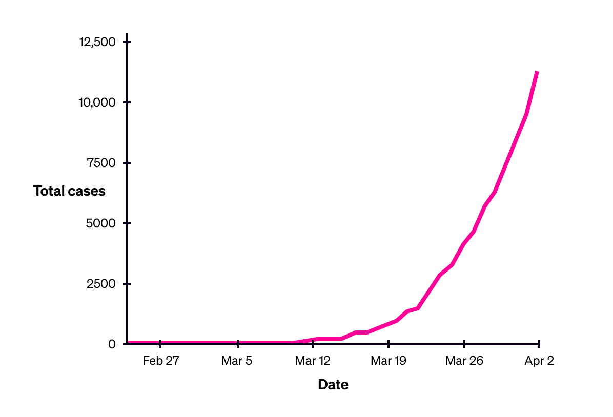
Canada’s total coronavirus cases, up to 2 April 2020 (standard scale)
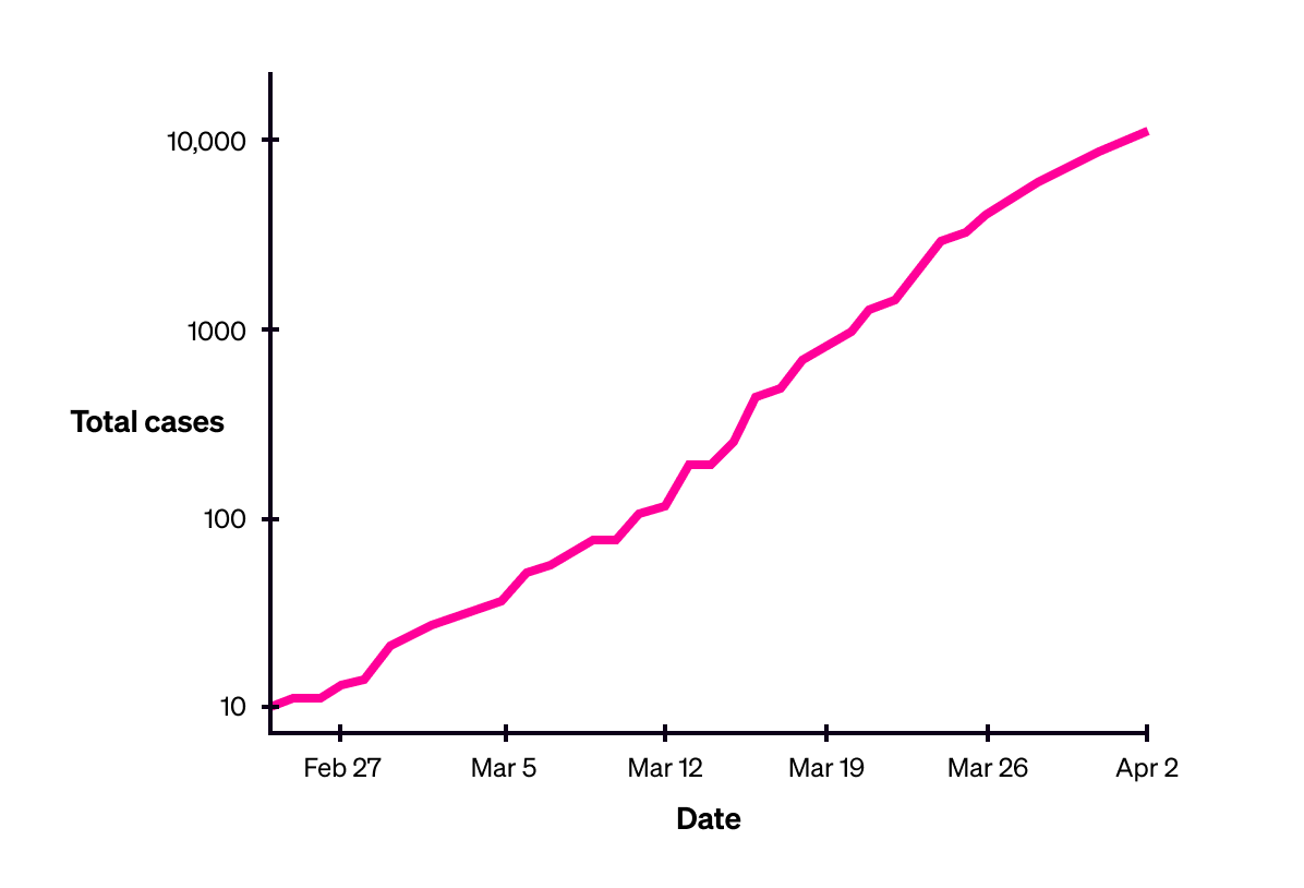
Canada’s total coronavirus cases, up to 2 April 2020 (logarithmic scale).
Image credit: the above illustrations are adapted from a graphic by the United States National Center for Biotechnology Information, using published data from Johns Hopkins University (CSSE).
2. Use of a false y-axis
A “false” y-axis is one that doesn’t start from zero, or which uses some other scale or starting point, often to exaggerate or downplay an interpretation.
Consider the following charts of the number of recorded crimes in the U.K. from 2017 to 2019. The first uses a false y-axis, starting at 5.9 million recorded incidents. The second uses a true y-axis, starting at zero.
Presented with the first version, a non-expert audience might misinterpret the information, and conclude that the crime rate is sharply rising.
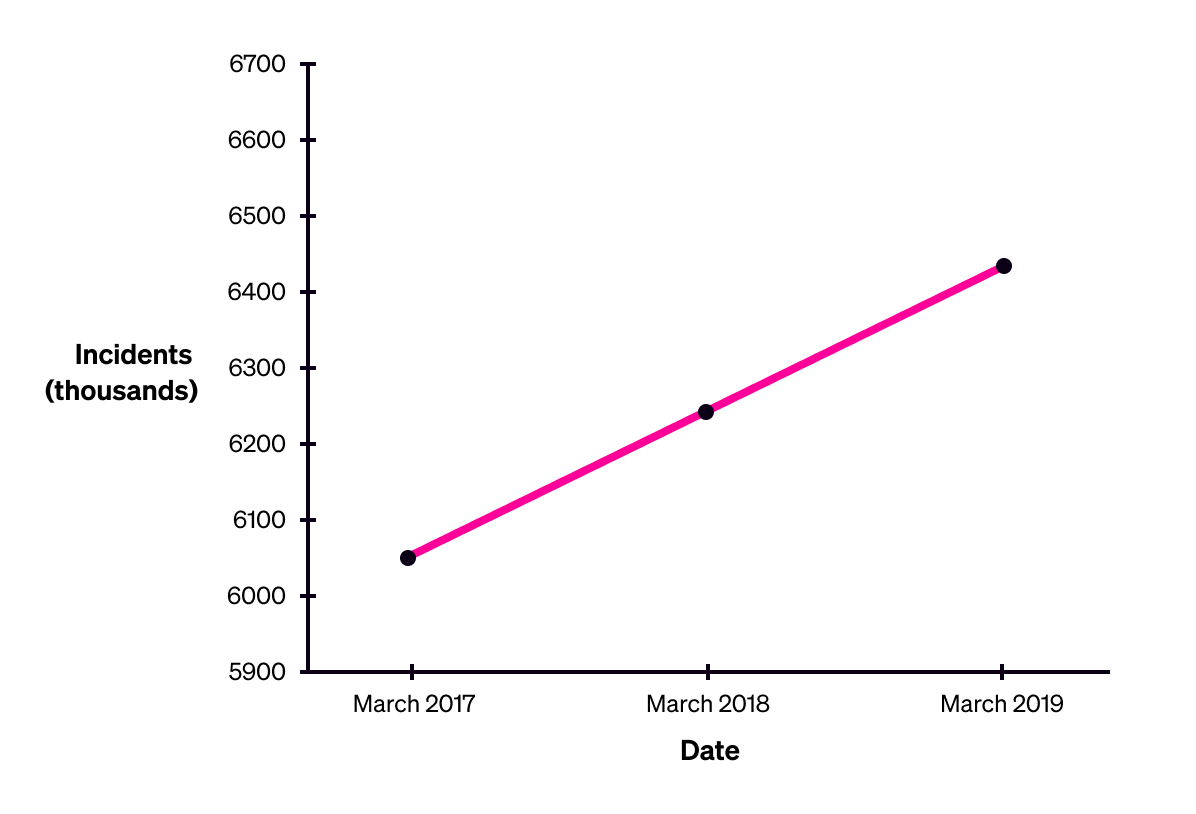
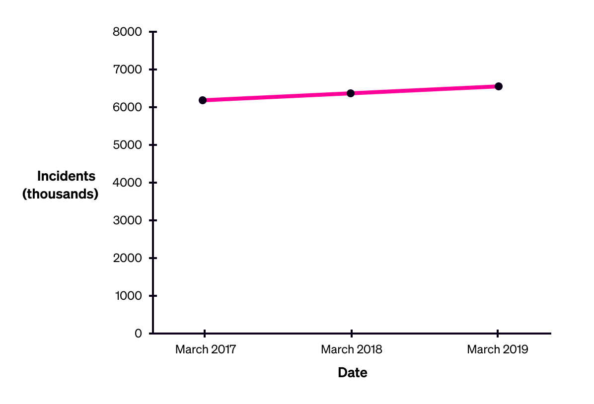
The United Kingdom’s total recorded incidents of crime, excluding fraud and computer misuse, 2017-2019. Source: Office for National Statistics
Using a false y-axis isn’t always an issue, however: it depends on the audience, and the context in which the graphic will be used.
For example, it’s important to stockbrokers to be able to clearly see small changes in a stock’s price. Since they are expert interpreters of that kind of visualisation, using a false axis is very unlikely to cause any misunderstanding for that audience.
Here’s a page from Bloomberg’s website, which uses a false y-axis to allow people to see short-term changes and trends in market value.
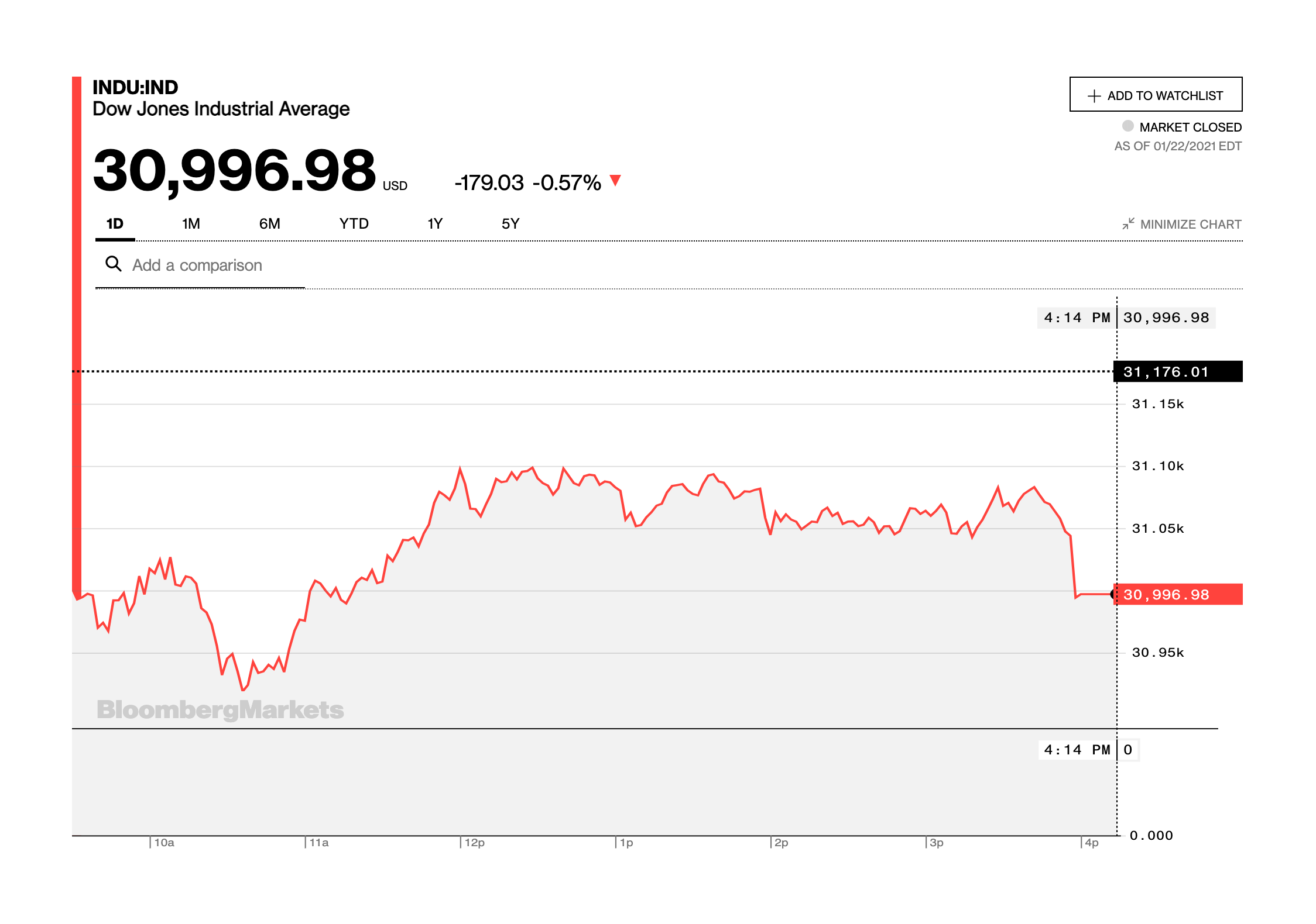
Image credit: Bloomberg
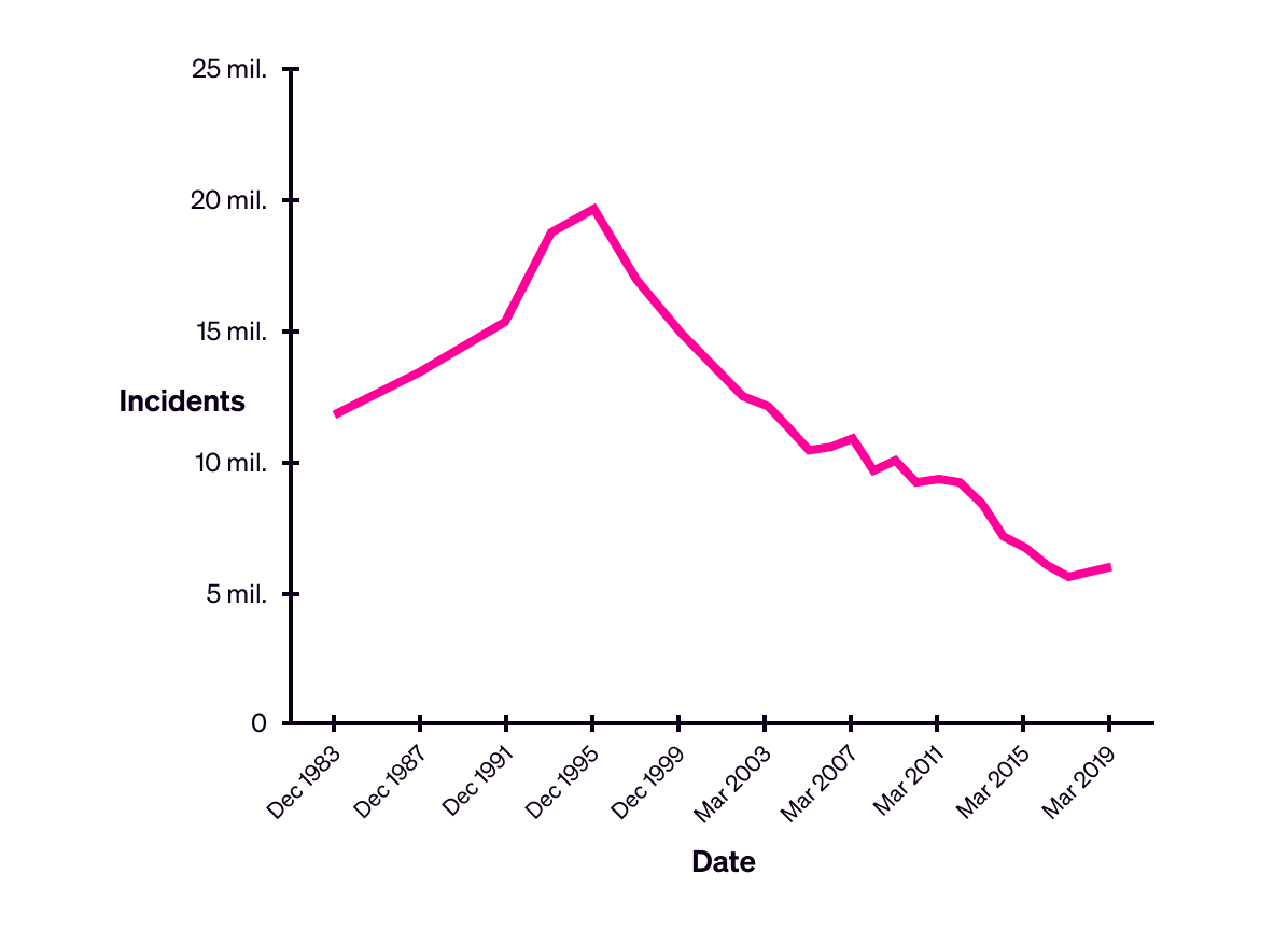
3. Omission of context
Particularly in charts that show change over time, it can be problematic to leave out data from before and after the period under discussion. Doing this can cause people to build a false impression of the situation, or to focus on a less significant short-term trend over a more significant long-term trend.
For example, to return to the example above, the U.K.’s rising level of crime between 2017 and 2019 means something different when it is displayed in the context of the data from previous years:

The United Kingdom’s total recorded incidents of crime, excluding fraud and computer misuse, 1983-2019. Source: Office for National Statistics
4. Confusing scales
The way that scales are displayed on charts can confuse any audience, particularly if they will only be glancing at the information, like when reading a newspaper or scrolling through a business report.
For example, the y-axis scale that we used in the U.K. crime graphs above is “Incidents (thousands)”, and the markers on the axis are then also labelled with numbers that are in their thousands. This means that people need to figure out to read the data points as “thousands of thousands”.
Of course, since a thousand thousand is a million, the data itself is in millions. We could avoid all of this confusion and thinking-time by simply displaying the scale in millions instead. Here’s an improved version:
5. Lack of future-proofing
The purpose of some data visualisations is to be updated regularly and viewed repeatedly. In these cases, it’s important to think ahead, and future-proof the design of the visualisation as far as possible.
Poor future-proofing is often seen in heat maps (choropleths) that are updated periodically to display updated data. This was seen widely as the global coronavirus pandemic developed: as cases increased, the colour scales used in graphics were repeatedly changed to reflect the new range of numbers.
The problem with this approach is that it can make it seem like cases in some areas have reduced, because they now have a lighter colour — when the reality may be that cases in those areas have stayed the same, or even increased.
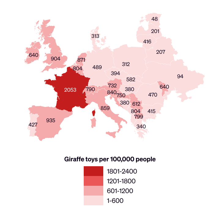
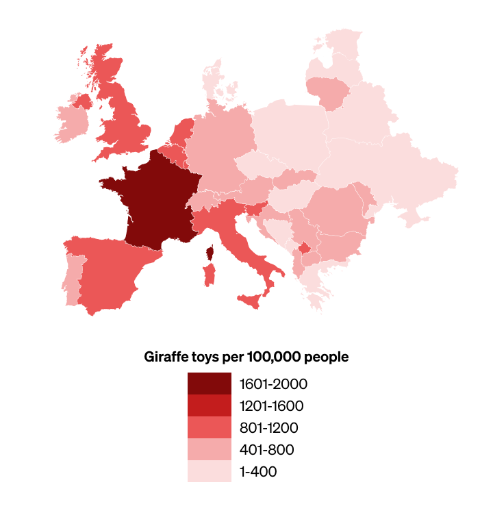
For an illustration of how this can happen, here is a visualisation of some fictional data about giraffe toys in western Europe. The only difference in the data between the first map and the second is that the prevalence of giraffe toys in France has increased.
But because the entire colour scale has been shifted, it looks like giraffe toys have instead become less prevalent in other countries. (We’ve repeated both maps below with the number values labelled.)

First version
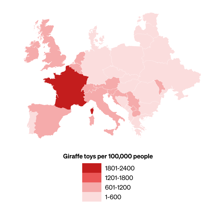
Second version, with colour scale updated to accommodate an increase in the number of giraffe toys in France
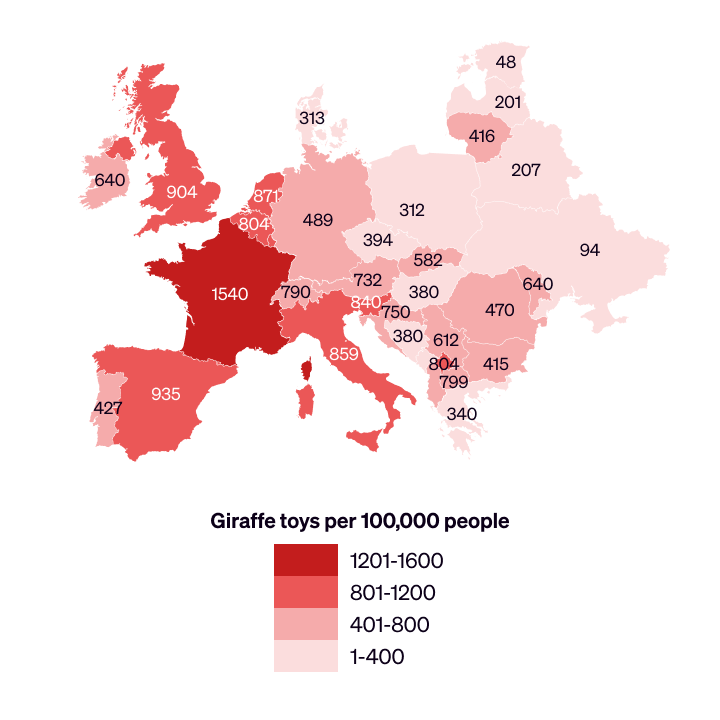
First version, with values labelled
Second version, with colour scale updated to accommodate an increase in the number of giraffe toys in France, and values labelled
In this situation, it would be better to add to the existing colour scale, which avoids changing the colour of areas of the map where there hasn’t been a change in number of giraffes:
The best solution would be to design a full colour scale at the outset, which can accommodate every anticipated level of giraffes. However, to avoid confusion, it’s best to include with the graphic only the range actually in use.
See below for a design of a full colour scale — we’ll assume that there’s a theoretical maximum of 2800 giraffes.
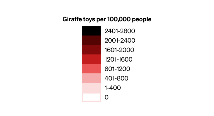
Design of the full colour scale, to accommodate all anticipated data
Graphic showing only the range in use
In conclusion...
You’ve now seen both the power and the peril of information design and data visualisation.
In the next assignment, you’ll analyse an example of information design and identify what makes it successful.