Course · Part 5 · Assignment 27
Read ![]()
What Makes a Data Visualisation Great
KeyThree
The key points from this assignment.
- Use good quality source data, and prioritise truth, honesty, and transparency
- Consider the audience, their needs, and expertise, and make the design accessible
- Aim for simplicity and visual clarity, and be careful when using colour

Image credit: Baseline Team
Introduction
In this assignment, we’ll run through ten practices that can help you create great data visualisations.
In short, it’s about making good-faith decisions about how to represent data, in light of the needs and expertise of the audience, and the purpose of the project.
1. Use good quality source data
A data visualisation can never be better than the data it’s visualising. If the data set is very small, or if the data is incomplete, faulty, or of otherwise poor quality, no amount of graphic design will improve it.
For example, a visualisation could claim to show health trends in a country, but it might work from source data that is out of date, has a small sample size, or is drawn from an unrepresentative sample of that population.
2. Prioritise truth, honesty, and transparency
There is often an incentive for organisations, companies, governments, media, and individuals to use data visualisation to hide or distort the truth, often to support a chosen narrative or editorial line.
While the motives of those actors may be beyond our control, we can use our power as design professionals in the following ways:
- Advocate for the publication of source data in the projects we work on, and include a note with each graphic that states what data have been used in its design
- Promote the use of simple visualisation styles that empower the audience to ask their own critical questions
- Refuse to work on data visualisation projects that cherry-pick data in order to paint an unduly positive, negative, or otherwise inaccurate picture
- Blow the whistle on persistently unethical practices around data and data visualisation
3. Consider the audience, their needs, and expertise
Designing a good data visualisation depends on understanding the people who will use it, what they need to understand from the graphic, and what expertise they have that might help (or hinder) them.
For example, visualising data about the stock market for an expert audience of stockbrokers will probably require a different approach from visualising the same data for a general audience.
4. Choose the right type of visualisation for the data
Perhaps the most important choice when visualising a set of data is what kind of chart best accommodates both the data and the audience. This can be a difficult decision.
To help, ask yourself: what is the visualisation’s goal? Or more precisely, what does the audience need to understand about the data through this visualisation? Then, consider how well different types of chart might meet that need.
Choices of chart type can be problematic in quite subtle ways. For example, it is common for line charts to be used to connect separate data points that are separated by long periods of time.
The chart below shows a company’s profits and marketing budget for five years. But each year has only one data point, which is a sum of all the profits reported in that year, and all the budget assigned to the marketing department in that year.
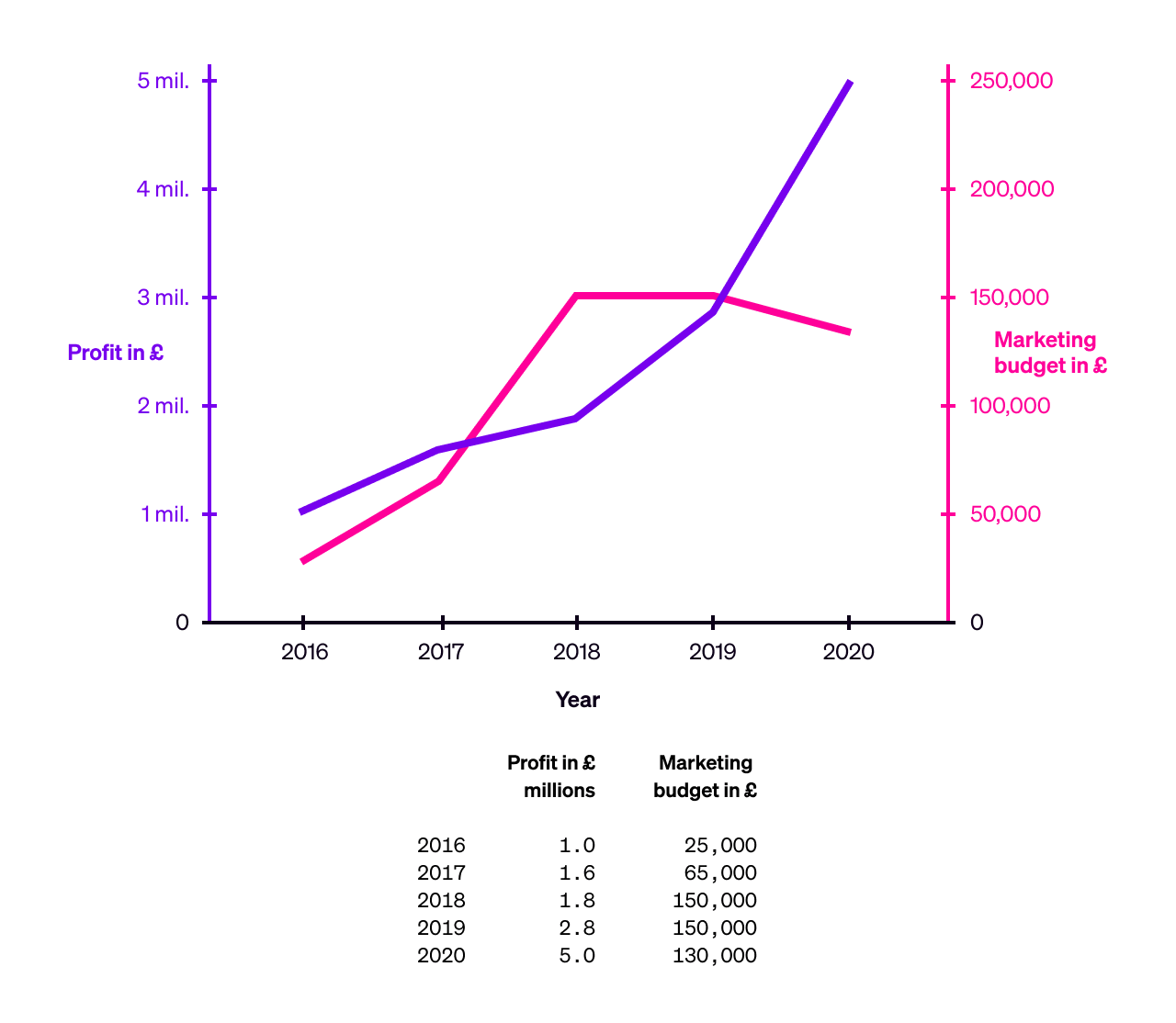
The problem is that the lines connect discrete data points in a way that implies that both profits and the marketing budget were changing during the course of each year. But that may or may not be true — we don’t know, because there is only one data point provided per year.
In other words, the chart above visualises “more” than the data behind it can support. A better option for this set of data would be simply to show the data points, since this avoids implying that there are additional data points.
5. Make it accessible and inclusive
Accessibility is about more than ensuring that a product or service accommodates those with disabilities. It’s also about ensuring that the things we design include as many people as is practically possible.
In the context of information design, this can mean:
- Ensure there is a text or audio description of each graphic available for those who are visually impaired. (On websites, this can be achieved using alt and caption attributes.)
- Where practical, include the source data, or an outline of the source data, for example in a table. This can help people who find it easier to “look at the numbers” than to interpret a graphic.
- Avoid colour schemes that exclude people with colourblindness — especially combinations of red and green, which are both very common, and very problematic for those with reduced colour vision.
- Use a text size that is as big as it can be, within reason, and without obscuring or polluting the graphic.
6. Pursue simplicity and visual clarity
With so many graphic design tools at our disposal, it can be tempting to go wild when visualising data — whether that be adding pictorial elements to charts, or combining many different categories of data in a single, clever, and complex visualisation.
However, while the results might be visually stunning, bear in mind that the more complex a data visualisation becomes, the more difficult it will be to understand — and in almost all cases, the central purpose of a data visualisation is to make understanding easier.
We’ll come back to this point in a couple of assignments’ time, when we look at more advanced data visualisations, and the special role of complex infographics.
7. Promote comparison of data where appropriate
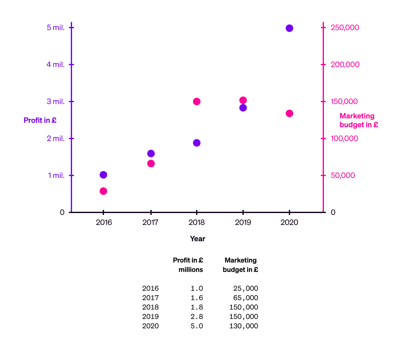
Many charts have an element of comparison — for example, before and after, year-on-year, place-by-place, etc. A data visualisation should make it easier to compare the relevant values in a set of data.
Returning to the example we looked at above, this visualisation allows the audience to compare the shifts in profit and marketing budget over time. It also uses a separate scale on the y-axis for each series of data, meaning it’s also possible to see when the marketing budget was above and below 5% of profits.
8. Be restrained when using colour
Data visualisation pioneer Edward Tufte wrote back in 1983 that “color often generates graphical puzzles”,* and this is truer than ever now that colour is nearly always at our disposal as designers.
While colour can be a very useful explanatory tool, it tends to be meaningful only through cross-reference to a key which states what each colour stands for. Colour is therefore less direct than, for example, the height of a bar, which means something immediate without the need to cross-refer to a key.
The more colours that are used in a diagram, the greater the need to cross-reference, and the overall effect can be to confuse rather than explain.
Tufte presents this example of an undesirable “puzzle graphic”, which features “16 shades of color spread on 3,056 counties”:

Image credit: Edward Tufte, “The Visual Display of Quantitative Information”, 1983, page 153.
In general, using a grey scale or other single-colour scale is easier for people to understand, because they only need to interpret the graphic in terms of light and dark, rather than light, dark, and multiple colours.
The New York Times used a grey scale in their SARS-CoV-2 vaccination tracker:
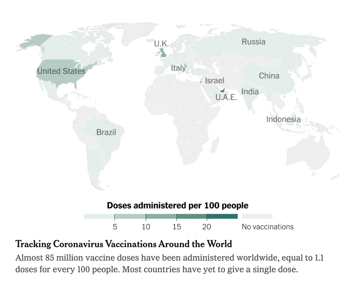
Image credit: The New York Times, online front page, 29 January 2021.
* Edward Tufte, “The Visual Display of Quantitative Information”, 1983, page 154.
9. Add explanatory labels at strategic points
Depending on your instincts, you might find yourself resisting adding notes or extra labels to a chart because they feel like clutter. It is true that too many labels, or notes that are unnecessary, can create clutter. However, one or two labels that draw the audience’s attention to important points or observations can support the overall goal of the visualisation.
Examples of where to use notes or labels on a chart include to explain an anomalous data point (if an explanation exists), or draw attention a particular trend or interpretation of the data.
10. Make it beautiful
Although beauty is not the essence of data visualisation, it is an established fact of user experience design that interfaces that are perceived as beautiful are also easier to use. (This is called the “aesthetic usability effect”.)
Making a data visualisation beautiful — as long as doing so doesn’t detract from its simplicity and visual clarity — can make it more engaging and easier to understand.
The work of designer Nicholas Felton provides a superb example of how to combine simplicity and beauty to support the clear communication of complex information. Here’s a page from his personal 2009 annual report — he created these in different graphic styles for ten years, from 2005 to 2014.
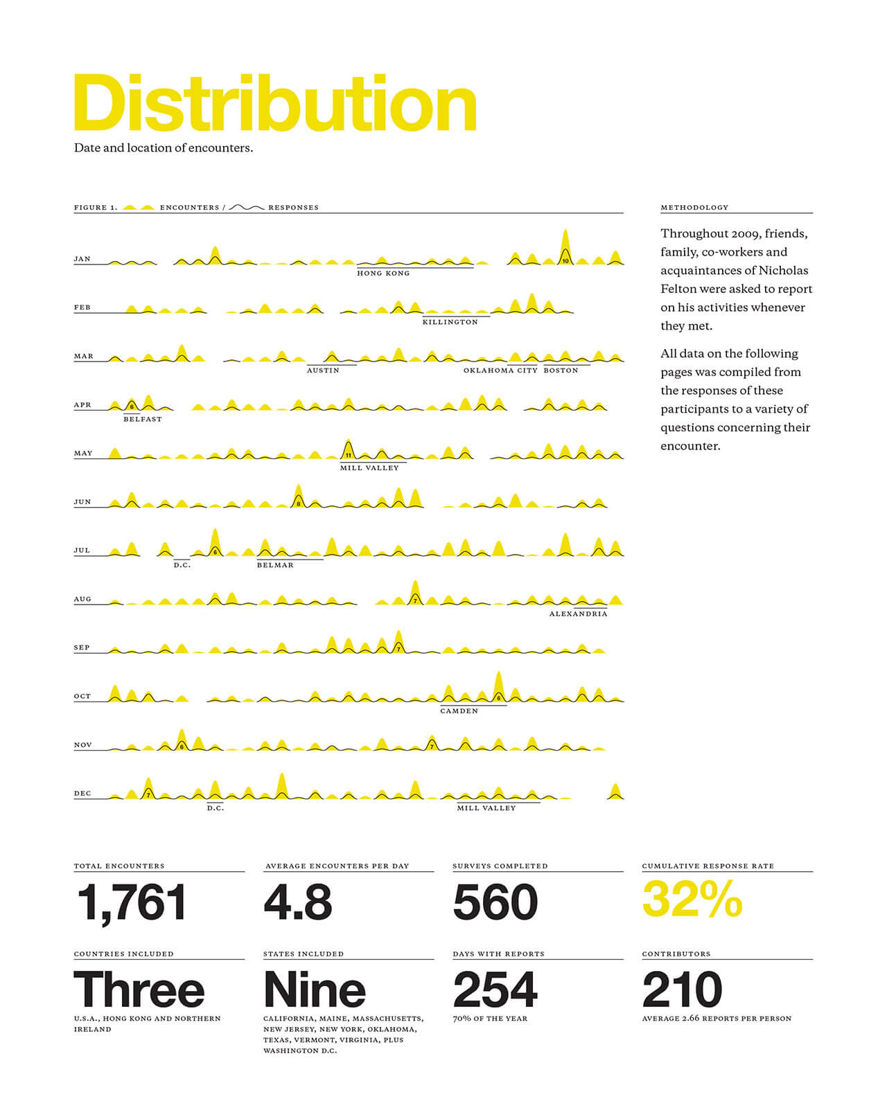
Image credit: Nicholas Felton
In conclusion...
Now that we’ve covered how to make a great data visualisation, in the next assignment let’s consider some ways that information design projects can go wrong, and how to avoid some common mistakes.